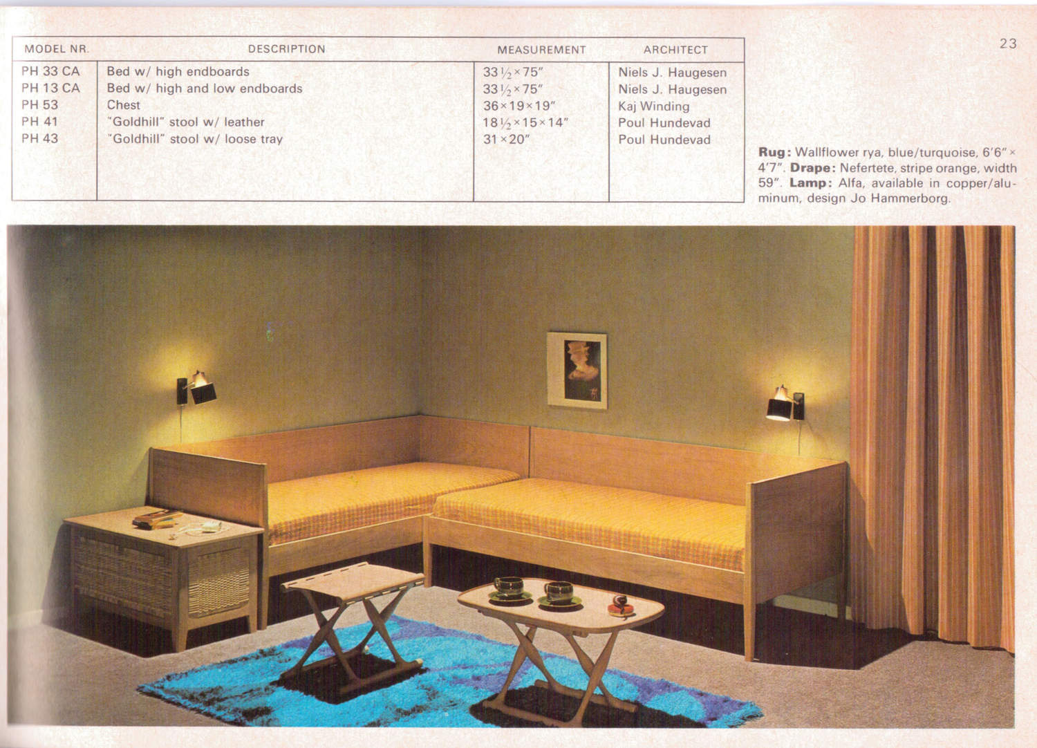
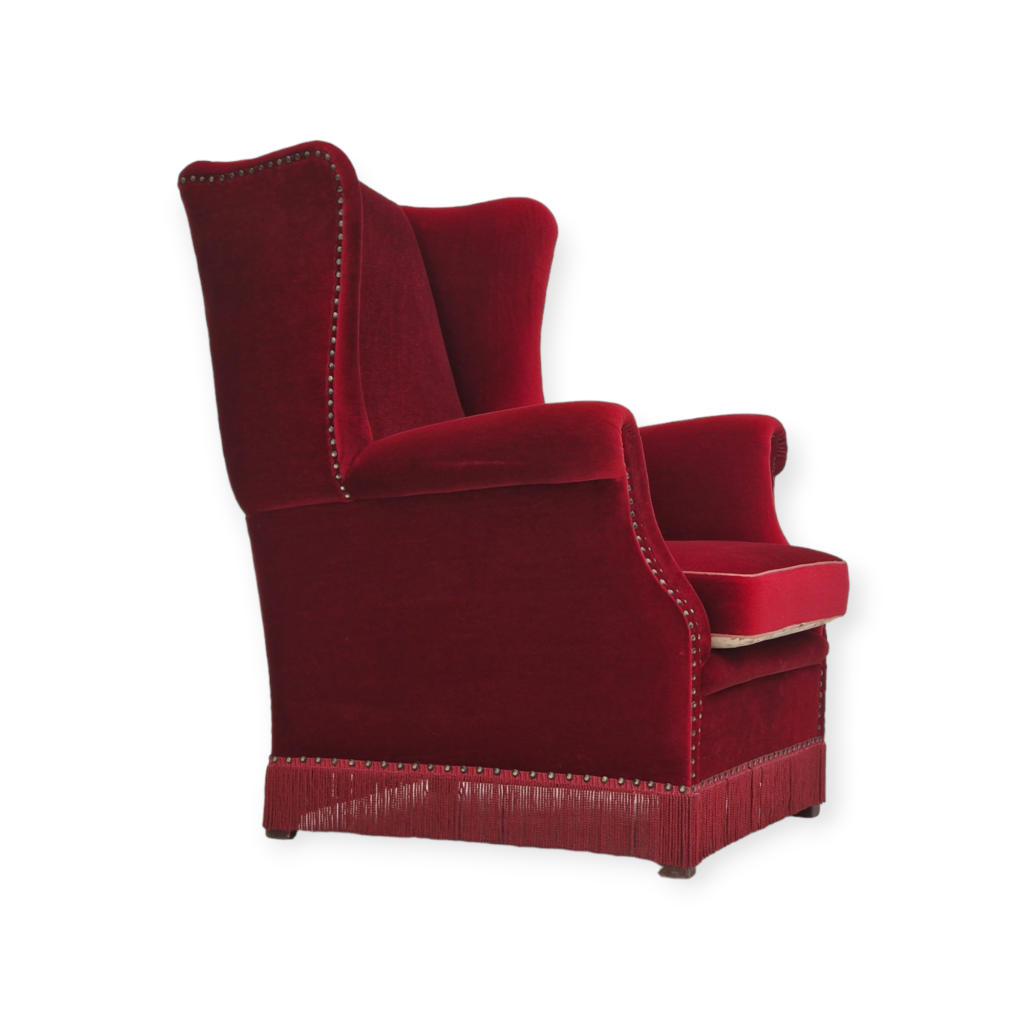
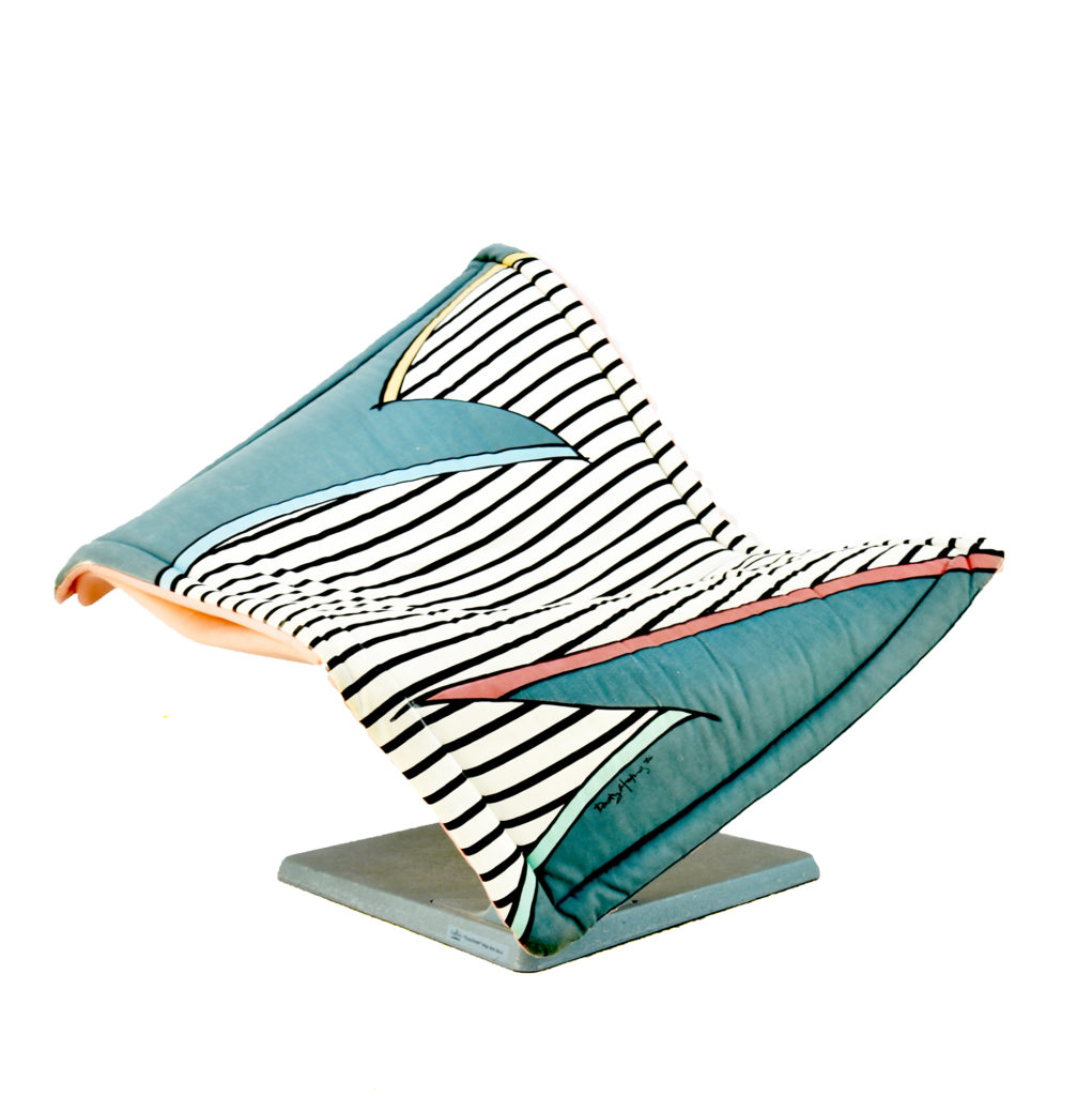
This thread is about Poul Hundevad: what he designed, what he made, or more precisely what he did NOT make and who made those things and why Poul gets framed for them. He is not the most famous Danish designer, nor producer, not by a long shot, but he is responsible for making one of my favorite pieces of Danish Modern, the Gold Hill Stool or guldhøjstolen. <img class="wpforo-default-imag
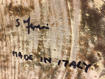
Alright, so if there are two companies who made what? Let's start with Poul Hundevad and his Gold Hill Stool, since it is incontrovertibly his. Can be find a marked one and start to sort this mess out. It turns out that Poul Hundevad was really not very fond of putting his logo on anything (how very Danish of him...), and least of all his Gold Hill Stool. But there are a few, and here is one with even the original box. See that "PHV" logo? That, right there, that is Poul Hundevad's logo. "PHV" for P-oul H-undevad, V-amdrup.

So then what is the "hu" logo?
It is the logo for Hundevad & Co of Ulfborg. "HU" for H-undevad and U-lfborg. Or possibly it is just the first two letters of "Hundevad," but Danish furniture factory naming patterns suggest it would have been the town. This is why so many towns are incorrectly advertised as part of the name of a Danish furniture company, because many always put the company name immediately after (for example: Aksel Kjersgaard Odder; Axel Christensen Odder (whose logo was 'ACO'); Koefoeds Hornslet; CFC Silkeborg; Poul Hundevad, Vamdrup; etc).
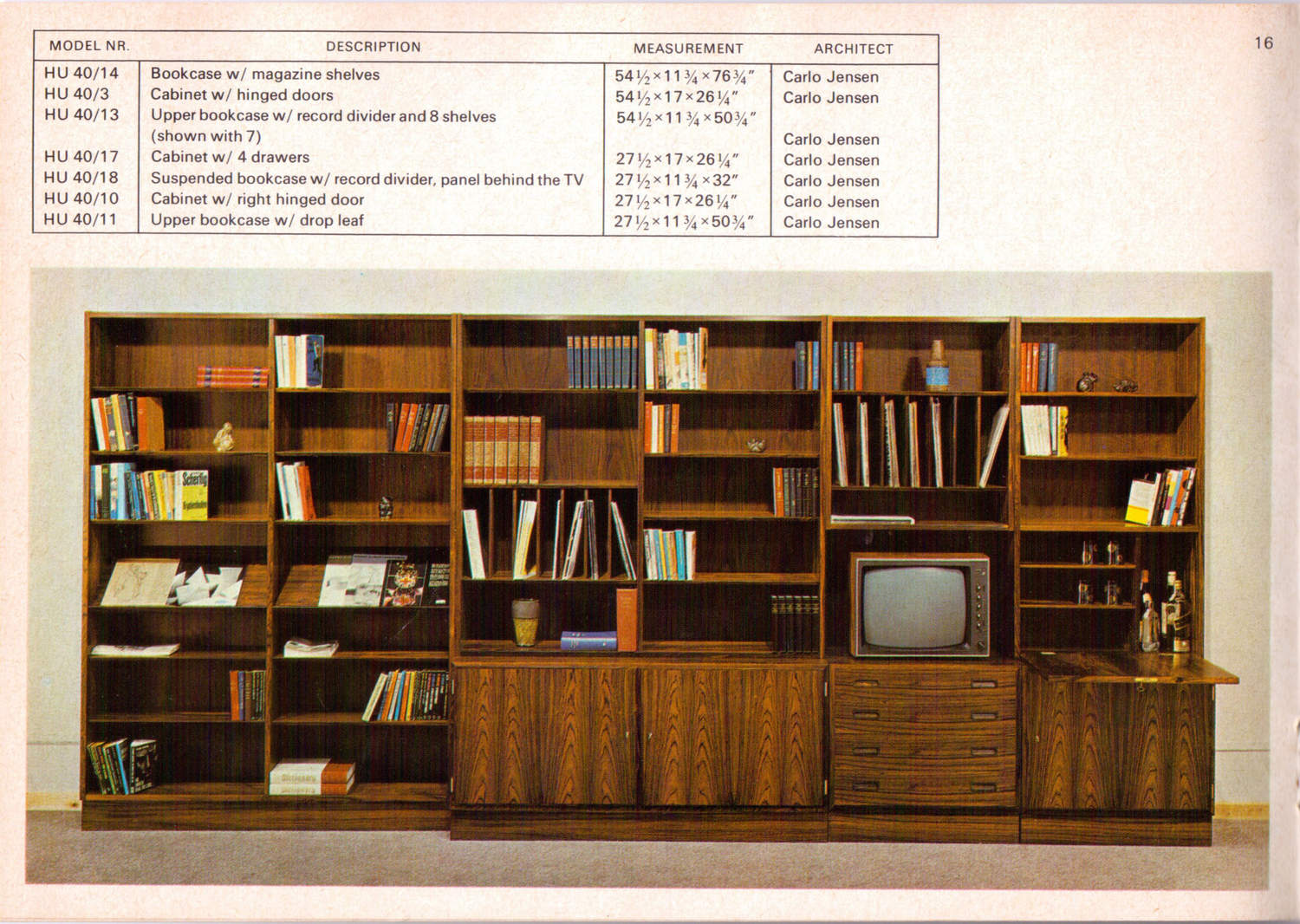
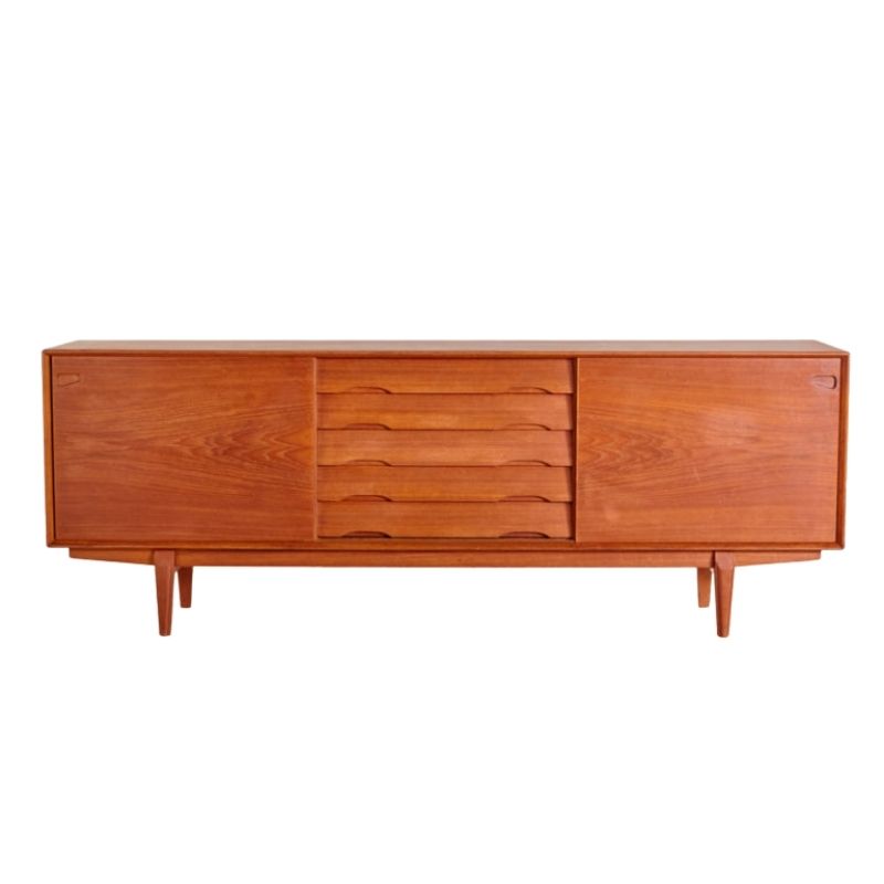
Hundevad & Co mainly built case goods, and here is one of their pieces. This was designed by Carlo Jensen by the way. Also, note on the Domus Danica page, that the model number is prefixed with 'hu,' just like the logo, incidentally. This prefix code was how all Domus Danica literature identified Hundevad & Co pieces.


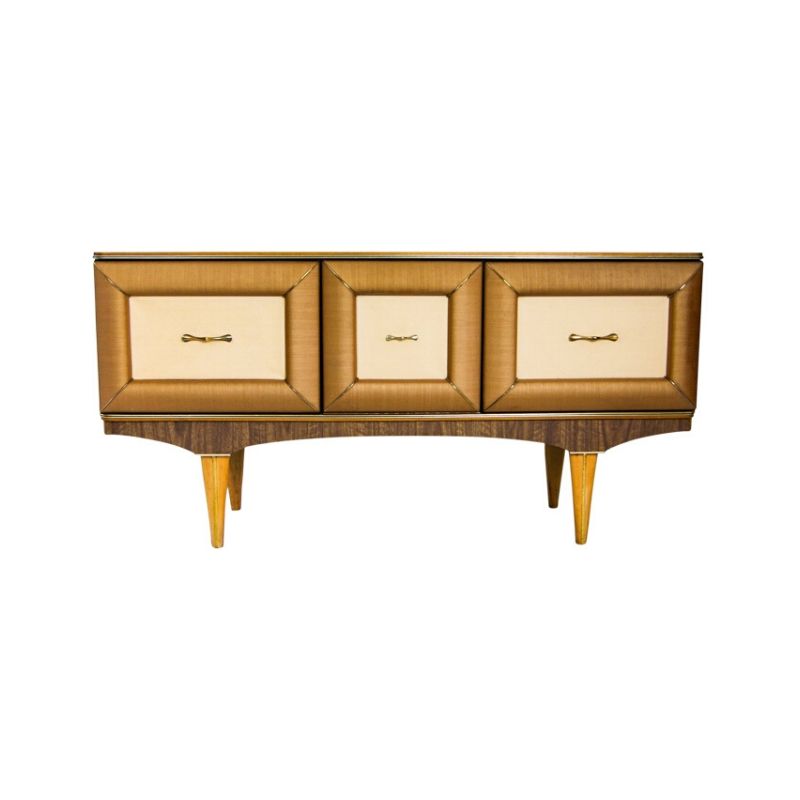
And this reminds me of another mystery. A few times I have seen Danish modern pieces--unidentified, and I think all have been case pieces--with a "CHO" mark, and nobody seemed to know whose mark it was. Well, the answer is Hundevad & Co. My guess it is an earlier than the "hu" mark. And the mark is not supposed to be read as CHO, but rather as HCO. This graphic design failure probably had a lot to do with why the company's logo was changed.

If you need any help, please contact us at – info@designaddict.com


