One of the things that first attracted me to Danish Modern furniture a couple of years ago was that some of my favorite designs just happened to be some of the more affordable pieces (if only cars worked the same way). In particular, dining chairs seemed to fall in this category.
A set of eight Erik Buck OD 49/50 chairs, made by Oddense Maskinsnedkeri, was one of my earliest purchases. These chairs are fairly common (as Danish Modern pieces go) in the US, and I was able to get them (pre-shipping and pre-reupholstered) for under $100 apiece. After having these guys for a while, they are still one of my favorite chairs to both sit in and look at.
As I was walking around Wright's showroom before their Scandinavian auction last week, I had the chance to sit in the Wegner Cow Horn chair for the first time. This lot of eight had a hammer price of $36K ($4500 apiece), and that is before the buyer's premium and shipping/insurance costs are factored in. Although I find these chairs aesthetically pleasing and reasonably comfortable, I would still choose the Bucks if value and limited availability criteria were removed from the equation. Now, I understand that these two chair set prices should not be compared. One is factory mass-produced with a decent number of pieces that come on the market regularly, and the other is limited production by one of Denmark's best cabinetmakers and chair designers. I was only making a preference statement about design of the chair itself, separate from valuation/rarity factors.
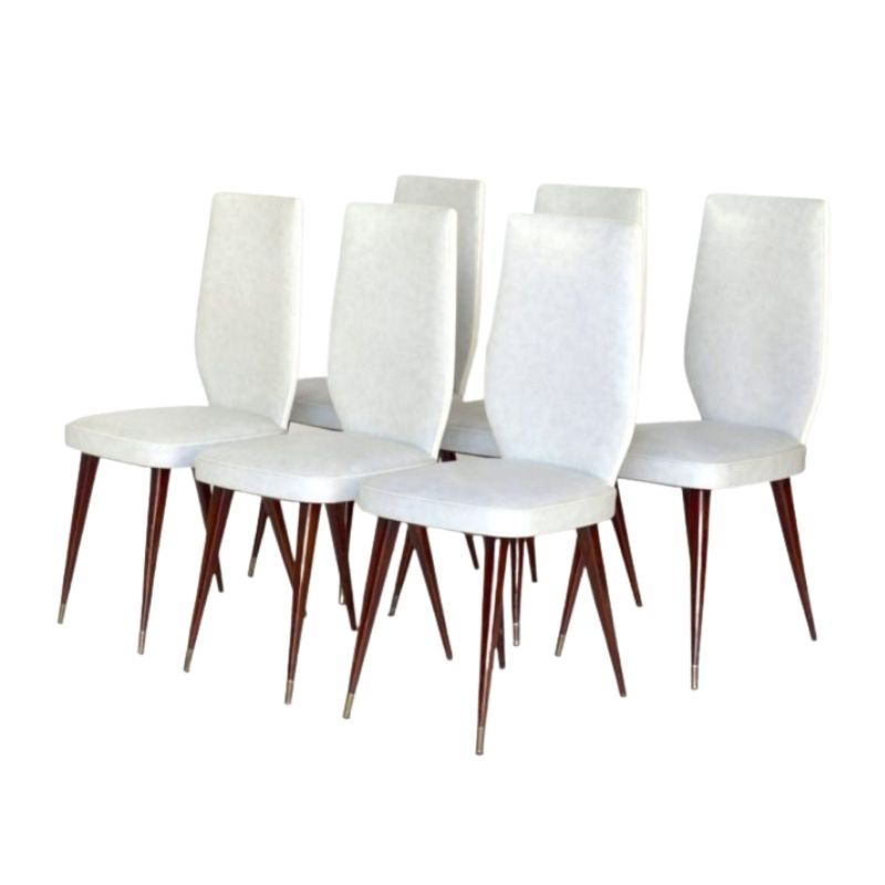
Anyway, the point of this post is to find out what others consider as their favorite mid-century wood dining chair. There are many good choices out there, both affordable and some not so much. My second choice for dining chairs at the time was the Erik Christensen "boomerang" #360 chair by Slagelse Mobelvaerk, which mesmerized me by its simple elegant form. I have since acquired three of those for my kitchen table. These ones are a little rarer/pricier than the Bucks, but can still be reasonably had.
(note: attached photos are not mine/Wright's, but found online)
<img class="wpforo-default-image-attachment wpforoimg" src="  | http://d1t1u890k7d3ys.cloudfront.net/cdn/farfuture/6bBEHSMFhrYxWXtPcW6Jx9OtHWED8RNEWTJBcA8_E8M/mtime:148790
Dear cdsilva,
What a lovely dining room that you have. Do consider moving the artwork (located above the sweet buffet) to the left, and placing the candle holders (located on the table) to the top of the buffet...right side...tallest holder on the rightest side. And then invite me over for dinner. You have booze!!...I'll bring some more. I have a pet peeve about seeing candle holders next to a light fixture...especially when they are of such good design, and your current vignette is too predictable.
just a thought...or just disregard my stoned self......I need therapy.
Best,
That photo is over a year...
That photo is over a year old. I need to take a more recent version. No worries on the suggestions. It's always nice to hear another viewpoint. Some follow-up notes on the dining room:
- There is the same camerapoint nighttime shot of La Sagrada Familia on the opposite wall (not visible in photo) in line with the table axis. I had them side-by-side at the old place, but always envisioned them facing off to each other.
- Good point on the candles. I've moved them around to different locations in the house, but they currently are on the table.
- Pontopiddan tea cart, two Buck dining armchairs, tripod wood lamp, area rug, Incan calendar wall hanging, and sheer curtains have been added over the past year, making the room feel more inviting (and the neighbor's house less visible)
- And most importantly, a second row of booze bottles has been added in the hutch.
Unfortunately yes. It is hot...
Unfortunately yes. It is hot water and not steam. I also cut a piece of extruded polystyrene insulation (the pink stuff from Home Depot) to exactly fit the back of the credenza portion to help buffer the temp swings.
Not an ideal situation, I agree, but I need that radiator to be active and didn't have too many options otherwise for furniture layout.
This particular Bernhard Pedersen and Son unit was designed to go against the wall and doesn't have the same wood finish on the rear as the other surfaces.
.
I've thrown many a dinner party on this old dining set (roche bobois, circa 1990)... but I'd sure like something else. I keep thinking about a Florence Knoll table (desk), with a set of 6 Riccio chairs. The food would probably taste better.
Maybe not.
edited to add a snappy.....I'm feeling buzzed.....
not at all. The comments...
not at all. The comments were taken quite well. I hope my writing didn't infer otherwise.
Back to the chairs, I didn't want to crowd up the first post with chairs, but I just had to post an image of the Knud Faerch cow horn chair, which I actually prefer to the Wegner design.
But I suppose it is easier to refine a design that someone else pioneered many years before. . .
If you need any help, please contact us at – info@designaddict.com


