I really wish the picture-hanging rail hadn't disappeared from the walls of the modern home. This one device, so simple and straightforward, makes it easy for the home decorator to place pictures, and to move them, a little or a lot. A variety of stiff-wire double-ended hooks, of different lengths, enable a person to hang objects of any size, without a ladder, instantly. My old apartment, with nine-foot ceilings, has continuous picture rail at eight feet from the floor.
SDR, I realiize that the wall mounted hanging track is a good way to not have to constantly re patch and re paint walls when changes are made, but I have never liked seeing the vertical hanging wire... to me that is almost more distracting than a patched up wall.
I liked your idea about the "unconscious illusion of vast depth" when you discussed the blue wall earlier. But doesnt a wire kind of blow that illusion? A painting or object will no longer "float" on the wall if the track hanging method is used. Maybe I'm too much of a "reductivist" or just too OCD to get past the hanging wire, but so be it.
But somehow, once you are away from the wall surface (as with Mark's suggestion of a hanging lamp) the wire no longer is an issue for me. A cord is a different thing.
I just find myself looking at the wires more than the painting whenever I see them. I have the same problem with telephone lines in an outside view so its probably the OCD thing...
These new gecko foot nanotech pads might one day be cheap enough to solve the problem. There are those double sided tape things that claim to be easily removable yet strong.
Some galleries display collections on a saturated wall like that with little hooks or tiny shelves proud of the surface, as though its all floating there, can look striking. A wunderkammer without the kammer.
My suggestion was that you get that "unlimited depth" thing going when you don't hang anything on the wall . . .
Another technique is to place artwork on a narrow shelf and let it lean agains the wall. Others place large paintings on the floor and let them lean; we saw a lot of that a few years ago in the magazines -- along with drapery dragging or pooling on the floor. I'd rather see a few vertical wires, and enjoy the flexibility and raw practicality -- but to each his own ?
Sorry if I mis characterized what you meant SDR, of course you are correct.
Anything at all placed on the wall will usually tend to draw it nearer as it establishes the reality of the plane. (Wires or no wires!)
And yes, to each his own.
The track does allow for great flexiblity and very frequent changes. (I admit to wanting to change things up a little more than I do, just because that old nail is in the wall, and I am too lazy to get the paint and spackle out,
Oh well. Sounds like even Heath's "gecko-foot" approach may even have it's own price to pay. I've scraped off and repainted way too much double-stick tape in my day too. Choose your poision I guess...
Yes, the perfect solution seems to be a ways off, yet. In the meantime -- less is more ?
Heh. One is reminded of the way that Wright intended that paintings would be displayed in his new baby, the NYC Guggenhiem. He showed them leaning against the wall, at an angle, and (I think) lighted by the clerestory glass he placed above. And the display walls were to be painted the same color (sand) as the rest of the structure. In the end, paintings were placed on projecting metal arms, so they floated, level and thus askew to the slanting floors and ceilings, away from the outside wall. Neither solution really did justice to the art . . .
I have toyed with an elaboration of Schindler's door-top plate line and soffit (also used by Wright and others) which would be a convenient place both for a picture rail and for electrical conduit to pass around the room and from room to room, easily accessible yet unseen from the floor. Lighting above this soffit is ideal, as it washes the ceiling, expanding that plane into an sky-like nimbus. True "interior architecture" ?
I like your "sky-like nimbus" approach to lighting the ceiling SDR. Creating the illusion of depth and space in environments is so important. (Too bad more are not fluent in this skill)
And as for the Guggenhiem hanging issues and "neither solution did justice to the art"...
I think the problem was that the museum itself was the art-- and was far too interesting to take a back seat to the paintings and objects installed in it. I assume that argument was made many times since its inception. Maybe it should only be experienced "empty"? (But full of light, which was nice as I recall)
Its very difficult to hang rectangles over a sloping floor, let alone on a concave wall.
Wow, you guys have been busy over the holidays 🙂
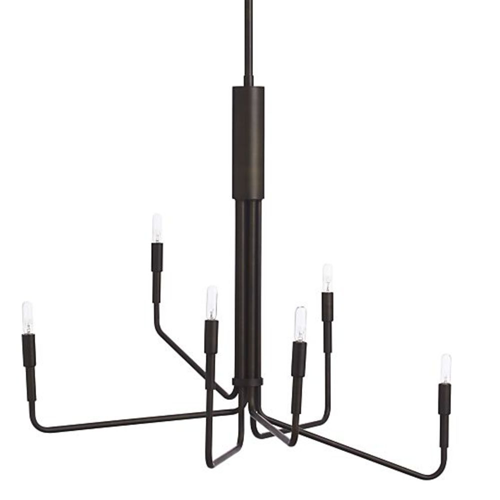
Thanks for all your responses and insights. I've quickly photoshopped some images using some of your suggestions and see what you guys think. Personally i am leaning towards the black bronze chandelier with an existing artwork leaned up against the wall.
I've also photoshopped a buffet table that's 62 inches long and 33.5 inches high (my current table is 72 inches long and 29.5 inches high). i've also attached an image of it.
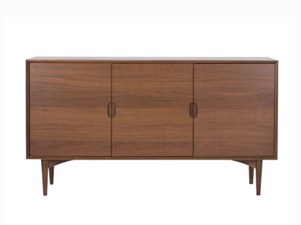
I'm not overly impressed with your images, I guess. The chandelier is okay if that's what you like. My opinion is that the buffet cabinet should be as long as or longer than your table -- especially if it is to be higher than the table top. And a darker finish would be more fitting, too. As it is, the two pieces really seem a mismatch, I'm afraid.
The buffet would want to be longer than it is if a picture should be placed above. And the proportions of wall, picture, and buffet don't seem to lend themselves to having the picture resting on the buffet; the wall location, pleasantly off-center, looks better to me.
Other than that, everything's hunky-dory ! Sorry for the negative reaction . . .
I much prefer the black lamp as the Danish light is way too common now.
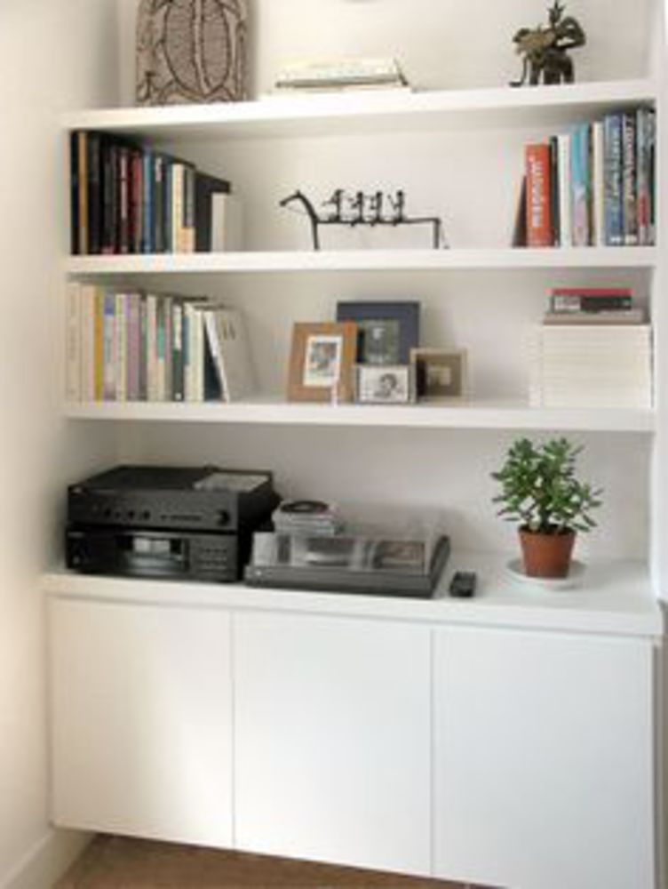
The most practical solution would be a wall to wall floating credenza with shelves covering the whole wall like Heath mentioned.
I would prefer get rid of the teal and continue the black right across.The safe and cost effective way would be all the joinery painted white with black seen through the shelving.Fill the wall with books and those or some objects can add colour and interest.
Simple joinery like the first image with wall to wall floating credenza but with black seen through like the second image.
If you need any help, please contact us at – info@designaddict.com


