No worries SDR.. these are all great suggestions. A book case would definitely look good, but i would still keep the teal wall as background against the bookshelf 🙂 But we are getting into custom stuff and that's not in my budget. I have to work with my budget right now...maybe in the future $$$.
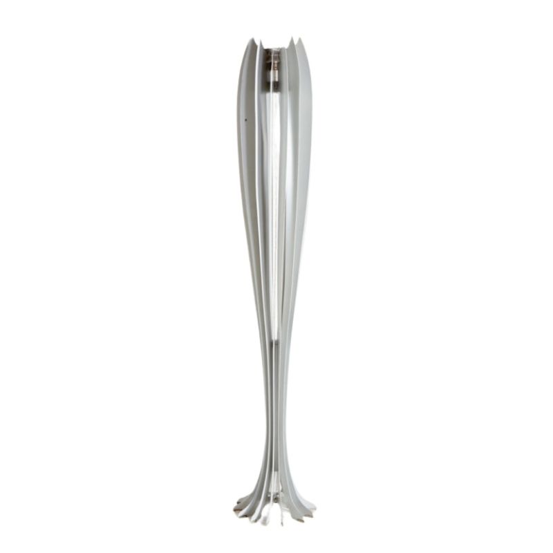
hmmm... this Nelson lamp is starting to look good 🙂

Yes, that looks good. The comment that one should disregard a classic fixture as "way too common" just doesn't hold water, for me. If that were true, your Eames chairs would have to go, too !
The real difference between the Nelson bubble and the other fixtures I mentioned has to do with the nature of the light that is emitted -- admittedly the more difficult and dodgy aspect of lighting design, in terms of making a choice. But the problem is more or less self-evident when we look at the fixtures. The glowing bubble will spread its light evenly all around, up and down -- and into the eyes of the people in the room. The metal fixures are designed to direct light downward to the table, with some light going up to light the ceiling, and a little being emitted outward as well.
(With a dimmer switch on the ceiling fixture circuit, one could control the brightness of the bubble lamp, of course -- or a different lamp ["bulb"] installed).
By thinking about this difference in advance, one can make a selection based on preference and not be unpleasantly surprised when the chosen fixture has been purchased and installed. Lighting isn't only about how the fixture looks in a photo -- just as seating is about more than appearance.
Very well said sir... thanks SDR. I agree with you on the overly done part. There's a reason why it's still around cause it's tried and tested.
Your comment about the light fixture is also on point. Something that i didn't think of.
So glad to have bumped into this website... lots of great design inputs 🙂

There you go. Of course your sunburst clock will have to be moved . . . !
See how nice the wall looks with nothing on it ? I'd say that, if you decide on wall decoration, the dining lighting should be ceiling cans (hidden downlighting) . . .
I do envy those with Photoshop. I've had to make do with collage -- which I enjoy.


If you need any help, please contact us at – info@designaddict.com