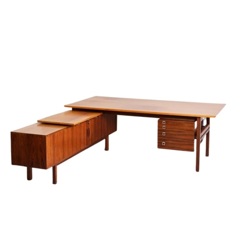
Hello there... Just wondering if there are design rules i should abide to when buying my first buffet/credenza. My dining table is 72 inches long. Should the buffet be shorter or longer than the table. I was planning on placing the buffet on the long side of the table.i noticed most of the buffets are sold in 60 inches long. Is there a rule that the table and buffet should match in lenght? thanks Roger
Some will probably disagree, but from me to you, NO RULES but yours. Your place, your rules, If someone comes in and beg to differ, show them the way out. Follow your instincts and what pleases you not others, but if you must it is probably best to consult with an expert or a professional for a design/space planning advice.
Thanks I am glad to hear that there are no rules. I have done some research and other professionals have commented that as a rule, the buffet size should fit within the space it's placed in. Not too big and not too small.
This will be my first time buying a buffet so i thought i'd ask.
Thanks again...
Roger,I would most agree with your own research from professionals about fitting the space.
I would also agree in theory there are no rules but that is only true if the end result works.
The best word I would descibe things is symmetry which you have to get right.
The size of your pieces in relation to each other and the room they are placed in.
Oversized pieces can work too but again goes back to if the end result works.Normally by oversized I mean more so an artwork,sculpture or light rather than furniture which cramps the space and can ruin the look of the whole room.If needing a bigger table it may just mean a design with a slimmer construct,width or a clear glass top etc.
I would trawl through interior images and save then cull all your favourites down to the best 10 or so.
Once you have that done you can call in a pro who's style you really like to help put it together from there.They may throw it out and start again but if you like their previous work then just let them do their thing.
Thanks for your comments. That's a great idea. I will do a mock up of it. In the meantime, here's a picture of my current set up.
My dining table is 72 inches long. The teal wall (which will be my next project - mirror versus mixed picture frames) is 155 inches long. The future buffet will be along that teal wall.
BTW, from my previous Eames post, i went with the walnut legs on the chair.. still waiting for the red/orange end chairs with walnut legs as well 🙂
Really ? That beautiful teal wall will never be lovelier than it is right now . . . !
Less is more. Maybe just a thick walnut shelf at table height, or one of these:
http://paulgadamsinc.com/2010/03/sarasota-fine-woodwork/black-walnut-and...
Resist the temptation to hang something -- anything -- on that wall. The space will seem bigger without it. The blue wall is like the sky, or a view to the horizon. Hanging something on it slams the door on that unconscious illusion . . .
I know it's hard. Try it for a while. Sometimes nothing is better than something -- and this way you don't have to choose the "something" !
Yes -- I underestimate my new friend's intelligence by suggesting a shortcut to the understanding of my point . . .
A thousand pardons. The facts (optical, and intangible) remain, I believe. The point of modernism, at least from Mies' point of view, was that decoration should be restrained in favor of space and the elements of its containment. This can wreak havoc with the impulses of the inveterate collector of Modernism (capital M) !
If you need any help, please contact us at – info@designaddict.com


