well then......
do you think that I should replace the current beveled mirrors with wall-to-wall non beveled mirrors? Or ? And I'm gonna need some advice on a sofa purchase. I don't want to make any mistakes.
Many thanks and hugs,
Aunt Mark
ps I've alway's liked the Nelson marshmallow sofa...but It might not be a decent choice. I walked into Design within Reach today, and saw a few lovely sofa's. I need to think.
pss many thanks.
.
Given the shape of the room -- twice as deep as it is wide -- seems to me to justify the mirror as placed. I can't see it as a bad move.
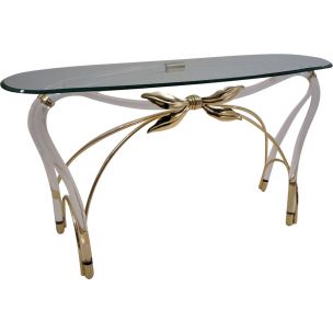
I can't agree that placing (a) sofa against the mirrored wall is a mistake, if that's where it makes the best sense for room arrangement. On the other hand, I don't think the mirror needs to be hidden by furniture -- and it may be that a new sofa, placed to enjoy the view, would work better, with smaller pieces placed against the mirror. Perhaps a console or credenza could go in front of the mirror ?
As far as I can see, the only beveling is to the strips of mirror which cover the seams -- is that right ? Isn't it possible to remove those ? If the resulting gaps are too dire, perhaps smooth gray strips of anodized aluminum, such as are available at the hardware store, can be applied. This would look more like a window mullion and would disappear better, I think. Too bad the mirror wasn't installed without those cover strips . . .
The room that spanky shows has a healthy amount of mirror, but it's not the first thing you see in the photo. This image is a good example of the strategy I mentioned earlier. Mark could reduce the size of his mirror by one panel, leaving some blank wall to the left of it -- maybe in a nice color, or even a fresh accent like vertical wood paneling ? Then the two remaining mirror pieces, with one discreet metal molding down the middle (or newly installed mirror with minimal seam ?) would remain, performing the space-and-light-expanding function, just not to quite the degree as now.
Best of two worlds ?
Looking at the room,
I see too many wall paradigms meeting where the mirrored wall meets the glass wall:
exterior heavily textured wall
mirror panels with mirror "posts"
glass panels with red/brown metal posts
So I have suggestions based on this analysis rein in the wide palette:
A. Remove mirrors and smooth texture the interior and balcony walls to match each other, paint in a light color.
B. Replace the mirror "posts" with metal faux posts to match the glass wall posts.
Also, since at least one treadmill is non-negotiable, I lean towards mirror removal, so as not to have two treadmills.
Until the walls are brought into harmony any furniture placed in the room is going to struggle. The root of the problem is actually the balcony wall, and the discord it creates with the interior wall and glass wall. I suspect that is why this interior wall has been removed in many other units.
The photo re-attached below best illustrates the problem as I see it.
Btw, where's the chrome
in this mid century setup? You know, you really could use some. All that new stainless really doesn't jive, and the pendants don't help. It looks like the inside of a chain restaurant. More chrome, less stainless. These would go nicely in their place:
Or maybe this fixture:
Or this:
That would be a good start. Hey. He said he could take the abuse.
Ummm . . .
or, not. Mark has some very nice pieces; the triple pendant over the dining table is sweet, I think.
New carpeting, or rugs ?
If the sofa is comfy and well made, perhaps all it needs is re-covering, with restructured back cushions ? It has an unusual leg.
(Aunt Mark may have an unusual leg, too -- but that's not our affair.)
Not saying it's terrible
Just kinda what I see. A lot of nicely colored wood with not enough shine on it. I'm just not big on crossing old with new like that I think. There's too much great vintage art to fill a whole house with.
New stainless and frosted glass fixtures are everywhere you turn. Imo, no pizazz, no personality. I have a minka aire cirque fan in my living room, but its really only because I couldn't find a nice vintage one.
Cool fan !
The change of ceiling plane at the dining room is a nice space-defining feature. It would help shorten the room if the mirrors dissapear -- I suppose. Perhaps something more could be done with that ? Maybe the floor covering moves from the dining room past that ceiling step, to the next "line" in the space, and then changes markedly for the living room ?
Thanks...
It has kinda grown on me. It does make people take a second look, and that's cool. They must think it's a funky ceiling sculpture or something, because the first thing someone says any time they see it is: "is that a ceiling fan?" Ya. Then it's: "Does it work?" Ya. Kinda funny...
Oh, and mark. Please take my opinions like all others, with a pinch of salt. I was gonna say the shirt tucked into the Hawaiian board shorts needed to go, but I chose the fixture instead...:)
If you need any help, please contact us at – info@designaddict.com


