Design in the 1970s
Do you love indoor plants, wood panelling and confortable sofas in interiors right now? You’re maybe in the midst of a Seventies revival!

It is easy to dismiss the 1970s as “the decade that taste forgot”.
after years of pared-back discipline with a focus on function in the mid-century design movement, the 1970s was a decade of excess and over-the-top interiors!
The 70s was a decade in contradiction: austerity and decadence, drab earth tones and campy colors, nature-loving hippiedom and high-tech futurism. The decade was a significant turnover for interior domestic design, marking the transition from the Modernist 60s to an era in which represented a reaction against sleek mid-century modernism in favor of Self-expression and individuality. Of course, self-expression can manifest itself in some downright hideous ways, whether in the gloomy wood-paneled living-room or the bedroom saturated in colors. Not to mention the macramé, the creepy spider plants, the shag toilet seat covers…
What are some of the more interesting, even inspiring, features of 1970s design?
Back to Nature
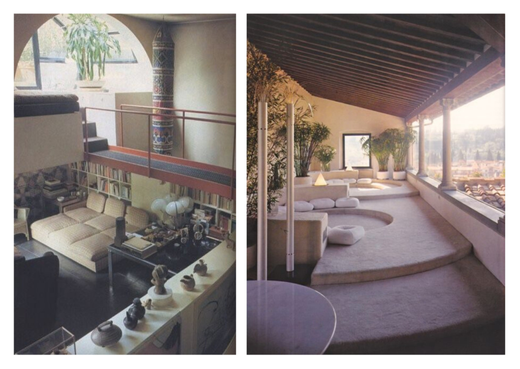
70s style was greatly influenced by the back-to-nature movement, which arose from both a hippie rejection of consumerism and materialism and a renewed environmentalism following the 1973 oil crisis. Many 70s architects were early adopters of new energy-efficient technologies and designed houses as organisms that mesh with their surroundings—living, breathing, and changing together. Big windows and skylights were popular, as were indoor gardens and elevated or stacked stone fireplaces. While high-tech plastics were obviously big in the 70s, so too was teak and pine furniture.
Open-Plan Living

While many rooms in the 70s resembled wall-to-wall carpeted, wood-paneled dungeons, residential architecture of the time was actually very innovative when it comes to light and space. In many ways, the 70s introduced the concept of “open plan living”, with double-height spaces, open planned living and grand entrances. Many homes had massive windows, spiral or “floating” staircases, interior second-floor balconies and vaulted ceilings. Often the living room was spread out over multiple levels, sometimes with a sunken seating area. Homes were also being designed to accommodate and integrate children into every day life. Studies and home offices started being built. Kitchens expanded to accommodate more cabinets and countertop space, many kitchens had islands or breakfast nooks, bringing the family into a room once reserved solely for women or staff.
Lot’s of colors
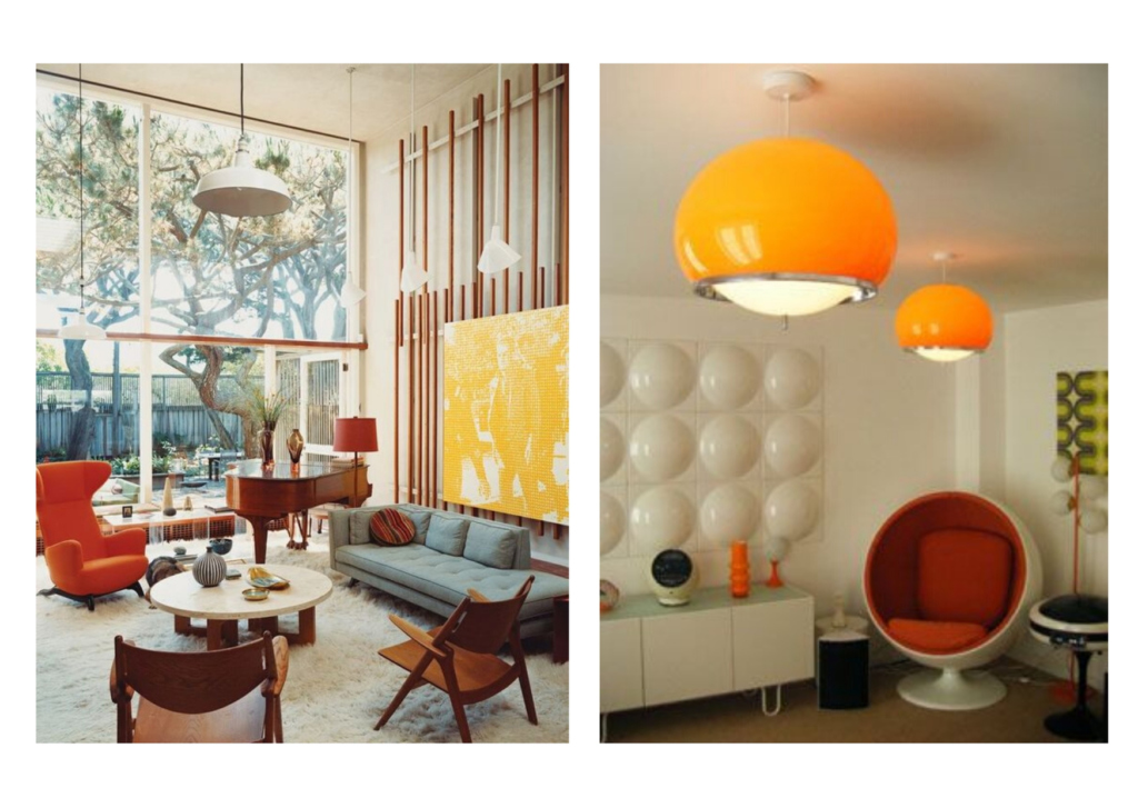
Love it or hate it, the 1970s was a colorful time in interior design. There was A LOT of pattern and colour all at once. It was layered, colourful and free! And probably a little over the top. For every drab earth-toned room there was an equally colorful one. The architects reveled in form, function, and funkiness.

Wallpaper
The 1970s was a decade where wallpaper was used with great enthusiasm. Every room was covered in a patterned wallpaper, and every room had a different pattern, which was sometimes combined with contrasting patterned curtain fabric and patterned carpet. It’s thanks to the 70s that we are very frightened of wallpaper.
Lounge Low and chair mania

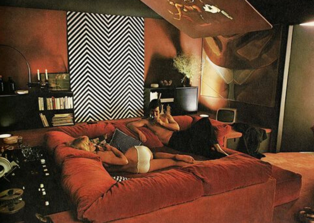
They really knew how to relax in the 1970s, and the low, chunky sculptural furniture facilitated some serious lounging. Furniture of the era is soft, marshmallowy, curved and all about comfort.
The 70s was a time of major advances in the design of chairs and modular office furniture. Designers began experimenting with ergonomic designs for the workplace and home office.


