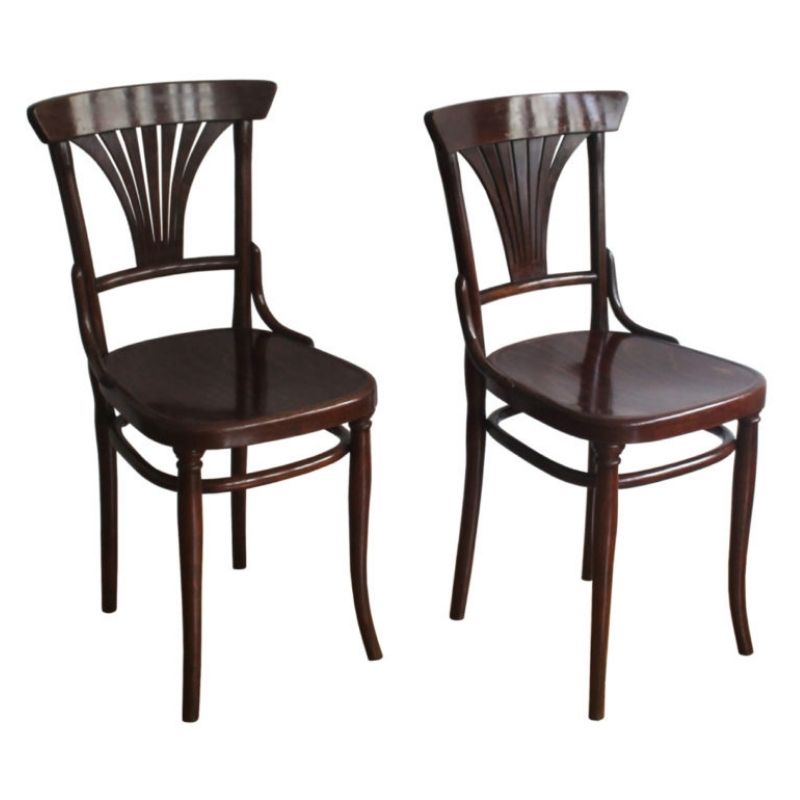
An informative paragraph that I read today. Yes.
Aunt Mark
________________________________________________
In conclusion the question presented here was why did the Danish industry move away from wenge finishes in favor of lighter finishes such as walnut more than ten years ago. The initial reasoning suggested that perhaps competition from Chinese companies making imitation Danish designs in wenge contributed to the change. Alternatively it was also argued that trends in consumerism with regards to wood finishes prompted the slow and steady move to walnut and away from wenge. Whichever reason is right, perhaps simply reinventing what it means to be Danish in design could be the best explanation unto itself.
_________________________________________________
from this article.
http://www.qconline.com/brandboost/danish-furniture-hot-on-walnut-finish...
Huh. Who knew. I wasn't aware that the industrious Danes had taken to the wenge look. Had they been staining teak to look like wenge -- or what ? I have to get out -- to Scandinavian furniture stores -- more often, clearly.
I'd like to reinvent what it means to be me. Should I move away from wenge suntan oil to more of a walnut look ? After losing my bike and the jacket with it, I had no decent outwear left. I got a Tommy Hilfiger simple black zippered number called Allsea at the Burlington Coat Factory today, for $50. I look like hell in it, but it'll do. The black backpack also went; it had my tape measure and a can of spray glue. No biggie. I went to three flea markets Sunday looking for the bike. It's like the one in the picture:
http://ridethisbike.com/2007/12/sandy-st-augustine-florida-by-downtube.html
A Phillip Welch, some land, nice price.
but not for me,
Aunt Mark
http://www.realtor.com/realestateandhomes-detail/24349-N-650-Ave_Kewanee...
Frank acknowledged Goff without disfavor, I believe -- a positively glowing accolade, for him. Wright wasn't fond of the competition, by and large . . .
A 1951 Life Magazine article stated that Goff was "one of the few US architects whom Frank Lloyd Wright considers creative...scorns houses that are ‘boxes with little holes."
https://en.wikipedia.org/wiki/Bruce_Goff
Goff, and one of the oddest photos of Wright that I've seen:
Frank was a giant, but he liked gingerbread a LIT-TLE too much...
But I admire almost ANYTHING that attempts to go beyond the box, and Frank was a true artist.
I do find the box to be a compelling "given". For me, the best stuff has to do with "going with" the inevidablity and primitive logic of the box, rather than circumventing it.
Frank's stuff always looks (to me) like that house that Mark just posted. While that house has an admirable and strong point of view that has to be respected, I'm just sayin'...
Good morning.
(And SDR please forgive me for this post. Just my two cents… )
PS I think Frank's hat looks like a hairpiece.
Yes -- well, he's apparently trying to keep up with giant Goff, there. I have dozens of photos of the man, and no two are alike; they could almost be of different persons. I like the one below; I could swear he's pissing behind a bush.
FLLW said a lot of things that, in retrospect, don't seem to make sense. He made better boxes, is what I think. And yes, he liked to decorate -- claiming that the filigree wasn't "mere decoration" but was instead somehow integral to the design. Like it or not, he did "get there first" with a number of modernisms we now take for granted, however.
If you need any help, please contact us at – info@designaddict.com


