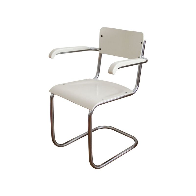
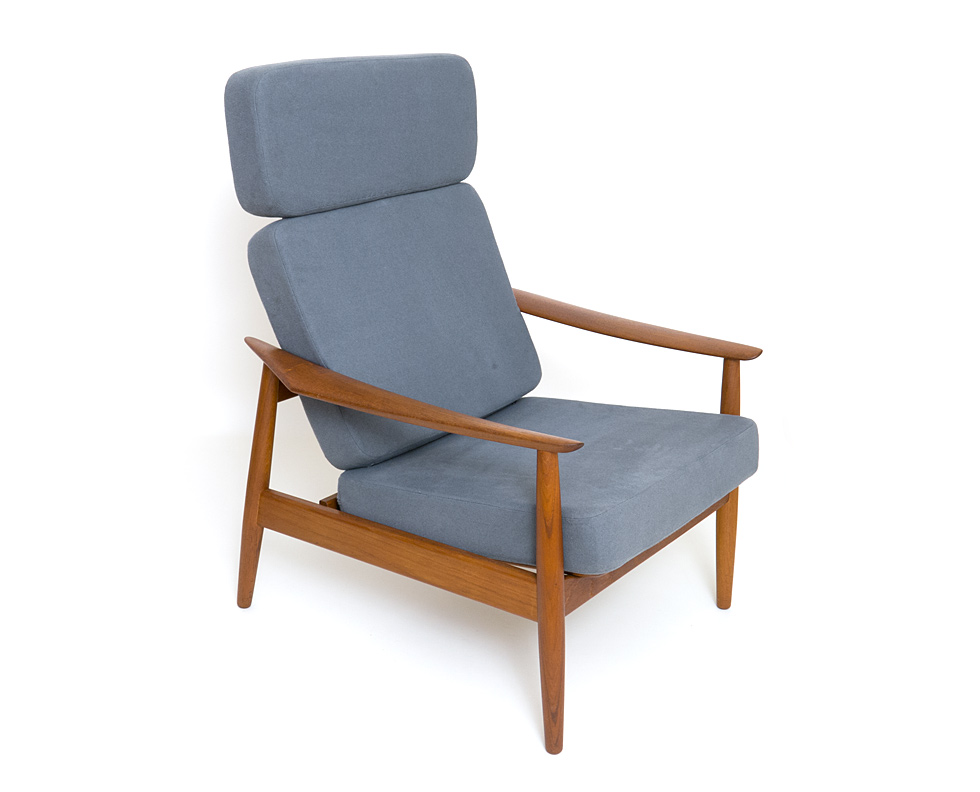
I like this chair, but...
there just seems to be something not quite right about it. I've tried and tried to figure out what it is and cannot express it, much less solve it.
I vaguely recall Koen commenting on it once several months back. Perhaps he will way in again and either: a) be able to explain what is not quite right, or b) tell me I need new glasses. 🙂
Wilde Coyote
Could it be the contrast of angular and curved forms? The two clashing...Reminds me of Pantons "S" (or Ghost) chair, even the more likely influencer, Steen Ostgaard cantilevered chair for Cado. Both of these examples present themselves more fluid and harmonious.
Viewed at fornt /rear angle or even profile, the legs seem precariously thin for their purpose. Seems very bendable and unstable.
Lets put that aside...It's a nice chair! Visually entertaining! I find myself following it, looking for some visual conclusion... Has an avian quality to it...
For me, I would fatten up the legs and remove the cross support connecting them. That though, would remove the continutity of the form...
Really? I don't read all the...
Really? I don't read all the threads so perhaps Koen's comment has slipped by me. I searched in the forum but found nothing. Although I found a thread where Koen express admiration for Kaj Franck and I must agree - I LOVE the colour palette he used for his pressed glassware produced by Nuutajärvi Nötsjo. I found 6 of his small tumblers last week at a local fleamarket and I use his subtle coloured Kartio glasses every day.
If you do choose to comment the chair, Koen, please don't pick it apart 😉 I'm considering it for my dining table and I really take you detailed point of view seriously.
I mainly like Myto because it's so acward. It comes in several bright colours but I don't think they suit the chair at all. Konstantin Grcic has taught me to like and use the triangle, a shape I've otherwise disliked for many years.
Here
Martin, Koen's comment on the Myto is here on the blog (link below).
I usualy admire very much Konstantin's work, i really think he is one of the most interesting designer of his generation, if not the very best. But the Myto chair leaves me perplex. I can't tell exactly what, but something doesn't seems right in this chair.
http://www.designaddict.com/design_addict/blog/index.cfm/2007/10/26/Unve...
I like his work
But this chair, like some design, takes on a human personality.
It looks like a human, kneeling, leaning back. Not a quality i like
in a chair or architecture. (and in an uncomfortable posture)
I learned my lesson by placing windows on the east side of our
workshop. It makes a pumpkin evil face. Overlooked design flaw.
Eyes and teeth on the side of a building! Lesson learned...
An insect, an egg, a comfortable relaxing body shape is comforting.
Something about that chair reminds me of a struggle? a yoga position?
I can't put my finger on it, but it feels like a balance issue. Visually.
If you need any help, please contact us at – info@designaddict.com


