This is the sort of furniture I can't stand...
...but maybe you'll like it (and if you do, there's lots more at the link below). Walnut corner desk by Kip Stuart for Drexel:
http://www.google.com/images?q=(vintage+OR+retro+OR+mcm+OR+%22mid+century%22)+%22corner+desk%22+-pine
You're not kidding.
I've sat here trying to imagine what a "good" corner desk would look like.
First of all the desktop necessarily has to be an odd shape-- a skewed pentagon (like a cut-gemstone seen from a side view). This weird shaped top cries out for either five legs or a heavy cabinet base (like the ones Lit Up recently posted). Horrible. HORRIBLE.
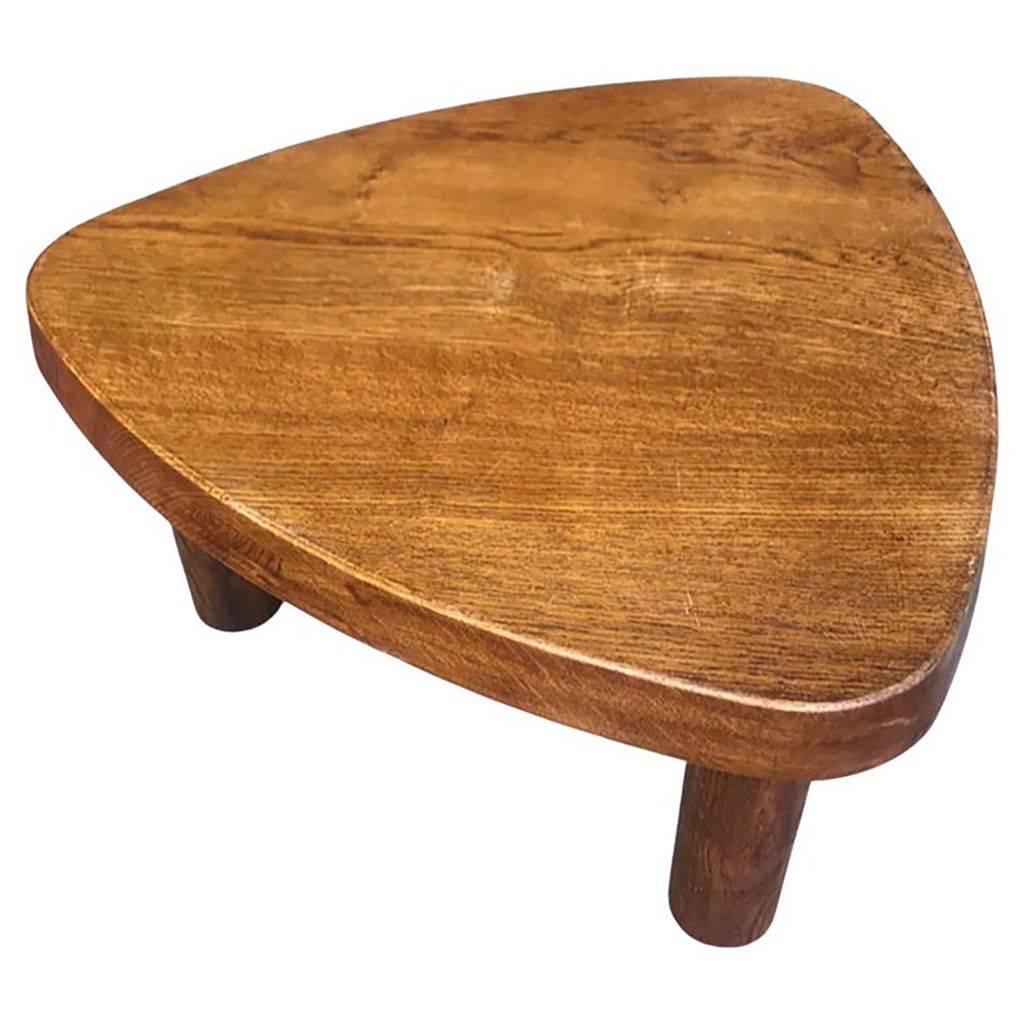
A triangular Parsons table? The shape's better, at least. But, any other furniture within a four foot radius would look awkward, abutting the triangle.
The answer
Lit Up,
It is one thing to ask a question, it is another to expect the answer to match your expectations. william-holden-caulfield had what I believe to be the correct answer.
Rather than be a smart guy and discuss house keeping (that is my friend the Ark's territory) I would suggest that you hire an interior designer that you trust and respect and have them give you guidance. I took this approach and my person (Harvard educated) came up with william-holden-caulfield's reply. My Albini desk for Knoll sits on an angle in the corner of the room with a black laminate pedastal holding a Sowden Metropole clock filling the dead space.
Contempt prior to investigation is non-positive action.
I don't understand you, Lit Up.
Placing the monitor on a wall-mount swivel seems the ideal solution, since it would give you visibility from all angles-- the whole reason you think you NEED a corner desk.
You deem the swivel arms as "horrible" looking, even though they're barely visible when in use. Even if entirely visible, a small hinged metal device that performs its intended task efficiently can't be considered ugly or a bad design by anyone who has their head on straight; it's the heavy, veneered dog-house/ compost bin of a corner desk that's the bad design. Can't you see that?
http://www.questia.com/PM.qst?a=o&d=4092357
As I stated earlier in this...
As I stated earlier in this thread, placing the Lovig desk in the corner would be completely against the intentions of the original design.
The desk displays best when placed facing towards the room. IMO, it would be a complete waste to place in the corner.
If you need any help, please contact us at – info@designaddict.com


