Now, I really don't want to...
Now, I really don't want to be rude, so please don't take this as rudeness, but you have to improve the english on your site. If you can not do it yourself, there are translators out there that can do it.
I liked some of the product images on the site, but the bad english did put me off, and it will put investors off if they have english as their primary language.
I DIDN'T SEE ANYTHING WRONG
With the English on your website. I didn't read everything but what I read, I understood perfectly. Not sure what he was talking about but if manufacturers are interested in something, I do not think slightly bad grammar is going to turn people off, it's the products they are after and they are not there to read a novel. But again, your English seems fine to me.
great looking website. i...
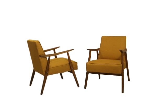
great looking website. i like the bright green/orange colour scheme. i like that graphic design piece that's orange with the chairs but really wish i could click on it to view a larger image!
also, might i recommend not using all caps for your main text. it's very hard to read especially in those long lines. writing in all capital letters makes it difficult to distinguish words and letters since the shapes are all relatively uniform. in online chats and such it looks like screaming, though on your site it doesn't, which is good. but for the benefit of your viewers, and to your own benefit, see what it looks like with "ALONG OUR EVERYDAY LIFE WE SEE EACH OTHER SURROUNDED AND BOMBED BY GRAPHIC MESSAGES" etc. in lowercase (with capitalization when appropriate). 🙂 also, i'm finding my browser (safari) is coming up with scrollbars on the graphic design page, when it really shouldn't. secondly, heh, i just clicked on Deutsch without realising it and when i went back to english, it took me on the main page. it may be good to distinguish or separate those in your menu 🙂
dankeschoen, und viel gluck
[I find
only the text on the "neo production" page to be sub-par, for some reason:
"NEO DESIGN TAKES PART OF HIS EXPERIENCE AND RESPECT FOR DESIGN WITH THE PERIODIC PRODUCTION OF IMPORTANT EVERYDAY LIFE PIECES.
OUR CONCEPT REFLECTS CONSTANTLY OUR PRODUCTION, FORMAL SIMPLICITY IN ORDER TO POTENCIALISE THE OPTIMIZED USE OF EACH EQUIPMENT AND A SELECT AESTHETICS IN ORDER TO MAKE POSSIBLE THE CREATION OF A NEUTRAL AND ELEGANT ATMOSPHERES.
BE PERIODICALLY ATTENTIVE TO OUR INNOVATIONS EXPOSED IN OWER STUDIO FACILITIES OR OVER OWER WEBSITE AND NEWSLETTER."
It's also the only one that's "over-written," perhaps ?]
somebody else interested to...
somebody else interested to help me with importnat critics?
Thanks
http://www.neo-studios.de
If you need any help, please contact us at – info@designaddict.com


