Alex Singer bicycles are highly desirable custom lightweight bicycles made in Paris. A 1949 Singer bicycle catalogue is being offered on EBAY and I found the art work on it quite striking. Might someone here take a peek at it and tell me what style or period of commercial art work it represents and if it looks like the work of any artist anyone recognizes.
Although...
the bike image suggests a retro-look (seen from a 1949 perspective) There is not much in the graphics that could be qualified as Art Deco. Red on a white background is clearly a "Bauhaus" signature, the vertical lettering is rather constructivist, but was very common at the bauhaus to (including the wording on the building. Constructivism was of course a major influence on the Bauhaus" The play with the cross-bar of the "A" is about the only element that through it's playfulness has a Art-deco influence.
Lissitzky influenced bauhaus
A great artist like Lissistzky had tremendously innovate the calligraphy and setted it up as an art during contstructivism in the 1919 . This artist is one of the major designer who has inspired many bauhaus artists and later contributed to advertising page making thoroughly used by major american and european advertisers from the 1950 till 1990 .
ART DECO
To suggest that the typography is not Deco shows a less than in depth knowledge of period typography. In addition to geometric simplicity, alternation of line weight, especially an exaggerated alternation, was the staple of Art Deco typography (The "E", the "S", the "G"). Bauhaus typography used geometric simplicity, but like the Bauhaus typeface that carries its name, rarely incorporated variation of line weight. While Constructivist was most typified by rectilinear forms. Both Bauhaus and Constructivist typography tended to follow hard-and-fast rules for their letter-forms. Whimsical plays, like the "N" and the "R" would have been rule breakers, unless a similar rule applied to the rest of the font's alphabet. These things make the "SiNGER" font indisputably Deco.
Constructivism- 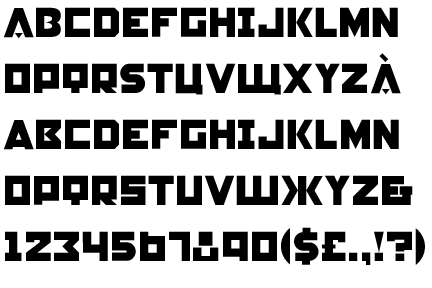
Bauhaus- 
Deco- 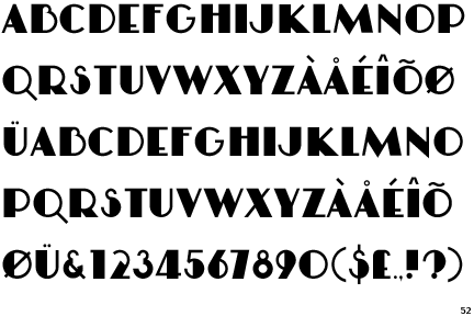
Bauhaus was a German/Austrian movement. Contructivist was Russian/Soviet/Eastern Block.
This bike catalog is French.
Even the red should give no signal to a Bauhaus color palette. The cover is in red, with blue line art. The Bauhaus "brand" palette was red and black. This catalog is French. The colors used on the cover are red and blue on white- no great surprise that a French bike company is using the colors of the French flag in its communication material.
While other contemporary and recent-past design movements may have influenced the designer (they almost always do), the designer, working in France, on a French catalog would have unequivocally considered himself/herself to be working in the Deco style.
I'm open to any rebuttal from the "people who know what they are talking about".
I do not know who these people are...
...but to use examples of commercial fonts that happen to be called "Deco" "Bauhaus" etc is hardly a convincing argument. To suggest that the Bauhaus colors were red and black is not either. There are hundreds of printed documents from the Bauhaus that would show exceptions on that rule. Nobody has said that this was a "pure" example of anything, but a combination of several. To limit certain styles to certain countries, in this case Constructivism to Russia and some east bloc states is a blatent under estimation of the influence it had on modernism. On top of that the axis Moscou-Paris was very strong with Sergei Diagilev as one of the main links...you might want to look up some of the posters for his Ballet productions in Paris...
ART DECO
You're the one who stated it was Bauhaus because of the red color palette:
"Red on a white background is clearly a "Bauhaus" signature..."
So if you're now refuting that position, you're just arguing against yourself, not with me. My point is, just because it's red doesn't mean it's Bauhaus. I'm inclined to think that the red together with the blue line art on white was inspired more by the fact that it is a French company, than by any knee-jerk assumption that if it is red, it must therefore be Bauhaus.
All of this is beside the point. The issue here is really one of type design.
You seem pretty adamant that the font is not Deco (except for maybe the "A" in "Alex"). I'm simply saying that is an uninformed opinion about period typography.
Bauhaus typography-
The so-called "commercial font" that you seem to imply merely holds the name of the Bauhaus is not some new contemporary concoction, but is based upon Herbert Bayer's Bauhaus campus signage. Bayer's Universal Typeface also has no variation of line weight at all, nor do any of his other type designs. All are single-weight strokes.
Constructivist typography-
Only rarely do the Constructivists show variation of line weight. So you feel that contemporary fonts that use their name are not to be trusted as "proper" examples? OK, fine:

http://www.motka.com/09.06.04a/DSC08589.JPG

http://transcriptions.english.ucsb.edu/archive/courses/liu/english25/mat...
The only similarity that is there, in fact at all, is the use of red. Since we seem to agree that we should not base our assessment on the red in the color palette, then that similarity can be discounted.
Just to be sure I'm not just trying to prove a negative... this catalog is positively Deco. Would you dispute that this signage is Deco?-

But maybe if it were red it would be Bauhaus or Contructivist.
And if the Singer cover typography isn't Deco enough, the "GRAND TOURISME" on the inner page is Art Deco typography 101.
I respect your opinion on many subjects, but you're speaking out of your element here, and to suggest that the typography on the Singer catalog cover is a Bauhaus face or Constructivist inspired and furthermore, that it is NOT Deco demonstrates an uninformed opinion on period typography.
dcwilson has called me out as not knowing what I'm talking about because the "people who know what they are talking about", namely you, have shown me up. No slight meant to you, but when another participant chooses to call my credibility into question based on your statements, I'm going to defend them.
Hi Chris,
First of all, I have no doubts about your qualifications and I wonder why you would have doubts about mine. We are both comparing notes, which could be interesting for other participants. Yes I mentioned that red on white was a very common Bauhaus combination and in this particular cover the red is quite dominant. That the blue line art would refer to the french flag is not unlikely but it seems quite a coincidence that one of the Bauhaus theater posters from 1929 shows exactly the orange/red on white with secondary text in this particular washed out blue. It was not my intention to reduce the colours to red on white, but because of the similarity between the cover and this particular poster, that association came to mind before the much stronger red/white/blue combination of the french flag. I guess everybody's memory makes different associations and mine did not see the french flag first, but a Bauhaus theater poster...
Your argument of type-design is an understandable one. Herbert Bayer designed a proposal for a universal type in 1926. One could assume that an effort like that would be supported by a frequent use in Bauhaus documents after it's publication...As you know it did not happen. publications as late as 1929 still do not show a trace of the Bayer proposed type, and even Gropius did not use it for the cover of his Bauhaus Bauten Dessau book of 1930. So why would that particular type be more "Bauhaus" than a Bauhaus party invitation of 1920 where they are clearly using letters with wide vertical bars combined with very thin horizontal ones?..Does that realy shows that I am "uninformed?
I called it a commercial font because that is realy what it is. There are major differences between the two. Bayer's proposal did not include capitals (other than the K and the T who had the shape of a capital, but the size of a small letter. I am not going to compare every letter shape, but there are substantial differences in every single letter with exception of the "l" (a vertical bar) and the "v". I would suggest that someone skilled in the art of typography would never confuse the two. That's why I felt that calling this type "Bauhaus" was as justifeid as calling "univers" a "Bauhaus" type.
You are asking my opinion on the style of the signage, and asking if it " is Deco?"...well I lean toward agreeing with you, but it is a little bit beside the point because what you are showing is a mature letter, with the combination of thin and thicker bars used consistently throughout the word. I suggest that the bicycle brochure is more experimental than that. The letters ar in-consistent and to some extend they seem to come from different fonts. I think that that kind of "experimental use of fonts is closer to the "Bauhaus" spirit that the more mature "Art Deco" fonts.
If all of this is
"speaking out of your element here and demonstrates an uninformed opinion on period typography"...so be it.

I would raise
the issue of these letters as being entirely drawn for this piece, whether or not any or all were based on existing fonts. Commercial graphics of all kinds -- advertising, posters, book jackets, etc -- were routinely produced "from scratch" until thirty or forty years ago, I believe.
The G is particularly fanciful. . .
Koen, my apologies for taking such a tone.
I took the time to answer this question several days ago when nobody else had yet bothered.
I came back to the thread a few days later and found not just that several people had chosen to disagree with my assessment (fair enough, though I disagree), but that the thanks I got was an insult from the individual who originally inquired.
SDR, yes, I would say that this is hand drawn lettering. I would also say that this lettering is in the Deco style.
.
Uncomfortable as it may make us, not everything can be fitted neatly into just one category. The disparity between the different letters in this display may neatly parallel the imperfect fit with any one school of design.
No one likes to have their expertise questioned. The inability to neatly categorize any particular work of art or design can lead to disagreement. Demonstrable fact and pertinent example go a long way toward supporting individual claims.
Chris G...
I've reread my statement several times that you interpreted as an insult and, frankly, your interpretation may say something about you, but it really says nothing accurate about my statement. Here's the first line:
"Thanks All..."
That expressly included you.
Here's the second line:
"What I love about this site is that people who know what they are talking about are actually able to explain why."
I was praising the professionals who took the time to expound on the subject. I am a layman. I was being grateful for those explanatory responses.
You interpreted my praise for others as an insult of you. In a monopolar world where everthing was about you, I could perhaps see how you would draw such a conclusion. But in a world where no one person is at the center of it, which is the one where I live, I do not follow your logic.
Let me see if I can clear this point up.
Here is how it would it would have read had I intended to insult you:
"Chris G is an indolent wankar for suggesting art deco. And I know he is an indolent wankar, because he was only able to write two words--art deco--and he could not explain himself."
But, of course, I did not write that. And I did not think that. And I did not mean that.
I wrote: "Thanks all..."--a rather amiable statement, and
"What I love about this site is that people who know what they are talking about are actually able to explain why." This is another cheery statement.
And for that I get accused of hurling an insult.
And for taking his time to thoughtfully respond at some length to my question, and to yours, Koen gets an unneccessary ration of you defending your professional credibility.
Frankly, I'm sorry I ever asked the goddamned question and double sorry I thanked everyone for their responses.
Now stop, will you?
Whatever
I wrote a one name answer. When I came back 3 people had disagreed with me, and explained why. My post, being the first, was the only one which did not explain why.
You replied-
dcwilson wrote:
> What I love about this site is that people who
> know what they are talking about are actually
> able to explain why
It's not a leap...
...but I shouldn't have taken it personally. I went overboard. It was a particularly bad day (I've had too many lately). I should have defended my statement without making it personal.
By the way, it's Art Deco. Take it to anyone with expertise French Advertising prints and they will tell you the same.


If you need any help, please contact us at – info@designaddict.com