SCALE IT DOWN!
The most important for your room is scale.
That sofa is big for any room...let alone yours.
I would paint the walls a simple putty color, possibly a soft gray...get yourself a smaller sofa, maybe something like a daybed (armless) and then a really cool chair facing it.
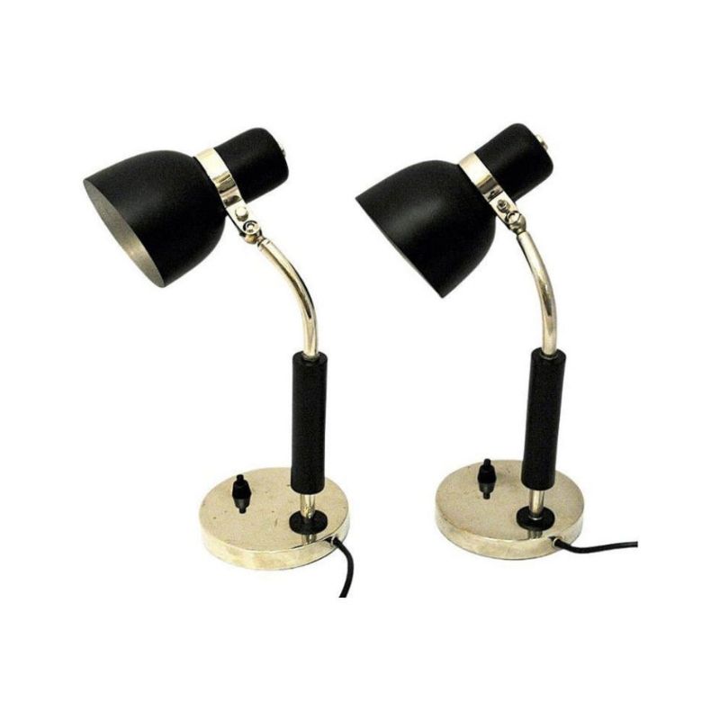
A rectangular coffee table and a side table with a cool lamp.
That sofa needs to go!
Nice one!
A very good choice,NickR60. From the images posted in the thread that is what I would have chosen.
Why?
Firstly, it looks great!
Also, because of the height of the back. Most of the others had very low backs and, whilst they might look good, you do not want to spend long on one.
I made my own sofa way back and half way thru I sat on it and found it needed more height. I added 50mm to the back. I've kept that in mind ever since.
Not that you are asking -...
Not that you are asking - and this type of post always runs the risk of pissing folks off, but consider pulling the clock down and to the right a few inches, and offsetting your art so it's not hung exactly over your great sofa (both get diminished I think by this presentation). And this will draw more attention to your great AJ lamp.
Same with the Bertoia - I would move it to a left angle rather than directly in line with the Nelson bench. And the low Eames table needs to go for something with more height, a Nelson round table (white base/black top) or similar Saarinen in all white. Sorry in advance for this conceit.
Hudsonhonu approves of this message.
Not pissed off at all 🙂 I...
Not pissed off at all 🙂 I appreciate the Eames table, I might swap it round with my Nelson pedestal and see how that looks. I'm also currently installing a walnut CSS unit to the right of the sofa where the current Vodder book case sits. I'll take some new images soon once it's all sorted!
Thanks for the replies guys!...
Thanks for the replies guys! Paulanna - You are correct, it is by Alan Davie. I have to admit, it is one of my favourite works - I have a number by Julius Goldstein, Robert Medley and Alistair Grant etc.
I have literally just moved the Nelson swag leg to where the Eames LTR was and I agree it looks better. Will have a look at the clock/painting situation too although that is going to require some paint to cover up the holes!
Also, please-Lower the art!!
Grear elements in your room,for sure! However,I have a constructive point to bring up. It's a common mistake,but we all have a tendency to hand art too high.It should be about 57-60" max from center of the art to the floor.Right now,your picture seems to be disconnected and floating away.In other words,the same distance from the top of the painting to your ceiling is about how close it should be to the back of your couch!I have done extensive research on this,and it will enhance your room in a way you never envisioned.Try it.
lovely choice
but as a fluffy girl I'd love to see a great textured cushion or two or a throw on there,(personally I'd go for some wonderfully coloured felted ones) I need to add colour and texture when I see something flat - well that and I'm a slob and like lounging around - just working out what I want/can afford for my latest sofa, but it's nothing so impressive, one can really get furniture envy when you hang around here 😉
Ruth
Thanks Ruth, I shall...
Thanks Ruth, I shall probably buy more of the Girard & Eames pillows for the sofa to match the diamond chair.
Latest pics below, just about finished putting up a 1/4 of my CSS system - I really like it, looks better than the Vodder book shelf in my opinion and keeps my American MCM theme going..
Hope you all agree!
If you need any help, please contact us at – info@designaddict.com


