Very nice.
Don't stop now.
It's possible that a form of this with four pieces is already out there; I've seen something with four identical slanted elements ? But try it; it's certainly a logical object. (Logical Object © 2007 Stephen D Ritchings)
(I've wondered about making glass-topped tables for shipment without the glass, letting the purchaser/end user get the glass from a local source. Or does everybody ship pieces of glass everywhere now ? What is considered the size limit of such pieces ? Are they always tempered or laminated pieces ?)
Again, kudos, James !
SDR...
its all toughened glass now for a domestic use i think,no doubt someone will correct that if its wrong.James,are you going to put a small rubber plug on the apex of each support so the glass top wont slide?, it would be better on the eye with a larger in diameter top (to me anyhow).
heavy
i think i prefer the small model rather than your production piece.
the base now seems too heavy in that there is not a lot of space between the actual form of the single unit. perhaps the heaviness is alleviated in the model as the elements are grouped closer together. i like the idea of a group of like shapes into a whole. i would suggest perhaps making a smaller or more sleek version of the elements or grouping the heavier looking elements together much closer. not too close as to deter from seeing the actual elements. as for the size of the glass top, i do not think it would look good with a larger piece either as it would become much too large for the use of the table (side or coffee) i think the design problem is in the elements themselves and need further tweaking in order to be a solid or more cohesive design both aesthetically and functionally.
just my two cents!
price
the only problem i can see with the piece in a sale situation is the relative simplicity of the design. by that i mean the ease of obtaining materials for one to do this themselves. in order to alleviate this you would probably need a little more designing to make it more difficult for copycat home DIYers to copy . i love simplicity but there is a fine line i suppose.
# 2
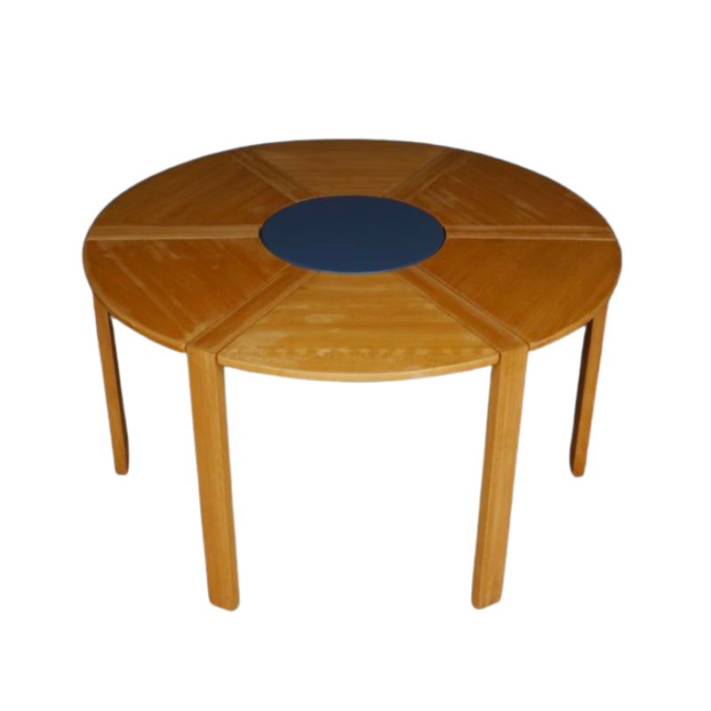
not the euphemism for bodily waste elimination but my second table. I'm sticking with this shape for now. I don't think it looks too heavy and it is very study, I can stand on it and I'm a big guy, 6'4" 195lbs. You can probably boink on it but I can't help but think of some poor cat or small dog walking by the table and looking up to see their masters ass pressed firmly against the glass... I will try the wood grain oriented vertically and # 2 will be cherry and a darker finish. I agree with Viv and will add 2" to the top diameter. I have clear rubber bumpers under each corner.
Since wood
is stronger when oriented as you have it (running generally with the direction of a piece -- horizontaly, in this case) it would be undesirable to consider making one (in solid wood) with vertical grain. ( I wonder if this fact is intuitively grasped by the lay viewer ?) Even though in plywood there is virtually no difference in this regard, my feeling is that the same principle applies -- or should !
Plywood
Since it is hardwood plywood and I'm already playing up the underlying structure by showing the plys visibly through the top I figured using the grain vertically was a Logical Object (© 2007 Stephen D Ritchings). The magnet that removes the long pin (also visible through the glass) is the same 1 1/2 inch radius as the leg ends and can be stored on the glass over the pin or on the side of the leg.
It's a neodymium magnet and is strong enough to hold onto the steel pins even through the glass or half an inch of wood. If I don't like it then it's just another gift for Xmas 2007...
Do it yourself pourable casting stuff?
While the finish dries on #2 I started making a mold to cast a version of the table. Which begs the question:
What is a good material/system for do it yourself in the garage casting? That would result in something strong enough to say sit on.
Just a thought
Great work! (And an interesting discussion.) Design is beautiful as it is, but I can't help wondering if it would gain a little je ne sais quois if each member narrowed toward the center of its length. I mean, if the ends are, say, six inches high -- what about a smooth, curving taper to maybe four inches in the middle, and back out to six? A cool design, in any case.
Very handsome and
complete. I'll be interested in the cast version.
I have a problem with the plywood pieces: I'm afraid that plywood won't be indefinitely reliable when cut and drilled into a semi-tubular section such as you have at the ends of your pieces. Perhaps if the raw pieces were dipped in resin of some sort after milling and machining, in such a way as to impregnate and solidify just the ends of the members. . .? You would then re-bore the holes to assure the correct inside diameter.
But it's just not a wood-friendly connection, with so much material removed from around the cylindrical bores. (Too bad you're not a Constructivist; then perhaps an extension of each member beyond the pinned joint would be acceptable, and the problem would be essentially eliminated.)
Maybe this wants to be a carbon-fiber table -- or sheet metal ? Certainly cast resin is indicated; one die !
SDR
James...
I am the least qualified to comment on your good design, but here is my thought.
Everyone agrees it is a keen design, but astutes like Koen and SDR are basically telling you you're onto something fresh and very good, but its not quite right somehow. I think their antennae are correct but their solutions are not yet on target.
There is a heavyness to the shape of each of the three members that keeps me from enjoying the rather astonishing elegance of the design.
I suggest you look at a Coke logo with that curved line Coke uses and at least consider thinning your three members near the centers in the fashion of that Coke logo line.
Otherwise, this is a very "it" table. Nothing extraneous. Congratulations on giving birth to this new form. I feel privileged to be here for the delivery. Cigars anyone?
If you need any help, please contact us at – info@designaddict.com


