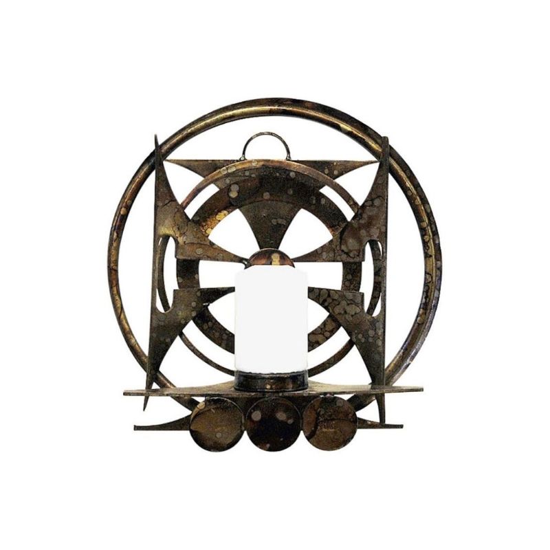
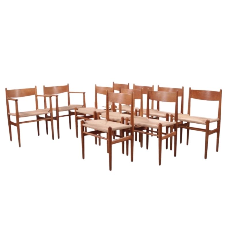
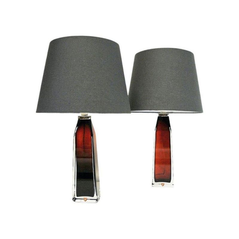
Anyone watching any of the presidential debates? Notice the reoccurrence of MCM designs in the background props. Some very cliche. Off the top of my head, George Nelson Lamps, Saarien Chairs, Nakashima table. Correct or add any items...quite fascinating to see.
Could be a new drinking game. Anyone still sober by election night '08 loses.
Yes, high design items have...
Yes, high design items have been used as props since yada yada. It's the awkwardness of the recent displays that puts me off kilter. I've been accustomed to standing debates behind podiums. Seeing each democratic candidate sitting in a white tulip based red cushioned Saarien styled chair is jarring. My eyes and what they've seen, modern interiors don't suit Presidential candidates too well...they augment their stiffness and out of touchness.
As for connecting the dots, I suppose you're refering to the clichedness (even a word?). Same design layout seen in hordes of modern magazines..even some TV shows. To me it discounts legions of deserving designs and designers.
Live part 2
Speaking of cool design as props for a TV program, have you ever seen the PBS show "Life Part 2"? It's an half-hour program hosted by Alan Rosenberg.
The set includes Saarinen tulip armchairs, a Noguchi table and Nelson Bubble Lamps.
Standard classics (probably got them from DWR), but it sure looks nifty.
WoofWoof I hear you!
I'm not far removed from current politics. In fact I am a political junkie who mainlines that sh*t, current political debate and all things political straight into my veins. Presidents, elections, constitutional amendments, a womans right to choose, equal rights, KBR or as they are also known "Kill em Bag em & Replace em", the Iraq debacle, Bombing Iran, run up to war, Mission Accomplished, no bid contracts, the Unitary Executive, massive secrecy coupled with massive incompetence equals massive f*** ups, bring it all on. But alas a forum on Design is no place to get all political, although I do think that everything is ultimately connected.
And yes, those ass clowns have some nerve misappropriating icons of modernism as set dressing elements. It causes a total disconnect in my cerebral cortex also. Now if you want a cool venue for MCM pieces, check out AMC's "Mad Men" But alas I digress, 426 days, give or take until January 20, 2009.
Saarinen table in the Ladies' room?
I just saw a (stupid) prescription drug commercial for "Detrol LA".
A women has a "chat" with the blue female bathroom sign character, and they're sitting on bench that might be a Florence Knoll, but on the left is a Saarinen table!
Imagine a Ladies' can with such an expensive budget!!
Life, Part 2....
Is it libreral or comservative?
Well, it's one the liberal side, but not overly so. Alan Rosenberg is currently the head of the Screen Actors Guild.
It's a show about aging for the over-50 crowd...myself included.
But it's the set design that's really neat, despite where you are politically.
Big TV Man
Politics on fire...you're rolling! Gotta respect someone with a passion for politics, regardless of what it may be (well a few unassociated fields not worth mentioning).
With whats been used, and potential evolution of props, can't wait until they get to the psychedelia of Panton, Vasarelyetc. That would be serious weridness...but tres cool. I'll pass on the kool-aid.
Here's a Thought
When a Presidential candidate travels up to New Canaan and stands in front of Mr. Johnson's masterpiece and announces his intention to run for Pres with a speech like "Let my campaign be as transparent as this icon of modern design, with a bright and clear vision for the future..." Then I would'nt mind all the misappropriation of MCM icons. I don't think we'll ever see such a thing though, as politics usually plays to the lowest common denominator and cutting edge architecture and design rarely seems to be embraced by the lowest common denominator, we also seem to be too polarized to really get behind a "bright shining city on the hill" as a vision for our future, at least as things seem to stand currently.
The site is however now open on a limited basis for tours, I wholeheartedly recommend it.
If you need any help, please contact us at – info@designaddict.com


