.
The only reason I posted that photo was because the subject was pink, you are quite right White or any other colour would have done the same job. The picture is just one corner of the room and other pictures will show you its not just the coffee table in the room for colour.
It is just a stylists shot and the table could have been sitting in another room or in a corner....who knows.
I like the all grey but I have to say I have a weakness for atomic pink, fuscia or bubblegum pink whatever you want to call it, everytime time I see a black door I want to paint it....
Great taste Olive.
Ridicule is nothing to be scared of - perfect for this forum!
http://www.youtube.com/watch?v=Yt9Gewdq138
Actually, again
If I'm going to do pink, that's the kind of pink I go for. Big, bold, loud in-your-face atomic pink. Anything less is too girlie and cute for me.
That room had orange and yellow represented as well and I like them there. The pink is just so PINK that it becomes the strong focal element. However, if one was to tone it down, you might as well replace it with another color altogether, I don't think any other shade would look as wonderful.
Now back to watering my plants with my atomic pink elephant watering can...although this pix shows him looking a bit soft...
.
The pink table is great.
The penguin-lamp, matches perfect
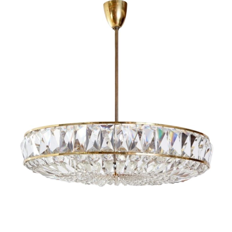
The grandmother-lamp, is there matching everything, and staying there to somebody say ,,It?s the grandmother lamps,,. Every piece is very accurate, as the picture, the colors and the pink-dog.
The penguin lamp is more dangerous than the table, the table is the first shot, provably it will be move out soon. But the penguin... will be there laughing for years. The same spirit, but looks like a gentleman.
I?m even more interesting in the other guy photo. So much class, so other culture... really I?d like to know more, so new and interesting to me..., once Heath put a similar one. Afraid to provoke some nasty comment... but would love a little clue, a link to go on searching.... Truly and respectfully amazing.
Woody: you said ,,color can be nice in moderation,,. Completely agree. 🙂
All the week>>>>> white and black, and later have a colorful weekend.
Or, If I were a truly color as I should be I?d answer: moderation, moderation, OK, no more than one white wall
🙂
Pink stories.
15 years ago I made a restoration of the hall of a condominium association apartment building.
Those things you have to think about doing or not 3-4 times. But Just graduated and excited... Well... dealing with all the owners, and trying to make all happy...
To make this short, I?m going to gap-save all the interesting discussions between the beginning to the moment of the paint. Only imagine that every little detail need to be discussed.
At the moment of choosing the color, an about sixtiesomething lady-owner of 5th floor said that the color to choose should be... pink..., picture this: to convince others that she had really good taste, she exaggerated her elegant style, well dressed, and moving the hands with pink glamour.
Well, nobody was completely sure, but to left her spoke for a moment agreed, At that moment we also said.. OK.
As all could imagine, the pink there looked horrible.
She was very angry, because the result was not good, and not because of her good-taste, of course, nobody could doubt about it. She said that the problem was that the pink she had in mind was the Dior-pink (!!). Ahhhh! that was the problem.
Later, she wanted to try other pinks: pink Doir, pink baby. I don?t know if the problem was that was Fendi or Armani, or Dolce &Gabanna but not exactly Dior. (!!:))
Imagine the discussions with the rest of the condominium association.
At this point were near to paint it all in condominium association-beige.
In the end we did it withe with a small wall in red-Bordeaux. That with the new wood floor was OK.
Pink Story 2
Pink-lips.
Once I said that Brazilian are too colorful and Argentines are black and withe. Well that was some years back, after Argentine crisis, some argies realized that are in South America, and then should began to incorporate color (as me).
Well, today, Due to currency exchanges fluctuations, Brazilians come now to Argentina, to buy everything. Ladies walk carrying at least 3-4 bags in each hand.
I like the following phone, and have it at the store, but Brazilian ladies and girls..., when they see it begin to shout , even louder than unusual, and fight between them to see who buy it first.-Just in case there is no more....
Olive, that pink-elephant is great, not so punk, but cute in a too-positive way.
Other pink I?d go as well as pink-punk, could be
Pink-Panther
and Pink-Flower power (Very very hippie post-post MCM)
In the end will all end loving the pink...
Gustavo
I am not sure if you meant my photo? but if you did try this as a start.
http://www.howtodovintage.com/tag/zoot-suit-riots/
Zoot Suits!
I've always thought they were SO cool...and in pink it is indeed totally outre'!
Gustavo, I think your love of pink is wonderful. It sounds to me as if you have incorporated in your work many times since the Dior Pink lady! A signature color is a big part of so many designers, it's a time honored traditional, methinks. Now a days in my new home here in the high mountain desert, it's orange for me. I miss my ownderful oilive greens, but they just don't look good in the clear bright light out here. But you would probably love the pinks in our sunsets! Amazing colors, from orange to pink to violet.
.
Arthur:
The Zoot Suits Thank you very much for the useful link Arthur, yes I meant your photo. I didn't know. Is Truly Amazing, Great both: the style and the background history.
Olive:
The subtle sensibility that you have with colors is amazing. Many artist and designers provably will envy you. You already commented, then and now, how different you see some colors: you liked them in Massachusetts and how doesn't look the same with the sun in Santa Fe. Fascinating and lovely.
Thanks for your perpspective on my work, some perspective is interesting... you see, I began to posting saying that I don,t like pink, and you discover how much love it,,!! (Shhhh, but please don,t tell anybody hahaha). Indeed I,m trying to find pink-and colors it it own right place. On the other hand I also prefer by far Oranges and Reds.
Same colors in different cultures:
As well as some cultures prefer some design over others we can confirm that happen the same with colors, I can tell , for example, Argentines loves Oranges and Reds. I had some red-brownie globes , not the best for locals, but Chileans were mad about it, and bought them all. A Peruvian architect told me, Argentines are not very fund of blues, but Peruvian are mad for it. Brazilian green and yellow [as there flag :)]and all the others, all at the same time.
If you need any help, please contact us at – info@designaddict.com


