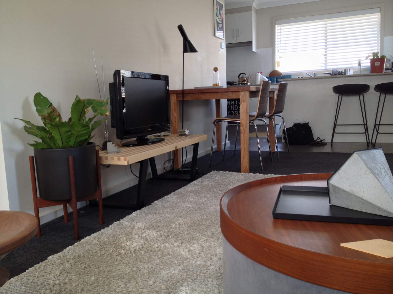
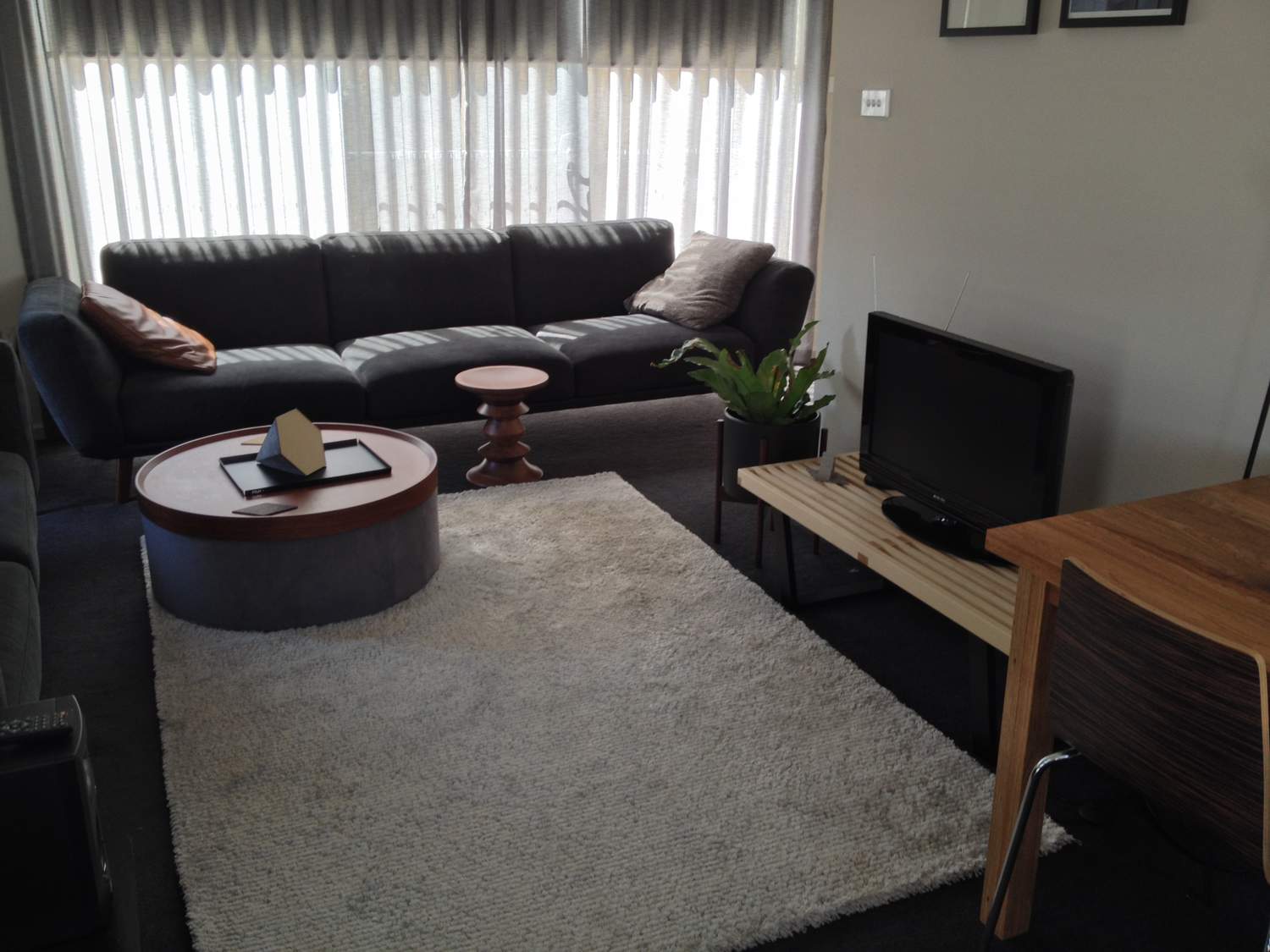
Partner says that it looks a bit cheap and plastic (!) He doesn't quite get it. Does anyone else have this issue. With partners not getting it I mean... I really like it, but must admit it does look a bit light (the colour of the wood). Not quite the ultra masculine item that I thought it would be. Did I choose badly or do I just need to move it around and find where it fits? It's currently in the living room with a television on it...
There's nothing wrong with the bench. The top of the bench is disappearing into the wall, however, because there is little contrast there.
(If this red squiggly line following underneath the text doesn't disappear I might have to kill something)
Ok, deep breath...
Because the top disappears and there's nothing below it, the TV is just floating above the empty space between the legs of the bench, so it doesn't look properly anchored.
I would get rid of those two little pictures up there as they're only providing unnecessary competition with your focal point
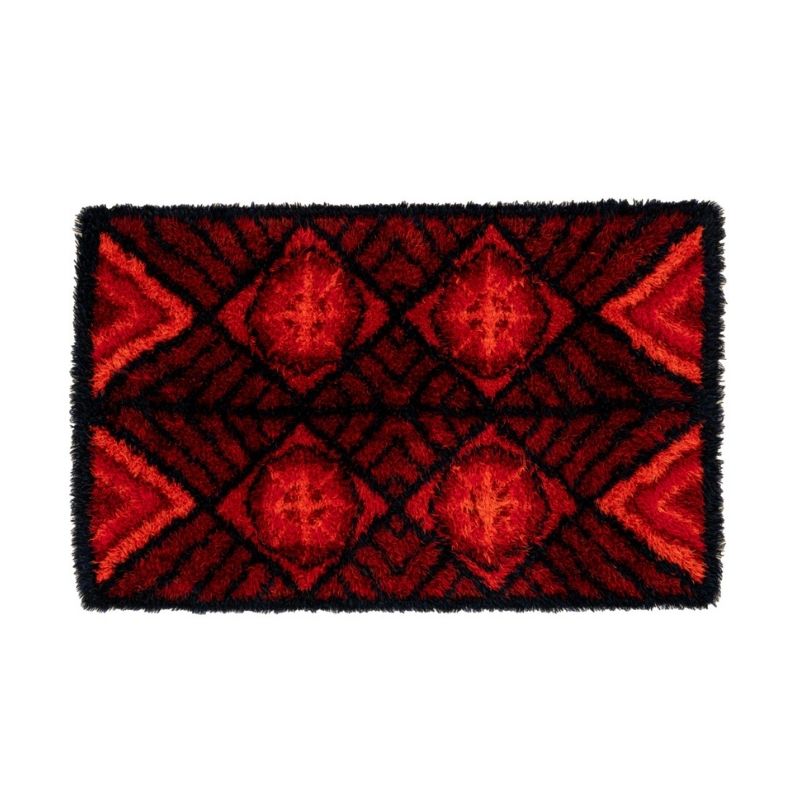
and then one idea is to try to find some sort of a tapestry or something to drape behind the television area that falls pretty much all the way to the floor, this will help to improve interest and define the area- adding color/pattern and tactile deliciousness, and giving the bench something better to stand against.
you could also just spray paint the top traffic cone orange, that would be fun
your place looks pretty reasonably sharp but I notice a distinct lack of books
Hi Objectworship 🙂
Interesting idea about hanging something on the wall right down to the floor. I would never have thought of that. Thanks for the kind words as well, it's our first real home, so needless to say there are heaps more things we want to do. Books are currently all in the study, keen to acquire some cool design books though to have around in the living room. My other dilemma is that I want this room and indeed the house to be quite masculine, but often when I buy something and bring it home it's not quite as masculine as I originally thought haha. Oh well.
Hi Dj.
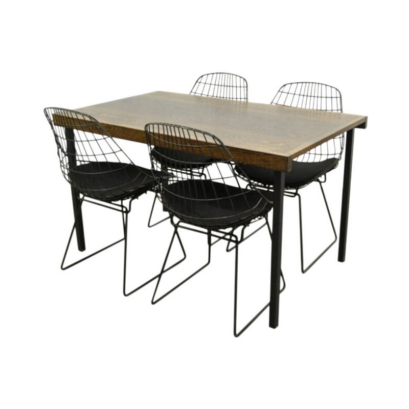
Now, bear in mind that I'm usually wrong. I just don't think that the tall dining table and the sweet Nelson bench are a good marriage. And when you combine that equation with blending in a television...something has to be edited. Have you tried to relocate the dining table over to where the barstools currently are (abutting the pass thru to the kitchen... and editing the barstools)? Or would the Nelson bench work at the end of the bed?..and then mount the TV to the wall (or edit it). Or use the lovely round coffee table as an oversized end table (left side of picture window), then use the Nelson bench as a coffee (beverage) table. You have some lovely pieces! And I agree with Objectworship, a room can never have enough interesting books to read.
Best,
Aunt Mark
ps consider lowering the artwork.
pss. I like your cat.
(edit) ok. probably the best option is to convert the big round coffee table into a side table (left of window), and use the Nelson in front of the sofa. Hang the dang TV. Make it fit. Feel the love. Change the channel.
psss. I like your black/teak planter. Yes.
or....
Put the round coffee table in place of the Nelson Bench (adorned with the TV and something simple)....then put the Eames stool where the big round coffee used to park...and use the Nelson bench in front of the sofa (under the window) as a coffee table. Or maybe I'm wrong.
Best,
Aunt Mark
Those pixies ARE too cute. Militantly fluffy. They are almost weird enough to make me stop short of smashing them to bits. With a hammer. Just to watch them die.
As for the apartment, there is masculine, and then there is sterile. (And no he-man wants to be sterile, right?) But it's not even like there is a fine line between the two or anything like that…
I sense some fear of making a mistake might be holding you back.
A little color is not against the law. "Warmth" is not only for women. It's human.
My advice would be to not operate from a position of fear in making your design choices. Just go wild. I know where you could get some pixies.
It's better to risk being "bad" than to be paralyzed.
Very warm indeed Mark.
Olive green ambience and warm wood abounds. Just the right touch of manliness! I think the original poster should adopt you as his role model.
PS But I do have to confess.. I have a modest TV in the living room. Not large. Set at a tasteful angle.
No pixies.
No Tarzan.
No Trump.
If you need any help, please contact us at – info@designaddict.com


