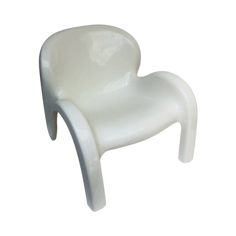
I just re-watched an old Schwarzenegger film by Paul Verhoeven called Total Recall, based on a wonderfully paranoid burlesque short story by Philip K. Dick called "We Can Remember It for You Wholesale."
Total Recall reminded me how frequently film makers use modernist design to represent heartless, alienating rationality run amok.
Alfred Hitchcock was one of the first directors I recognized doing this and he later said in an interview that he often used modernist form language to depict highly rational environments that triggered alienation. Hitchcock often associated dark emotional forces with nature, or with Victorian imagery, or what have you, however, and saved modernist form language for alienation and bitterly ironic events. I'm thinking of North by Northwest and Pyscho late in his career, but you can see him doing it much earlier.
Stanley Kubrick is the first director I recall that attributed most evil to rationalism itself. In Kubrick, the more dangerous and potentially sinister things become the more rationalized and geometric and often modern the background becomes.
Many later directors and contemporary ones tilt in this direction. Verhoeven is just one of many. David Cronnenberg has done it forever.
Jim Cameron inverts this a bit and makes the machines themselves the ultimate rationalization of evil and danger, whether its a Terminator chassis, or the Titanic or the diving equipment and the sub in The Abyss.
Ridley Scott likes rationalized, geometric background that is part crumbling and part mega new in which to unleash his gothic monsters.
I am a bit out of touch with the guys exploring the dark side these days, so I don't know what they are using, maybe decon imagery?
Anyway, all of the above is a long way around to my basic question: what is it about modernist design that makes movie makers and movie audiences so receptive to it as an expression of alienation and rationalism run amok?
Most persons here feel just the opposite about modernist design. They find a sensible approach to design that offers them a very pleasing environment to inhabit. Alienation and rationalism run amok are just about the opposite of how they feel. They find much of the modern to be light, and colorful and even playful in the case of the Eames.
Where is the disconnect and why does it exist and persist even after nearly a century of modernist design?
If you need any help, please contact us at – info@designaddict.com


