I don't get the assumption...
I don't get the assumption that JP designs don't work well or "match" more popular MCM designs. In terms of materials they certainly do ... plywood and metal. However, the persona it exudes is different ... serious rather than playful like most American MCM. Besides who the hell wants to match anyway? Disparate ideas create interest.
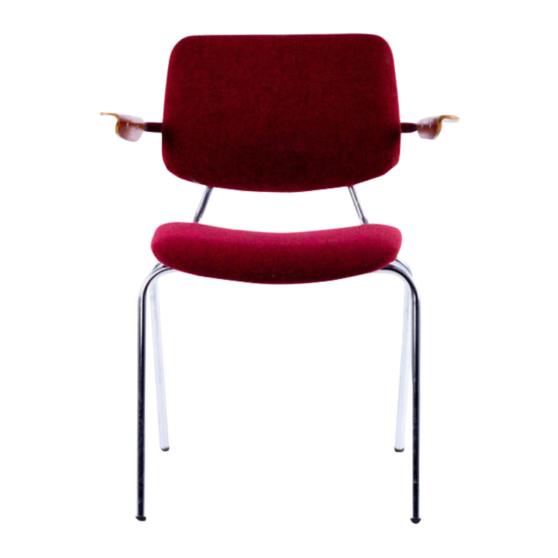
Years back I had the opportunity to acquire a Friso Kramer dining table and six chairs very affordably ... I can't remember the price exactly. I passed it up because at the time I thought of his designs as JP wanna-be. What do you think? Since then I have developed more of an appreciation for the very few Friso Kramer designs I have seen. Now this designer is one that is often left out. Why is this? Does anyone here have more knowledge about his work?
alexandersforum, well, the...
alexandersforum, well, the chair came after the table 🙂 I know that String came out in 1949 because their tagline says so. Not sure about the Tomado, but those colors feel more early fifties to me.
whitespike, I think you hit it with serious vs. playful. That's it. Yes, those styles do blend, but not so effortlessly, at least not to me.
One rarely sees vintage Kramer. Not sure about the prices they fetch, but a vintage would be the only way to go for me as I don't like the new ones in plastic.
Yes, there are obvious echoes of JP in Kramer's work, but I don't know anything beyond what I see. I too would be interested in learning more about Kramer and Rietveld in this regard.
mix n match...
mix n match...
Well, I think it is good to mix it up a little, but I find there's some things that mix n match better than others.
I love the work of Prouve and Perriand and I think some pieces would fit with what I like to surround myself with. For example, I think the small Perriand wood stools or the wall hung shelves would fit great with the more slender Scandinavian and US mcm designs. But for me the prouve EM table or the huge wardrobes with metal doors would be too much of a clash, just like I wouldn't mix in some old victorian style chair with my 50's dining table (I know, i know, Prouve is mcm and plywood and all, so it's a bad comparison...) . It all comes down to taste I guess, but as said, I really do appreciate the stuff...
Something I WOULD like to achieve in my interior is a good mix of old and new designs. Although I must admit, I'm far from having succeeded on that point yet... Still stuck in the 50's and moving backwards rather than the other way.
Speaking of Kramer vs Prouve, I agree there's a very obvious influence there, although I must admit I don't know that much about his work except for a few chairs and tables...
And the Tomado shelves... -Do we have any dutch design addicts online tonight? Maybe you can inform us about the history of the Tomado shelving system? And Pilastro, was that also dutch?
my 'room divider' is bigger than yours...
sorry, bad joke...
Here's a link to the exhibition in Paris where I saw the divider/shelf mentioned earlier. It's a one off piece, I think for a friend/colleague of Prouve's.
(Click on the picture at the top left)
http://www.jousse-entreprise.com/expoencours07/ruedeseinejanv/showhome1....
Carlo Mollino
I am enjoying this thread and want to keep stirring the pot; and so, I thought I would mention that there are a few Carlo Mollino designs currently in production by Zonotta. I drool over them at Unicahome.com but I am sure other sites offer the products.
I suspect the theory that Provue designs do not blend as well as the more iconic pieces is predicated on fewer photographic images that utilize these lesser known designs.
I think familiarity helps to ease the sensation of displacement or discomfort. As a design becomes more exposed it generally becomes more widely appreciated which leads to an accelerated general acceptance.
My wife now notices the use of designer furnishings to sell products as diverse as yogurt and pharmaceuticals. She notices the furnishings because we live with many of the pieces, and I suspect that she appreciates them more due to the media exposure. Perhaps, if she does not appreciate the designs more then at least she, hopefully, finds my furniture fixation less unusual.
While I am confident that many of the DA community are familiar with the lesser known designers it is difficult to work them into the design conversation unless someone is specifically curious or the designer is being celebrated in the mainstream. When was the last time you saw a Mollino design?
Thought of and still thinking of ...
Have been mulling over the CITE armchair for ages. Now that Vitra has announced another price-increase to take effect in September, am suddenly feeling more time pressured!
There has probably been a greater awareness of his work in London since the exhibition at the Design Museum earlier this year.
Prouve's designs come across as being extremely logical. The word "industrial" jumps to mind.
Definitely agree that they are pretty "serious". Which I think puts them in a rather unique niche: on the one hand being a bit on the "serious" side for the home, while on the other not being "classy" enough to be used in corporate settings; overall resulting in less exposure relative to the usual suspects (Mies, Eames, Bertoia etc).
Since we're on Prouve, does anyone know the original design / colour combination Prouve used for the Cite?
GMT
classy
I think that has a bit to do with it. JP designs are definitely not fitting for commercial use based on the public's expectations. When you think about it, all the widely known designs/designers have been employed widely for public space .... eames shells, saarinen, knoll, mies, corbu, bertoia ....
Anything else is very particular to the design crowd.
Herman Miller & Knoll are big in contract furniture and are also the best selling for the home. Coincidence? No.
If you need any help, please contact us at – info@designaddict.com


