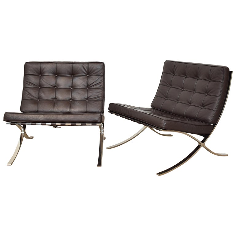
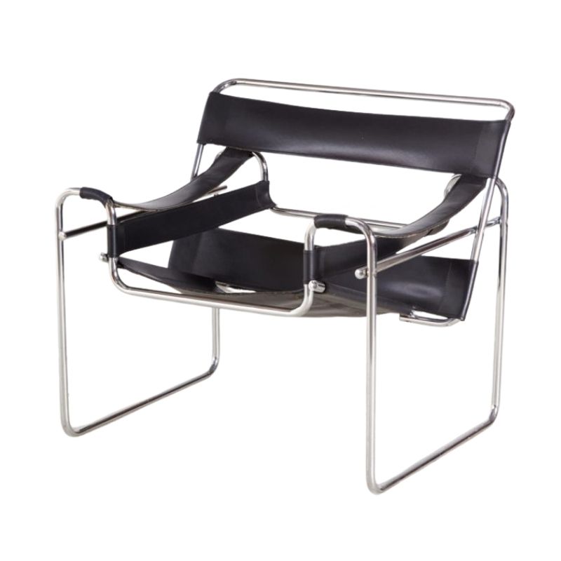
One thing i hate about these ...
One thing i hate about these overly-staged rooms...
So am I to assume that someone is going to sit by themselves in the corner of the room on that plastic chair, 10 feet away from the coffee table?
Or is the chair just a sculptural piece, or conversation starter?
I see this in magazines all the time. Shouldn't furniture be arranged in practical, usable ways? Such as near a table of some sort, or near other furniture in a conversational grouping? Maybe next to a lamp so you could read?
Just a pet peeve.
scooby
Not everything is permanent. I keep a chair out of the way in the living room that I never sit in - but it is easy to pull up the coffee table should extra guests need it.
but if you would like I can ask someone to remove that chair from you. Less chair, less color, less contrast, and one more step towards a better world.
Robert? The chair if you please.
actually...
Actually i would prefer if you could just move the chair closer to the coffee table, please. And add a "snuggie" with a cup of hot cocoa.
I often see these magazine spreads with forlorn iconic modern chairs sitting by their lonesome in the most awkward places.
And it's obvious that the chair is rarely if ever used. the owner just bought it to look at and/or display.
Oh, pooh
you people are way too anal. I love orange and purple and turquoise and lime green.
Lloyd, help me out here. Color looks good against black and brown and white. Living with no color is like only eating steak and potatoes. Everybody needs some zucchini, eggplant and deep red wine in their diet.
Since the majority of contributors here are men, let me appeal to your sense of taste. Do you not enjoy going shopping in the spring when the ties and socks in the shops switch from boring black and brown into the glorious colors of yellow, pink and lime green in the springtime? Is it "noncool" to be fun and festive? Jeez, live a little!
Here's to color, Riki!
I actually do like the pristine photo of this room, but it also gives me a feeling of unreality, like the stage set or a magazine. Unliveable, absolutely!
I think the addition of color to that room or any room adds life, livability and happiness. I have always hated blank white walls, even in museums. I like Riki's analogy to food, I think my house probably is a salad, due to my love of green. It's a carefully composed Salad Niscoise, versus a tossed garden salad, but still there's a lot of color here. Or was, really. Since we've been prepping to sell our house, we've toned down a lot of the color. I hated doing it, but I do understand the concept of my home becoming a commodity and needing to appeal to the widest range of people. The filming of the virtual tour is being done in a couple of weeks. Once we've done that I'll send you all the link so you can check the place out. You woun't find much purple, though 😉
Hey, whitespike? Steak is brown and potatoes are beige...you'd hate a house like that!
If you need any help, please contact us at – info@designaddict.com


