Well...
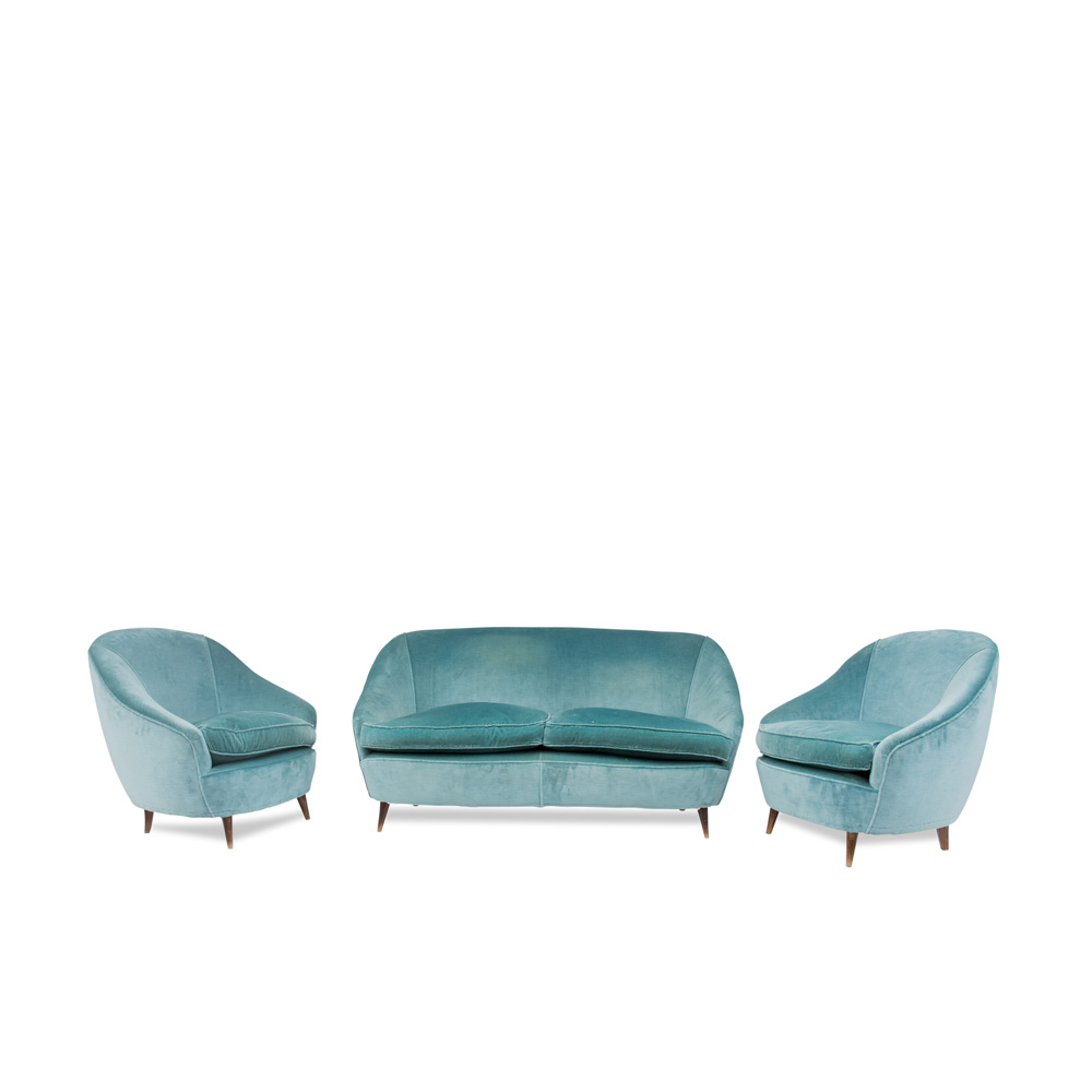
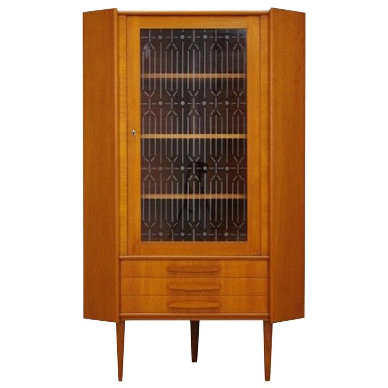
I only have limited funds with which to work with. I'm saving up to hopefully buy a loft apartment at one of the downtown apartment buildings in the future. That severly limits what I can spend on art work, furniture, etc. I'm still in the process of adding to my collection. These two paintings are what I have now that would look best in the space above my fireplace. So they'll have to do until I can find something more suitable. But that's not first on my list. First on my list is getting the couch recovered (it needs it badly) and getting a bookcase. All my books are currently piled up in the corner of the bedroom. I don't have much closet space so the books won't fit there so a bookcase is a must. Those come before any more art work unless I happen to run across a great deal at the thrift shop (but that doesn't happen often).
Several of us
seem to have missed that these two panels form a diptych -- there are lines that pass between the two compositions, combining them into one work.
I doubt that the artist anticipated seeing them hung diagonally -- though there are square pieces (including a well-known Mondrian) which are diagonal compositions.
Perhaps contrast isn't the only valid response to an existing feature like this fireplace ? And, different materials that share a similar coloration is surely not cause for alarm --- is it ?
That said, of course these pieces belong in a more sympathetic environment, which seems to be the owner's intent.
I agree with barrympis - the...
I agree with barrympis - the pictures are fighting a losing battle against that fireplace, however they're arranged. If you don't have or can't stretch to a new painting how about a large circular mirror - it can even be screwed directly to the wall with chrome screw covers.
If you need any help, please contact us at – info@designaddict.com


