The
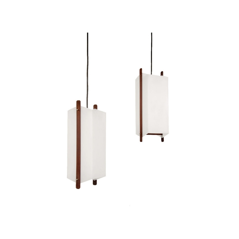
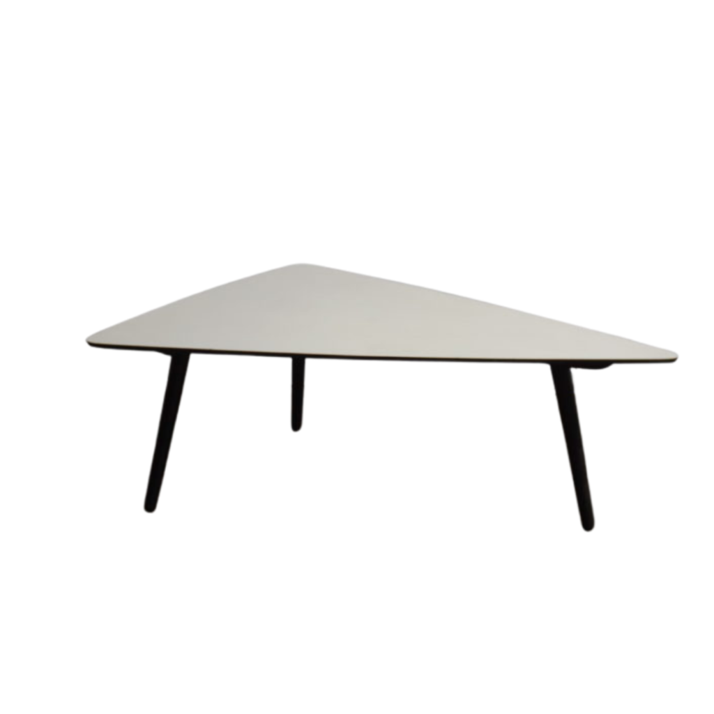
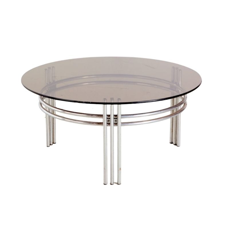
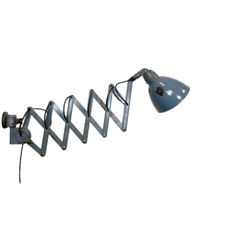
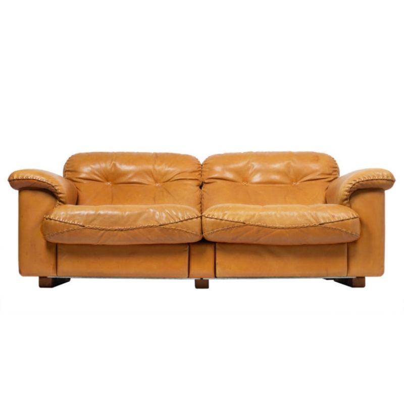
current HSBC ad here has some gorgeous stuff in it. I suspect it was already in the property they shot in.
http://www.hsbc.co.uk/1/2/security-centre/secure-key/tv-ad
.
Every commercial hires an Art Dept.
A few years ago, many decorators were clueless about the era
until MadMen...chair backs mounted up-side down etc.
If budgets are tight, they often use some furnishings that exist in
a chosen location but more likely the locations are stripped of all
furniture and smalls; vases, lamps, even dishes, and redecorate with a blank
slate. A good many are built on a sound stage so all furnishings need
to be rented/purchased. Prop houses have amazing collections.
Unfortunately, very few know how to use them. They, the art dept,
tend to pick the 'greatest hits', and the set can look and feel awkward.
With a very limited time frame and budget, renting is often the best option.
Purchased vintage items are often bought at very high prices and
offered for sale at the end of production, usually 1/2 price. Not
bargain prices. It is rare that producers/clients let valuable items
walk for free but it does happen.
The best designer/decorators rarely shop with themselves in mind.
not product placement
Modernist furniture from that period had been featured countless of times during their time more as props or to convey a message as opposed to product placement on magazine covers, TV ads, newspaper cartoons, record/album covers even an episode of "I Love Lucy". The Eames lounge chair was always featured with a famous CEO sitting on it, Elton John's The Fox record and album cover featured the Eames wire chair with the Eiffel tower base on the cover, JFK debated with NIxon on TV in the 1960's CBS broadcast sitting on Hans Wegner's "the chair", just to name a few.
The famous modernist architectural photographer Julius Schulman has been known to have two sets of interior views of a modernist house designed by famous architects of the period. One showing a view with the owners actual furnishings and the other the same view but everything removed per the architects orders and replaced with what everyone is now calling mid-century modern furniture which by the way was retro back in the 1980's.
Product placement is when a recognized logo or brand is flashed just for the sake of flashing or shameless advertising like in the case of when Judge Ito (during the OJ trial) ordered Sony to stop writing their company name on a piece of bond paper taped behind the computer monitor screen made by them because it just happened to show up on the foreground of Court TV broadcast.
.
The thread header is 'unusual placement', not 'product placement'.
Another ballgame altogether. A necessary evil we all must deal with.
Advertsing is unpleasant but just a part of the game. Some productions
need it to help foot the bill. Lawyers are needed to make sure a
clients precious product is not mis-represented...yawn
A greedy supplier may offer a set of chairs for free to get exposure.
Or hair gel. It has been done for years as you pointed out but not always
greedy. Sometimes just a decorator/designer necessity.
Implied
The setting was probably intentionally designed to convey something modern yet familiar and comfortable. The 'security key' being sold is new and modern, but the advertisers likely wanted to avoid the mistake of conveying 'modern' with cold, mechanical settings. So they went with familiar, warm, organic modern.
Interesting that the family is Japanese. Not to be cynical, but perhaps they, too, are a prop as 'everyone knows' that Japanese are efficient, modern people.
I suspect Sterling Cooper had a hand in this.
If you need any help, please contact us at – info@designaddict.com


