Design Addict

Cart

The last thing you ...
 

The last thing you made, part 3  

Page 5 / 7
  RSS

SDR
 SDR
(@sdr)
Illustrious Member
Joined: 15 years ago
Posts: 6462
10/10/2013 8:52 am  

Nice bench, Heath
Let's see at least another photo or two ?
The bamboo cut and milled easily enough -- no real difference from other hardwoods, so far. There is a resin-infused "rebundled" form of bamboo that reportedly makes a harder flooring. They stain in six ways from Sunday . . .
Multiple varieties of eucalyptus were imported to the California coast a century and more ago; the idea was that it would be good for building. The users didn't find it that way (it reportedly twisted and did all sorts of bad stuff) -- so they used it for windbreaks and firewood. Too bad; we probably just had the wrong varieties ? An ancient row of big old trees used to line a popular road up in Sonoma County. Don't know why it was finally taken away . . .


ReplyQuote
HPau
 HPau
(@hpau)
Illustrious Member
Joined: 6 years ago
Posts: 2534
10/10/2013 9:07 am  

I'll post some more when the blasted thing is finished. Eucalypts have a tendency to drop branches and have killed a few campers here and damaged cars, they also like to burn so I imagine thats why they were removed. This stuff goes under the name Tasmanian oak, people in Tasmania just use it for firewood, up here the local timbers are so full of twist and tension and are so incredibly hard they are rarely used as cabinet timbers, thats probably what you got there.


ReplyQuote
SDR
 SDR
(@sdr)
Illustrious Member
Joined: 15 years ago
Posts: 6462
10/10/2013 11:22 am  

They're beautiful trees,
I think; property owners complain about falling limbs and bark, and general dander -- plus fire. And some people think of them as non-native species and want them removed on philosophical grounds, or something.
I like their colors and movements. Leaves can be gray-green, on reddish strands, and they dance nicely in the wind. But you can't please everyone, apparently. I like them better here in NoCal than the (also non-native) palms -- which to my eye seem really out of place.


ReplyQuote
Spanky
(@spanky)
Illustrious Member
Joined: 6 years ago
Posts: 4376
10/10/2013 7:57 pm  

Those are beautiful benches, Heath.
Shellac should seal the oil stains on the black one, right?


ReplyQuote
adamfowler
(@adamsfowlergmail-com)
Noble Member
Joined: 6 years ago
Posts: 248
10/10/2013 8:01 pm  

really inpressive Manp & Heath
nice work, like the nod to modernism and both of your ability to bring something new to the pieces!


ReplyQuote
HPau
 HPau
(@hpau)
Illustrious Member
Joined: 6 years ago
Posts: 2534
10/10/2013 11:05 pm  

Thanks, they both need a bit of refinement though, the ply shell is strong enough without the spine underneath so I'd like to do something different with it that exploits that. The over-sprayed oil has left little craters where the second coat hasn't stuck to the first, the whole thing needs to be washed with de-greaser and sanded back.


ReplyQuote
Mark
 Mark
(@mark)
Illustrious Member
Joined: 15 years ago
Posts: 4586
11/10/2013 3:52 am  

*
Very nice work Heath!


ReplyQuote
leif ericson - Zephyr Renner
(@leif-ericson)
Illustrious Member
Joined: 15 years ago
Posts: 5660
11/10/2013 5:17 am  

impressive
Heath, that is very impressive. I want more photos!


ReplyQuote
Patrick Myers
(@patrick-myers-studiogmail-com)
New Member
Joined: 6 years ago
Posts: 4
22/10/2014 10:15 pm  

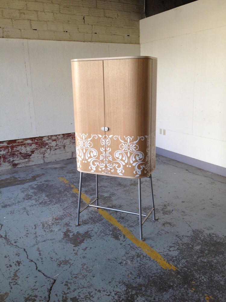
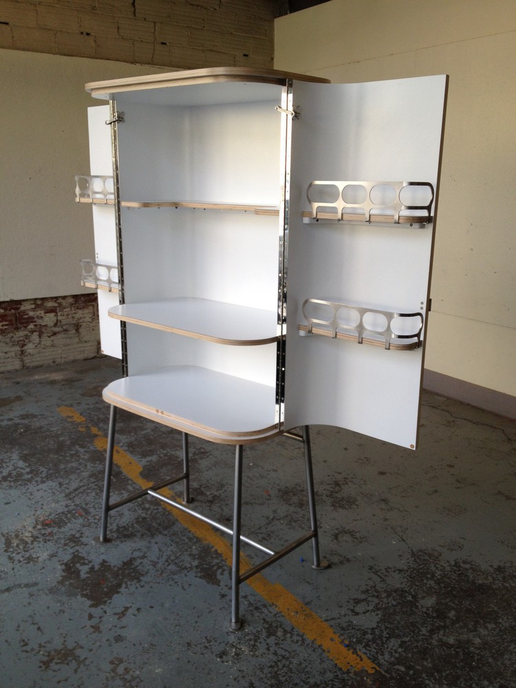
Eamesian/Victorian cocktail cabinet. bent plywood, veneer, stainless steel, paint, laminate.


ReplyQuote
Mark
 Mark
(@mark)
Illustrious Member
Joined: 15 years ago
Posts: 4586
22/10/2014 11:03 pm  

Well, I've never seen a bar that I didn't like.  Yours appears to be "top heavy" at a glance, but then...so  do I.  I would like you to grab your best phillips head screw driver, and align the screw heads....
 
Nice,
 
Aunt Mark


ReplyQuote
Patrick Myers
(@patrick-myers-studiogmail-com)
New Member
Joined: 6 years ago
Posts: 4
22/10/2014 11:27 pm  

mark-
Point taken on the screw heads.
Regarding the top heavy appearance, it is very stable-structurally, no signifcant flex in the base. I was trying to break away from the dark, baroque and almost monolithic cabinets out there.


ReplyQuote
Mark
 Mark
(@mark)
Illustrious Member
Joined: 15 years ago
Posts: 4586
23/10/2014 12:03 am  

Well, you are quite good at what you do.  Might I inquire about the stenciling?  The piece would look much "higher end" without.  The white interior is very appropriate, however.  It's all in the details.....the small details.
 
Very nice,
 
Aunt Mark


ReplyQuote
Patrick Myers
(@patrick-myers-studiogmail-com)
New Member
Joined: 6 years ago
Posts: 4
23/10/2014 12:19 am  

thanks again for the kudos. The stencil was done with a cut vinyl mask, then sprayed. very tedious.
My intent with the pattern was to challenge some sensibilities around "decoration". Potential future pieces I may consider ommitting though. All subjective, right?
p


ReplyQuote
Spanky
(@spanky)
Illustrious Member
Joined: 6 years ago
Posts: 4376
23/10/2014 2:01 am  

I like the cabinet shape, materials, and interior a lot.  I can make it go either way as far as top-heaviness--it's on the line for me, I think.  So no big deal there.  
The stenciling, though---that kind of nouveau Victorian scrolly stuff has been very, very trendy for a few years now and is so pervasive that it's got to be on the way out, I'm sure.  Something to consider.


ReplyQuote
SDR
 SDR
(@sdr)
Illustrious Member
Joined: 15 years ago
Posts: 6462
23/10/2014 7:10 am  

Nice work !  It's a pleasure to see anything well thought out, and accomplished flawlessly.  I say, screws should be driven to consistent torque, and let the heads (especially Phillips) end up where they may ?
My take on the stencil:  Why not ?  But the cut-off top of the pattern might better have been made an aligned "free edge" ?  Looks fine, anyway.  
The hold-open hardware -- did you find that, or make it ?  Slick . . .
SDR


ReplyQuote
Page 5 / 7
Share:

If you need any help, please contact us at – info@designaddict.com

  
Working

Please Login or Register