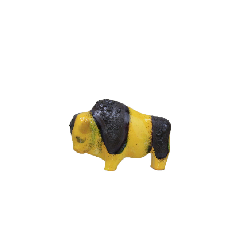
gnome side tables
they are kitsch, but i don't know if they are well finished, probably they are but i don't know.
http://www.designaddict.com/design_index/index.cfm/fuseaction/designer_s...
Cool kitsch
This is a cool kitsch by Patricia Urquiola. Very rare as she usually doesnt do kitsch design. I would define it as a very cool, well made, swanky kitsch.
http://www.designdictionary.co.uk/popup/urquiola3.htm
It means: Louis Ghost chair...
It means: Louis Ghost chair imitates some craft chairs. Those chairs were
shaped and structured taking into consideration the characteristics of wood, and
the tools that the artisans had. But the Louis Ghost chair is made of crystal, not wood.
The tools and the method used to produce it are different too. That way in which
the elements composing the chair and the assembling are defined is just unpredictable.
Not related to the material used. And the result is a nice kitsch.
Hi SDR..
Going over the different reactions I was asking myself the same question... To facilitate?... most of these curves were to show off skill and craftmanship...and I do not mean the curve itself, but the parallel carving of profiles along those curves. I am old enough to remember these parallel carving exercises...and there is nothing easy about them. In the plastic version they are left out but nothing indicates that these are shapes that would facilitate the craftspeople's work.
But that's just a side step.
In this I have to or I gladly agree with Antonella's remarks.
I would agree that the Louis Ghost chair is kitsch. The reason is not so much the "artisan" structure as the fact that it so clearly pretends to be something else than what it is: A plastic chair. The imitation of a Louis XYZ does not serve any other purpose either, it is to clumsy to be considerd a parody, to serious to be humor... Where Koziol and Alessi manage to introduce some form of humor into there kitsch design, the Starck design fails to do that. I think that it was one of the original caracteristics of Kitsch, that it was neither done with irony or any other form of humor, it was very seriously ugly. I guess what makes kitsch now more acceptable is first of all the Post-modern experience and secondly a certain level of humor. So to me cool kitsch or kitschy cool would have one or more extra dimensions beyond tasteless or ugly. The Tichelaar bisquit, although I dislike it on other grounds, has an element of parody in it that might appeal to the decadent-end-of-civilisation-crowd. Again it is not what is mend with kitsch but in spite of being traditional dutch mercantile opportunism, it might qualify for cool kitsch.
I also agree with Antonella on the Proust chair. To start with it is not ugly in the same way as the Louis chair is. This is an overloaded, Rococco chair but it is neither out of proportion nor badly detailed. This is a design manifest. Although Mendini is a skilled writer there were obviously things he could not express in words and so he used objects to do it for him. Which is fine with me but it does not qualify as kitsch. His intention is not that we take the object itself seriously , but that we take his ideas behind the object seriously.
In my view what makes Starck's rifle lamps Kitsch is that he want us to take his protest against war seriously. Unfortunately, by using the wrong means he has not the credibility that would make his protest genuine or honest. Strangely enough a lot of neo-modern would qualify for what was originally called kitsch. When the word became "en vogue" in the fifties it was used for a kind of copycat modern. Not for imitations of any styles, but for three tappered legs and chrome plated feet supporting a long hair fluor coloured cushion or a kidney shaped coffee table top with a few coloured tiles mounted in the surface...So to me it still stands for style without contents. Anyway good luck with your article Stephen
Hi Koen, Im happy you agree,...
Hi Koen, Im happy you agree, also i like this phrase you have used to
describe the concept of the Proust chair "His intention is not that we take the
object itself seriously , but that we take his ideas behind the object seriously".
I don't know what the ideas are, though... could they be about freedom in some ways?
about abolishing boundaries (as the pattern cross the limit and also goes where
generally there isn't any)?
Hi Antonella,....
Ever since he came on the design scene Alessandro Mendini has been protesting the un-personal caracter of industrial products, They have no personality and they are not personal are the themes of most of his work. Within the Post-modern context of the time the Proust chair illustrates the posibilities of going the opposite way, i.o.w. high personality, very personal in taste etc. The Proust chair and the reference to Proust's work illustrates this protest in an effective way.
If you need any help, please contact us at – info@designaddict.com


