Hmm
too bad.
It took a long time, in the postwar years, for designers to re-learn that wheels want to be out near the plane of the body sides, not buried under the body like casters. . .
Heath, the first white plastic stacking chair I saw, costing $5., I bought (at Safeway). I've never seen another I liked as much. The maker was Club, I think. It was actually quite handsome, I thought. The back and arm made a single sloping arc; the four-slat back and seat became the standard for many subsequent chairs.
SDR
I'm now crazy curious what...
I'm now crazy curious what exactly Pegboard and Glass consider a great designer...bad design! Please share...
Had a friend whose father owned a 1990 (I believe) Geo Metro...he proclaimed it the worse car ever built aside the Pinto. Can't blame him, his literally fell apart piece by piece. One of the few cars I was a little frighten of riding in.
note* I'm not on the attack, I'm quite playful...
i realize
now i overstepped my bound in speaking for pegboard modern. i should have said "i think this may be what he (she?) is getting at". to answer woof woof, i think something is bad design when it doesnt meet its aims or good when the opposite is true. my metro is good design by its intents but i will speculate that nelson wanted an appealing look for the kangaroo, a chair that i feel is awkward in its proportions. i also take several exceptions with the 670 which i have elaborated in other threads. my main design objections are designs that ignore the needs of the time they were created in. so i am presently dissatisfied with much current design that ignores ecological solutions in favor of flashy,clever rock star designing.
.
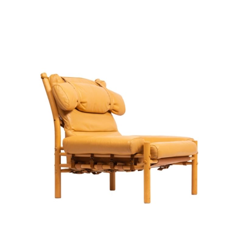
I'm yet to see one of these types of chairs I can tolerate, do you have a picture SDR?
Speaking of one trick ponys what do you guys think of the up-scaled object re-interpreted? It strikes me as a joke that Warhol et al made a long time ago that you could only smirk at once and now the joke has just be endlessly re-told.
btw I've sat in the Joe baseball mit chair, I enjoy it for its part of design history but sliding forward was a real problem which could be solved with stuffing it differently, (denser behind the knee, less dense under the bum. I've just found out that Heller are re-issuing the Joe in a hard plastic (roto?) version, that looks f**king awful.
http://www.helleronline.com/joe_main.php
.
This is the chair. You won't find one with this arm shape anywhere, now. It was a really comfortable chair, too -- as I guess a lot of them are. Looks good from all angles, I thought.
http://www.flickr.com/photos/danieljenett/248917311/in/pool-those-white-...
.
Here's another view of "my" chair. There's just something about this one that I like.
http://www.flickr.com/photos/danieljenett/248923752/in/pool-those-white-...
There's 1,000,000 opinions in the Naked City!
I realize how subjective this thread is, and not too many people are going to agree about much, but I still maintain that in the case of good furniture and furnishings that was designed from the 1930's-on falls into two primary catagories;
1) stuff that looks great and works for the purpose it was intended
2) stuff that looks great but is uncomfortable and difficult
Most of the 'post WWII' furniture and lighting designed by the best and most interesting designers and architects are designed SPECIALLY for great appearance, quality materials, AND comfort. Neither Eames, Nelson, Jacobsen, McCobb, Knoll, Saarinen, Bertoia or any other designers specially designed stuff to be difficult to use. They spent months and months perfecting their designs and used materials that were appropriate and possible to mass produce.
(Yes, I know that all of the latex foam from that era have turned to crap, but they used it because at the time, it was very soft and crisp-looking. How did they know that it all turn to dust or get rock-hard?)
However, honestly, when I look through the 1960's design books, there was a movement to "refine" design that often went beyond comfort and usability to an 'art statement' and to heck with anyone who didn't like it. Some chairs and other pieces really got goofy.
Lots of that most advanced stuff is cool to look at and they belong in a museum...but not my living room or yours, either.
do you'all agree?
If you need any help, please contact us at – info@designaddict.com


