I am about to bend one of my flexible rules against going negative on a designer's work (silence and indifference are usually the most effective criticisms of bad design for a layman such as me). Maybe its because I've been reading about bending wood and it has compelled me to bend a rule instead. Regardless, here goes...
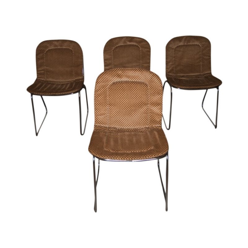
This 1965 chair by Borsani in Architonic seems almost calculated in its ugliness. I would like a designer to explain in aesthetic terms exactly what makes this chair so ugly (or defend it if my antennae are way off on this one). I'm serious. I want to know. A collector paid $2,800 for it. Perhaps the collector was legally blind.
Regardless, a little forensic design analysis seems useful here, as this chair seems to foreshadow alot of vulgar design that followed in the 1970s.
I don't think a layman could have come up with something this systematically awful, if only because layman aren't very systematic. I suspect that Mr. Borsani was working with a method...but what method and to what end in this case? I can see the underlying principles of a good chair here. But what makes a designer, in this case, make the fastener choices that he made?
The picture of Mr. Borsani in Architonic suggests an urbane man and a very natty dresser. Mr. Borsani would never wear buttons, or a tie pin, as unsightly and proportionally perverse as the fasteners he put on his chair. Or maybe he did in the 70s.
Any professional in creative activity makes goofs, or failed attempts, and produces the occassionally homely or dysfunctional artifact, but their professionalism rarely permits them to stray quite so far from beauty as this chair IMHO. I want to be fair to Mr.
Borsani? What was he trying he for here?
FWIW, Borsani's chair seems to foreshadow quite alot of vulgar 1970s designs by a full five to ten years.
My take on it...
would start with pointing out some severe inconsistencies. The two sides have kept all the caracteristics of a plywood cut-out. As such there is nothing wrong with building a chair out of plywood but the contrast with heavy leather cushions that bend over the edge is just too big. Form and colour are bettre surved by discontinuity than by large contrasts. To compare it with language, the expressive form you are more familiar with dcw, it could be compared with writing poetry using words from different languages.
The leather cushions themselves and the way they are attached only show one common characteristic: the large "button" like attachments. Apart from that too obvious and too expressive detail, each cushion seems to have it's own way of bending over the edge. The plywood base is probably adequat in terms of stability but the visual stability is not there.
A detail that really adds to the ugliness of the piece is that in one case the left side of the chair has a rounded front edge whereas the right side goes down vertically in a straight line. (in the other the sides are reversed) The rounded front is particularly ugly but it is definitly made worse by the difference between the two.
I wonder where that "Canadian" inspiration came from...we are not that ugly...
praxis/theoria
or in english, this raises a topic I've mulled over for some time, to wit:
In their day a lot of designers think they are making "modern" designs. But it's only many years later that we are able to discern the truly modern and timeless (a Saarinen tulip table) from the retro or even kitschy that clearly dates to a certain period (see the above playboy penthouse chair). At the time both designers doubtless thought they were creating timeless icons but one of them was wrong.
To some extend I follow James C. ...
in reasing the point of historical selection, but in my own recollection I do not see many differences between the ones that were considered exceptional and those who tried without succeeding. In spite of Techno's reputation these Borsani chairs were already in 1965 considered unsuccessfull. The Eero Saarinen table and chairs were icons from the very start although some critics (they still existed at the time) considered then at the very edge between good design and manierism.
Saarinen was a bad example
I'm thinking more of mass market/popular culture, not aesthetes at the high end of design. Look at much of the iconic 70's design like the loop phone. I suspect it's designers in '73 thought they were being very very modern. But in retrospect the design now looks dated and even worse it's awkward to use, I had one once and sold it on ebay years ago. I think that's a quality that dooms many designers with high pretensions to acadaemeological footnotes, designing things that look cool but don't function especially well.
A parallel example?
Might I suggest a quick peek at the current MoMA catalog? Two LED desk lamps. One of them ("The Leaf") trying W A Y too hard, IMHO, to be innovative; the other ("Z-Bar"), perfectly sane and balanced at one third the price. Which will look gauche 20 years from now?
http://www.momastore.org/museum/moma/CategoryDisplay_10451_10001_11461_1...
If you need any help, please contact us at – info@designaddict.com


