Thank you for sharing, very much appreciated. Your images are a source of inspiration.
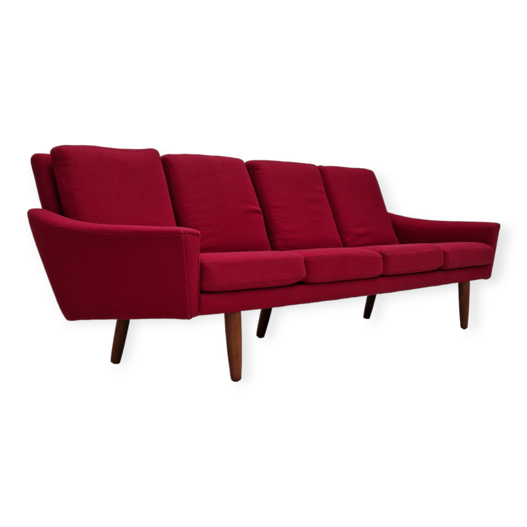
I was commenting, by looking at your pictures, that IKEA furniture could sometimes be a good solution, especially for a couch. But that couch you have is not produced anymore. I think the quality and design of IKEA is getting worse every year. In any case, finding a good looking couch, affordable, which can be washed, and comfortable, it's probably the most difficult task of furnishing any home.
Best wishes,
Ernest.
Beautiful home, Dr Poulet! You I like your balance of overall design form for each room with personal objects that give a sense of who you and your family are. I think a lot of people have trouble with that. (I tend to go overboard on the objects, myself.)
Ernest--the Karlstad is still available at the ikea near me but only in one size and maybe just one fabric so maybe it's just old inventory. I agree--slipcovered sofas that look good are hard to find. IKEA came up with some designs where the cover stays put way better than conventional slipcovers do, but that also makes them more of a pain to remove for laundering. Worth it, though.
I don't see a decline in the quality of their things but I also don't buy upholstered furniture there, or things like tables and desks and dining chairs. I have storage pieces mostly, I guess. And some housewares. I think they're fine for certain things.
It's beautiful Dr Poulet!
Ever since picking up those FD144s I too have felt like oak is almost as special as rosewood to me.
I sometimes feel (and I never thought Id say this) that my house is at risk of becoming a time capsule, and I really dislike that aesthetic. So I appreciate the interspersion of contemporary design. I want to focus more on this in the future in my home. Just like yours, not lots, just enough that the vintage pieces look timeless rather than of their time.
I'd love to know where your bed is from. Harder than finding the right sofa, is finding the right bed. And I really am fond of a caned headboard, I can no doubt thank Wegner for that particular fondness.
Kyle
I take what you mean Leif, and I'd never considered it that way. The less derivative of the 'fashion of the time' a design was, the better it stands now.
I'd always felt two things: the more abstract an item and the less dependent on classicism and simultaneously the more simplistic and less accented or embellished the better it achieves timelessness.
I am trying to think of a design I think is not timeless now to apply both.
Sometimes I think it simply has to do with the condition an item is in, too. 60+ years of wear and discolouration is identifiable to even the least initiated eyes. Or the fabric chosen...
This is an interesting discussion. I think that a flat becoming a time capsule has much to do with the overly intensive use of teak and/or rosewood. If you look at interior magazines from the 60s, you sometimes see flats that have been entirely furnished in teak. As much as I love teak wood, this is nothing I would aim at.
We have oak floring which sets a nice contrast to any dark wood. We also own some new reproductions made from walnut instead of teak. For me this also helps to give the flat a more contemporary.look. And not to forget modern textiles. We used contemporary fabric on Kai Kristiansen chairs, which also helps to prevent a room from becoming a time capsule.
The Dr. did it perfectly. I like the warm white walls which give a neutral but also modern background to all the nice pieces. Same goes for the black picutre frames which look modern and elegant. Imagine some teak frames or a 60s wallpaper instead. That would just have been to much.
"People buy a chair, and they don't really care who designed it." (Arne Jacobsen)
One good rule is that if you find yourself saying stuff like "I love this [whatever], but it's not [whatever style & era] so I can't put it in my home" -- then you are in the Time Capsule Danger Zone.
Look at the the home of Charles and Ray Eames. It may be too cluttered for some but there's a Thonet chair in there and the compact sofa is covered with non-Eames textiles, plus the zebra hide---and tons of books, textiles and objets from all over.
https://media.architecturaldigest.com/photos/56b92a667e88642d15270d67/ma...
Conversely, if you find yourself saying "I'm not wild about this [whatever] but it's SO [design style & era] that I have to get it!"---you're also in the Time Capsule Danger Zone.
Get stuff that you love and then find the right spot for it in your home, even if it means moving a bunch of other stuff around.
I will posit that the good doctor has excellent taste, and that is why his home is not a time capsule.
I will also posit that it is entirely possible to have a flat furnished all in teak that is not a time capsule, just as an example. However a great amount of the teak out there is a bit derivative in design. So to furnish a non time-capsule flat in all teak requires an eye looking to the most authentic and original pieces the were made in teak. As a crude measure I would exclude anything danish designed after 1960 (there are exceptions), and the furniture would significantly cabinetmaker pieces from the late 1940s and 1950s, predominantly the early 1950s. It would be ludicrously expensive today.
The point is that teak is not kitsch in itself. It is a beautiful wood especially with a light oil finish and this is why Finn Juhl liked it so much. It is what people used it for in about 1965 that made it very timely and kitsch, because so much of that was a reference to the finest years of Danish modern that were by then a decade and a half past.
If you need any help, please contact us at – info@designaddict.com


