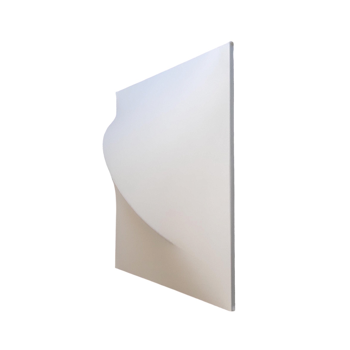
I don't think I ever posted this, I'd forgotten I made it.
I'm not particularly happy with it but I did get the seat angles and curves pretty much spot on for comfort. I've still got the template and ...one day... will use it with different materials.
I wanted something that was kind of like a cylinder of mutli coloured fruit pastels, but I ran out of money and enthusiasm.
Wow, that looks really...
Wow, that looks really friendly and inviting. I like it! I assume it also has rear legs, so it won't tumble over? I especially like the sort of added sides of the chair )rather than if it was one complete shape). Have you tried selling this chair/idea? I'm sure someone will snap it up.
Without wanting to play...
on words or on the name of the designer, I never liked those "Packman" shapes. (I am refering to the electronic game) In other words a circle with a cut out that gives it a function. To me this one is an exception. My first regret is that the convex curve of the seat serface is not (ever so slightly) repeated in the backrest. By being slightly concave the shape of the backrest does not really suggest the vague symetry that one would expect in a shape that otherwise is rather symetrical. Confort would not be affected by a slightly convex backrest. The second (they usually come in pairs) is that the transitions between the differentes curves is not as smooth as one would expect from an organic shape.
Although I seem to notice a central back leg, I am asking myself the same question as M_Andersen. "Visually" I find it less inviting when a piece of furniture like this looks unsupported.
All in all still a nice piece of work!!

.
Thanks guys, there are some aspects of it which I'm happy with, mostly the comfort. It is quite stable, there are four pieces of aluminium for the feet, I might change it to a rocking chair one day. THe original idea was to have them come in colourful wedge shaped sections and straights to form something like the Herman Miller foyer system, but I got bored with the entire thing.
The thing I dislike the most is the heavyness, perhaps over the holidays I will use the template for something similar though with an open frame construction.
sorta looks like a don ...
sorta looks like a don Chadwick modular with aluminum legs.
I think it is great looking and with a little refining you might have something good, I like your choice of color,as that throws into something Verner Panton would have used,
There is a great magazine i see on the newsstands out of Australia , has great modern stuff in it, send them a pick and a story never know:
.
Thanks again, actually designing + making stuff is all good, I love it but rationalising it for production and the promotion and marketing...I'd rather clean up dog poop for a living.
Anyone who likes it, feel free to copy it.
btw if it was arranged as a continous segmentation you'd only need two side panels, which would look nicer, I think.


If you need any help, please contact us at – info@designaddict.com