I've been spending time of late trying to come up with ideas for a fun, non-stressful secondary income stream that would allow me to utilize my skills and passions. Since, I'm an architecture/design geek and I can sew anthing I thought that I'd like to combine those concepts. I'm also an ardent sustainability advocate and I want to include that value in what I do.
I'm wondering if what I've come up with would be appealing to other design afficionados, so I'd like your opinions.
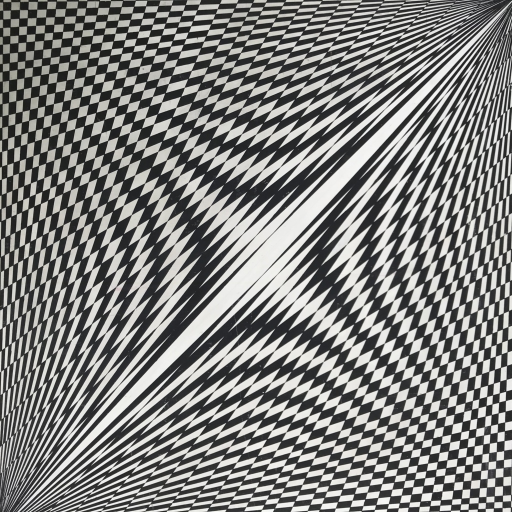
I want to take reclaimed fabrics from clothing, draperies, etc. and turn them into decorative pillows, wall art, or possibly footstools. Using segments of fabric I would mimic, but not exactly copy, the lines of famous modernist buildings. Like Falling Water, The Farnsworth House, or Koenig's Case Study House. It would be rather abstract and very geometric, just give the impression of the structure. the fabrics would all be either distinctly modernist in pattern or just solid colored and textural.
Thoughts?
I'm with you, Olive
If it's of any help to you, I've been spending some time re-furbishing/reupholstering & making new covers for some Ercol pieces and thrift store finds. Table runners, pillow covers & recycled fiber rugs have also been good for me. More profit involved in the furniture end, I will say.
And I second the motion for Etsy-great platform.
Thanks!
I was planning on using Etsy as the selling platform along with the multitude of shops here in Santa Fe.
I'm glad to think that reclaimed fabrics are of interest to the mod-minded, I wasn't sure that idea would fly, but maybe I shouldn't have since vintage furniture is so coveted by this crowd!
Thanks, Heath
Funny, I'd been toying with a design using either the century plant or the blue agave cactus and I haven't yet distilled that thought into design that looks modern enough for me. But, I kind of like the idea of using some of the plants out here for inspiration. They're so stark and geometric, due to the arid high mountain climate.
The landscape out here is incredible, but it's SO overexposed in all forms of art and media that it feels rather trite to do it. And it's hard to do a nice representations of the mountains without a lot of strong colors that would be hard to add to the average modern home decor!
Just a few quick thoughts, sy...
Just a few quick thoughts, symmetry and a 1:1.618 panel size always looks good and for your patterns an axonometric projection of a building or aerial view might work or at least be another view of the landscape that hasn't been too exploited. Perhaps a manipulated Wright floor plan or a closer look at some of the textile block patterns might lead somewhere.
Just had a look at some of the textile blocks, would translate really well I think.
Different buildings
will perhaps suggest different views. Many of Wright's plans would make nice abstract patterns (some have arcs or circles); elevations will also work well in many many cases. I'm not sure I'd get into perspective views, although isometrics -- where all angled lines are parallel -- would seem to suit the simplified "stylization" of buildings (if that's what you're after). Colors need not necessarily relate to the actual building materials, adding to the abstract or "puzzle" quality of the graphic ?
Funny how discussing this see...
Funny how discussing this seems right (or at least ok) with Wright but imagine trying to fiddle with anything by Mies, although even there the 'fabric' of the Lake Shore Drive curtain wall is obvious.
Are you familiar with photoshop Olive? Using the cutout or posterize filter followed by find edges/desaturate and upping the contrast and then printing it off in tiles would give you a pattern to work from.
Interesting idea...
but I think too 'literal' a translation for me. I want to go with very abstract lines that give a very general impression of the structure. And to stick with linear form that are quick to sew and will lend themselves to my ripping up salvaged fabrics. If I am going to hit a price point that is comfortable for the average 30-something, then I can't get too fancy in the stitchery! If I can't whip off 6 pillow in an hour then I'm taking too long. So I must refine my designs to distill the form down to just a line drawing kind of impression. But I will make patterns, though, that makes the production set up much quicker!
If you need any help, please contact us at – info@designaddict.com


