The name of the website is "design addict" one might suspect therefore that the forum would be a bit more intuitively designed i.e. not having a huge expanse of wasted space at the right that makes it impossible to post normal-sized photos. The capability to remain logged in would be a sensible option as well, rather than having to enter your email and password anytime you want to post or edit a post. just thoughts form a newbie.
Oh, I don't know...
It's different from every other forum, but it works fine for me. The content is what matters here, and the interface doesn't interfere much with that.
If you really hate the interface (and you run Firefox), you could write a Greasemonkey script to change it. Auto-filling the email/password fields would be easy, and I don't think it'd be much harder to make the forum show wider photos without scrolling or having to open them in a new tab.
http://addons.mozilla.org/en-US/firefox/addon/748
ZooMob,
The images that...
ZooMob,
The images that you have posted are 1024 pixels wide for a resolution of 180 dpi. It's anything but a normal size for the web. Maybe can you learn some web basics before criticizing?
For the other point, you're right. This version of the forum was designed in 2001 and needs some refreshment. We know that.
But since most navigators offer an auto-filling function for emails and passwords, it does not seem to be a major problem.
PS.
Like Robert in another thread, I must confess that I am irritated by uneducated participants who come here to look for information, who receive it for free and don't feel the elementary courtesy to thank people who help them.
When, on top of that, they are disagreable, it becomes unbearable.
No kidding. Back in the day,...
No kidding. Back in the day, you had to do your own coding to make photos happen. Now it's a snap.
If you have a problem with the way it is, make a healthy donation to DA. Write in the subject line on the check that it's for the update site fund!
But seriously, I like it's simplicity. There are people who have been on here more than 5 years. I'm rather used to it.
Lets hope...
...that Holographic data storage is reality soon.
http://www.ntt.co.jp/news/news04e/0402/040212.html
State of the art web sites mostly suck...
What is called state of the art today is just a web site designed to be ready sell its content (and track those sales) in the cloudware stage of the internet that seems to be ever imminent, but never quite here. Why is it slow in arriving? Because not even the most brilliant and conniving minds have been able to figure out how to sell anything on the net. Even now when they have developed and embedded the capability necessary to enable selling content (with a massive subsidy of recent joint NSA/Microsoft and NSA/Apple versions of operating systems),the only viable business model remains give-it-away-for-clicks-for-advertising.
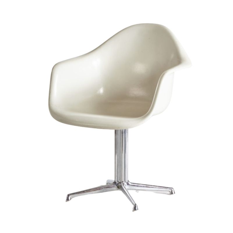
In the current internet environment, using DAs older, somewhat retro web site is a joy to me. It is like sitting in a 1960 Eames easy chair in 2009. It flat works as well today as it did when it was made. It needs some maintenance occassionally, but when that is done, again, it just plain works. All the crap that passes for progress on content-sales-ready websites is exposed to be just that--crap!
Retro? Nope.
Classic? Yes!
I hope Patrick and Alix always remember that what there web site does is what the internet was meant to do. Enable interactivity between human beings, not schlep content.
The internet started with four nodes once upon a time: UCLA, UCSB, UC-Berkely and Stanford. The idea was to send send email, bulletin board posts and files broken down into packets with code attached that allowed the packets to be scattered through the net and then converged on a destination, be reassembled, and then be read. The hope was that if you dropped a bomb on one node, the information packets could still find their way through the remaining nodes and reassemble. It was beautiful. It was elegant. It was simple. It was engineered functionalism. It wasn't perfect. It wasn't infallible.But it was damn good even without content-sales capability.
And no one here at DA need apologize for using a web site interface that is essentially stays true to the original concept of the internet; i.e., no one needs apologize for using the internet exactly the way it was originally intended to be used, rather than as a content whorehouse that Microsoft, Rupert Murdoch, and media conglomerates want to retrofit it to be.
A toast to DA and its authentic internet interface.

If you need any help, please contact us at – info@designaddict.com