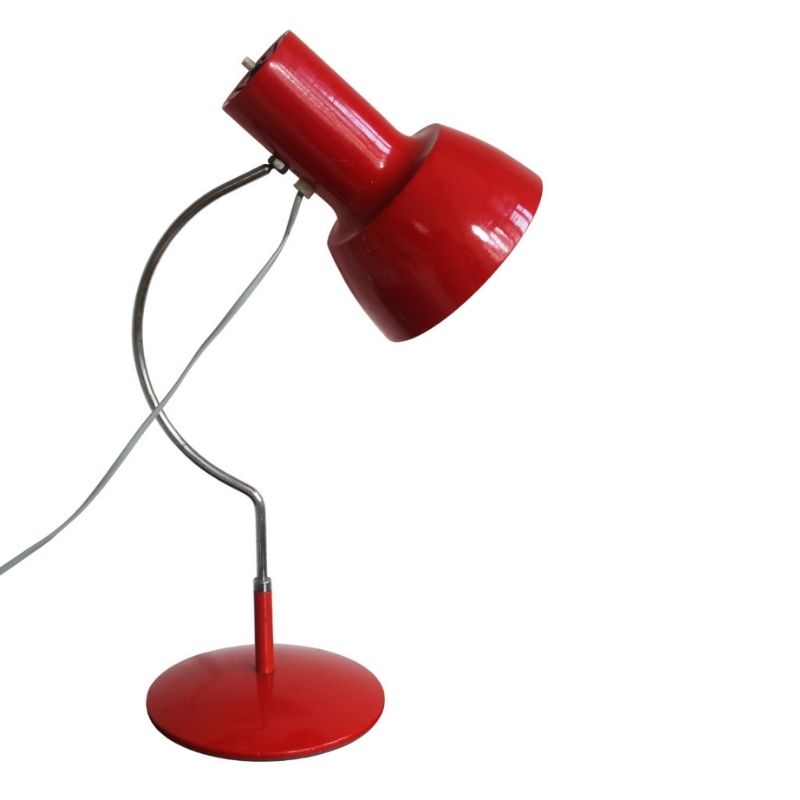
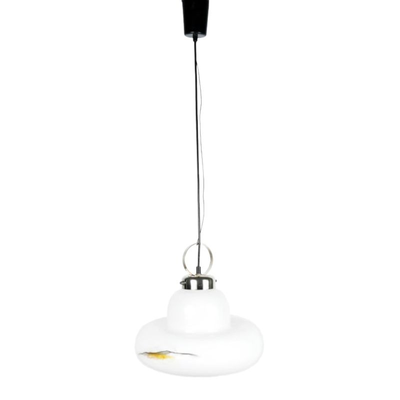
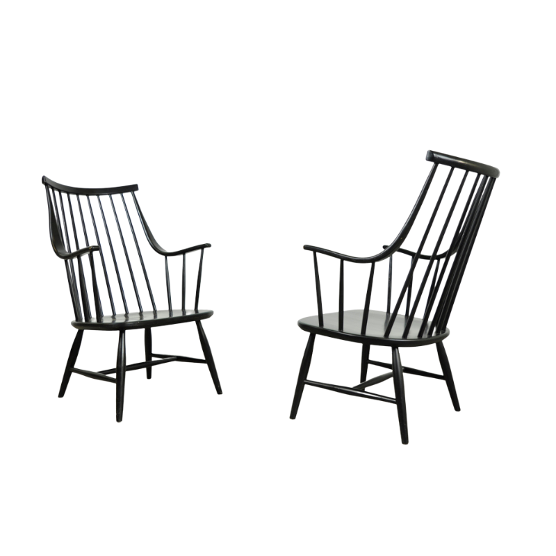
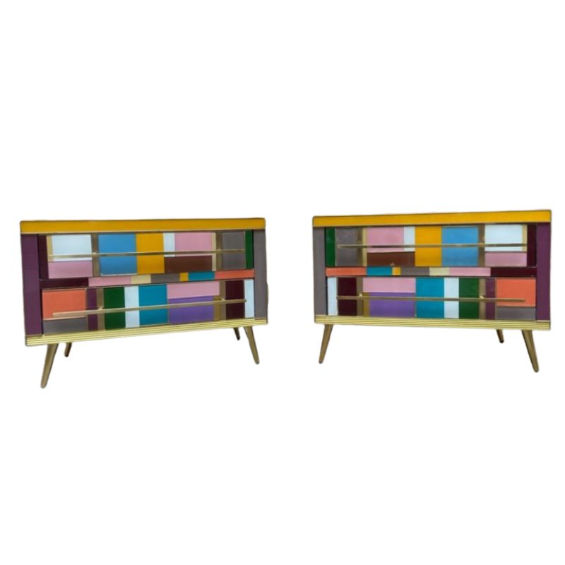
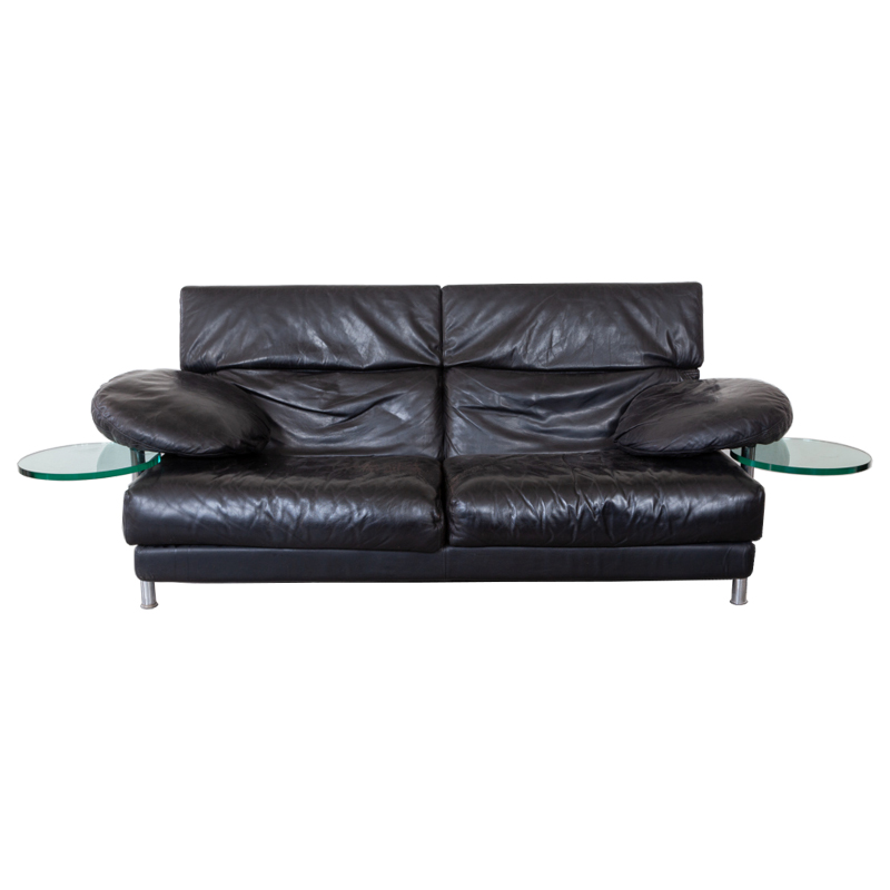
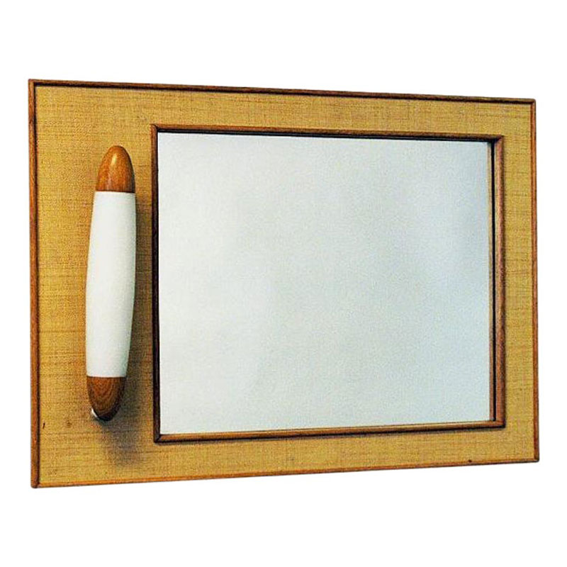
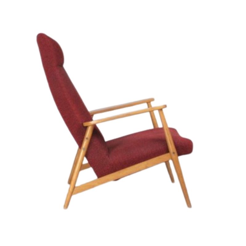
With prices falling rapidly and items being passed in at half the price they once regularly sold for in auction, are we witnessing an end to the global fascination with mid-century modern.
The past 2 mid-century auctions I attended failed to sell more than half of the lots and reserves were ridiculously cheap. Does this mean the beginning of a new trend and if so what will it be?
The interiors magazines are already saying that 1950's and 1960's furniture
is passé and all the talk is Art Deco and chinoiserie. My bet is on a return to solid timber furniture in a much more conservative style.
Most of us will continue to enjoy our modernist design, but what do you see as the new dominant trend?
.
I was thinking more like this, not quite but close, a bit more muted, maybe with a twist of Gattaca though I'd really like to see some proper minimalism come back. Who knows? Winds of fashion...I really hope its not that Hollywood regency stuff, although if everyone decides their Grete Jalk tables are boring I'll snap them up. But beyond collecting and interiors it all strikes me as excessive and fragmented, so hard to get a handle on anything. I don't know how people cope with all this social networking, working scattered hours, and endless stream of products and advertising and family life and on top of all that a fashion for collecting and what looks to me like a lot of very cluttered homes. So hopefully people will just start paring back.
Gah I just imaged searched 1970's Penthouse, so much Farrah Fawcett hair and boobs.
We?
We should remember as Design Addicts we tend to be ahead of the trends- and partly the reason they exist- and I guess why we're having this conversation in the first place.
(apart from the fact 'our' style has been appropriated by a popular television show so has been catapulted into high fashion status, and the inevitable going out of fashion that ensues any fad.)
Mad-Men Style anybody..
Nobody throws everything out and starts again- it'll evolve- Like Heath I think there'll be a return to (perceived) quality in materials, build and finish.
A more eclectic approach to decorating-mixing antiques with mid century stuff, as well as traditional textiles with furniture of different periods and cultural backgrounds.
(we're already seeing this with rugs)
More like the late 60s/ early 70s.
Think David Hicks perhaps?
I guess you both are talking...
I guess you both are talking dominant trend but Italian chic,70s and Hollywood Regency have been back for a while.
Surely everyone here has heard of Kelly Wearstler and Jonathan Adler.
Heath you talk cluttered,excessive and fragmented but that is just it.
These days anything goes as long as it works and the best part is you can't pigeon hole the look which is probably the aim.
People seem to think a certain look for say Hollywood Regency but if doing it today it needs to have a modern take.
Many people here have the Danish inspired or MCM interior but with too much it can end up looking like a tired snapshot back in time.We all have our favourite type pieces but it can be good medicine to force something contemporary into the mix.
The attached image has some basic mixed up pieces that are all fairly easy to acquire.Retro chairs,antique picture,a contemorary ottoman etc yet it has a modern twist.You won't find this look in an old magazine from a certain era because it's what some creative people are doing here and now.
'Back for a while'
is slightly misleading. Trends don't come and go overnight, they filter down- so it all depends on what area of the market we're talking about.
That said, it appears we're all pretty much on the same page, look-wise, whatever we call it.
There is no such thing as 'Hollywood Regency' outside of the US (one rarely hears it in Europe other than on eBay)
So this style might go by any number of different names, and may even acquire a new (more global) one as time goes on.
Robert,Maybe the masses...
Robert,
Maybe the masses but here in Australia we have known about Hollywood Regency for a while.
Both David Hicks and Greg Natale have been doing there take on it for a number of years.I assumed in the UK it would be a style too but you would know better because in London some are doing that look.
1st is David Hicks from the same interior you posted and the second is a recent one by Greg Natale.
Personally I think Greg's white colours are often too white but that is just my opinion.
I've
been in a few David Hick's designed rooms here on Palm Beach, and in Chicago. I must say that they are timeless..and what a pleasure it would/could be for design to stray back into that direction. Jonathan Adler certainly has a handsome spin on modern design, but his pieces seem to be more budget minded (perhaps I'm wrong). The Greg Natale room looks to be stunning, thanks Starline. I'll probably continue to learn/observe, and tweak my spaces as long as I'm still breathing...albeit occasionally misguided, natch.
ps anything but Country French, please.
Aunt Mark
a "multi-verse"...
...rather than a universe.
As stated above, it seems to me that if there is a move, it is more to the eclectic. And has been for quite a while now. Can you spell "Anthropologie"?
Way too many lofts with that look if you ask me.
People need to think of themselves as individuals, and a more eclectic approach seems to me to be the logical step towards "easy individualism". That, and the simple urge for variety I guess...
Nobody's mix will be the same of course. Except in the end, there will still be the required "sameness", that somehow always finds its way into things.
The sameness that Tick loves SO much! Just kidding Tick! I know you rail against such sameness.
To deem it okay to mix and match has become the simplest way to re-write the rules, and still deal with the reality of all the stuff one already has. (also stated above)
Still pretty much the same "pack" mentality will emerge. Do you know anybody who DOESNT think of themselves as a bit eccentric? Somehow, this seems to play into the whole "eclectic mix" thing. Just my take on it. I know I can be a bit less than positive sometimes.
But you wont see me "mixing and matching" anytime soon.
The recent overt trendiness of MCM only makes me want to go deeper somehow-- right past the veneer and the "look" of those beauty shot houses-- to include perhaps even the downside of the era.
The optimism of the mid-century design was often juxtaposed to the reality of lives that were being played out in a way that was anything but ideal.
It is not and never was about practical living choices. But the failed attempt was quite interesting indeed.
The whole idea of any one of us pretending that we just want to live simply and practically is quite laughable, when we spend so much time and energy considering and reconsidering our every choice. It has become ART, as much as it is life choices, and art is never easy, right?
I cant sleep. Did I go off topic?
Top 10 things to be found in the home of the future.
1. A big Buick in the garage.
2. A sunken living room.
3. Priscilla sheers.
4. Bev-naps everywhere.
5. Aromatherapy.
6. Household staff.
7. Unlisted telephone number.
8. Red meat.
9. No children.
10.A punch bowl.
just a thought,
Aunt Mark
.
I don't think its laughable to live simply or practically, its easy to have the best of both worlds, you just have to be ruthless.
In my kitchen virtually all the pantry food is decanted into large glass jars, polenta, lentils etc, no 'convenience' food in packets. I only keep 2 cups, plates, bowls etc out. Frugality takes care of a lot of other potential complexities. Next year I'm going to pay my very few bills all at once at the start of the year, no more yucky post. Only turn my phone on twice a week. Shop as much as possible in bulk, less trips to the shop = less temptation. Few kitchen gadgets just good knives, life is is good and design is a big part of that for me, its just about having the best quality and using less of it and being respectful about it.
But I do like nice things, took that a bit far for a couple of years and felt like I was owned by the stuff, took half of it all back to the charity shop, was like a weight off the shoulders.
But eclectisism the easy individuality, agree 100%
Heath, you are ruthless...
You sound like you are the perfect fusion of form and function, and life and art!
And I am not even being facetious! Seriously, I like your approach, and I do also admire your apparently "ruthless" discipline. Now THAT'S design! From the inside out, as it should be. And yes, very often in life, limits of one kind or another are a good thing.
I think MCM is about the ONLY indulgence I allow myself. I hardly even own any clothes past my basic couple of weeks worth. I keep it pretty simple and basic myself. But like you mentioned, it IS getting damned crowded in my very small-but-tall house.
Now as long as they don't raid your home and catch you eating junk food and watching reality TV on a giant flat screen all day, I will give you credit for having figured some stuff out in this life.
I just enjoy the "museum of real life of the mid century" so much though, I guess I am still happy to stumble around with too much of it.
If you need any help, please contact us at – info@designaddict.com


