indeed
Indeed Olive,
Light is very important. Without light : no colour.
What I always do is : put a sample (on a piece of cardboard or paper) on the wall and leave it there throughout the day and evening.
That way you can see how the colour changes with the light.
Sometimes you can be really surprised how colourtone can change.
Anyway : don't be afraid of colour!
Try before you buy
Hello!
Been reading but not posting much. Olive's advice would have been really handy when I was painting rooms!
Farrow and Ball is excellent for paints. They do tester size pots and are happy to post those to you.
Get all the colours you think you might like, smear them in large-ish patches on your walls. Then just sit around over the course of a week and see which ones grow on you and which ones are an absolute no-no.
Someone thought I had a serious case of mould in my flat when I first did that.
Thanks for the additional...
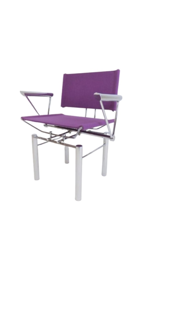
Thanks for the additional responses. It's been educational for me, allowing me to expand my thoughts on the subject. I asked about wall paint color because being no expert on modern interior design, I thought that there was a certain "post-modern aesthetic" that I should follow; at least for my post-modern room (the others are done in a warmer mid century modern). You know, like you shouldn't wear white after Labour Day, so maybe, you're not supposed to paint your walls in color (other than white), if you have a post-modern clinical room, as shown in the above picture with the Le Corbusiers everywhere. (I dont have Le Corbusiers in this room, but I have the same Kandinsky chair in that photo, and the sofa is pretty close to the LC). It didn't occur to me that the "paint squiggle" idea I threw out, for example, does not follow the post-modern or Bauhaus aesthetic, because of the curves.
I had seen documentaries on the Bauhaus institute, but never saw rooms with that kind of color - or perhaps I didn't notice that. So I guess this means that there are no hard and fast rules for what color the walls should be, whether we're talking about post-modern rooms or mid-century modern ones. In my post-modern room, my intention was to add color by way of accents, like paintings, rather than large spaces like walls. I was afraid that colored walls would upset the austere, minimalist environment I was trying to create with the furniture, and look amateurish. Otherwise it might end up looking like post-modern furniture in a victorian house - or someone just didn't bother to paint the walls when they moved in.
Olive: All that stuff about where the sun is coming in and the activities of the room dicating its color mood well.... the thing is, I don't really use the post-modern Bauhaus room, whether day or night. Only on a rare occasion when I want to watch a movie. But its the first room you see when someone enters, so I don't mind if it reminds one of a museum. I like modern art museums! That's why I wanted the (modern Bauhaus type) furniture to dictate what the walls and entire room looks like. Since the furniture is minimalist, it seemed to make the most sense that the walls be minimalist. Even if I were to color the walls in this room, I'm not sure what would work with the furniture, since its kind of sort of like the LC picture above - a room where the furniture, and even some paintings, is mostly absent of colors (other than black, grey, white, and some red).
Well, then...
if it's more of an art piece than a room for living in, to paraphrase LeCorbu, then by all means paint it what ever color you'd like. But I wouldn't necessarily opt for white, or grey walls. I'd say pick a piece of art that you particularly like in that room and find a color within it to pull onto the walls.
I'd pick something that will balance all the high contrast black/white/grey/red that you have going on. Flatted, or dulled colors, which are ones which are greyed down and softened from their primary hue would be good options to give the room a bit of balance. I'd head for the warm tones versus the cools, and pick a pale, faded tone of whatever you end up with.
Here's some ideas to chew on:
Ochres, really look good with black and red
Pumpkin tones, very dulled to avoid looking like Halloween
Greyed yellow-olive tones, like the color of olive leaves
Petrol or steel blues, yeah this one's a cool tone
Good luck...
Greeat ideas, thanks. I'm...
Greeat ideas, thanks. I'm recording all contributions here for future reference. Olive, aside from the colors you mentioned, all of which I like, what do you think about that burnt yellow in the picture above that WoodyWood posted (for my Bauhaus post-modern room)?

If you need any help, please contact us at – info@designaddict.com