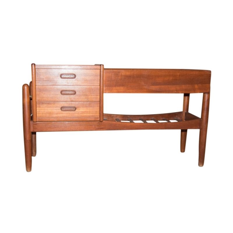
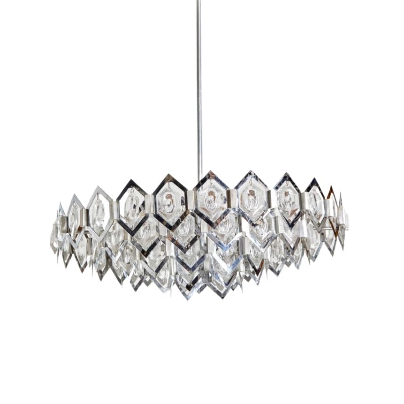
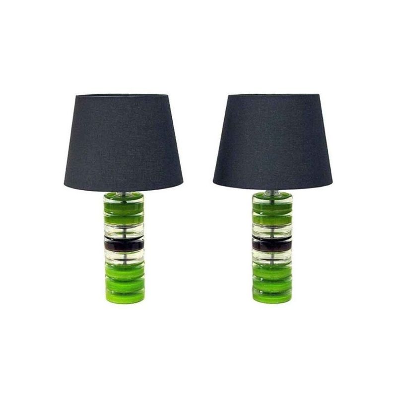
I'm thinking of painting my walls next summer, but not sure how to proceed. I would like to proceed in the "modern manner"! I have somewhat different styles in different rooms, but all the furniture is modern stuff. ie. Kitchen is mid-century modern (ie. 50's wood tones), bedroom 70's mid-century modern (again earth tones, mucho beiges/browns & white), living room is more like minimalist Bauhaus post-modern (mostly colder black/white/grey here). In which case, I read that colors are to be kept neutral in this kind of modern environment. Should this mean keeping the walls just plain white?
I'm not sure which direction to go in, but I know I want something that goes with my modernish decor; whether that means using color or just repainting all the walls plain white. I don't just want to use color (non-white) for the sake of using color. I'm open to any and all wall paint ideas. What is the norm for modern decors as far as wall paint is concerned, or is there one?
It does depend on your furniture and furnishings.....
For example, I have a red, orange and pink(!) fabric sofa and a blue and grey fabric on my Grasshopper chair and ottoman, as well as the Zebra fabric on my Aalto tank chair, so the walls stay white and carpet grey. I can't introduce and serious color to the wall, can I?
If your stuff is all neutral, then, by all means, add some color to your walls, but remember that too much wall color will stiffle and color you want to introduce to your furniture.
I'd rather keep the walls neutral and either furnish with color or get some cool colorful artwork!
I've used lots of color.
But i have seen neutral walls look fabulous.
I also have big bold vintage fabrics on some walls.
(The original owner was a textiles designer)
Maybe it is just personal taste though some houses just
dictate a need for color?
I'll see if i can find visual examples.
White walls = Dorm/Starter Apartment
plain white walls always equal a dorm room or a starter apartment to me. You can do a neutral that can be calm & restrained and still not-white.
I think the Bauhaus room especially should have color on the walls. Otherwise it ends up being a little too severe and like the lobby of a bank. Putting a color on the walls will immediately add a cozy, human touch to things.
The kitchen can handle brighter colors - yellows or blues. The bedroom could probably handle something a little cooler to contrast the warm wood tones. Primaries also can be brought in with soft furnishings, curtains, rugs, etc.
And worse case scenario - you paint something a bright color, hate it, and paint over it. A little work, but then at least you know what it looks like with a strong color.
go neutral
There is a wide range of neutral colors that can be very striking. Taupes and warm grays are nice, as are deep ivories and creams. Be sure to consider the natural light that your home gets as well as whatever artificial light you have.
Our main living area is a deep brownish taupe which looks really great with our framed art (mostly matted in various whites) and rosewood and oak furniture. The family room is papered in a wheat-colored paperweave grasscloth that is lighter and warmer but still very neutral.
I painted the upstair hallway a burnt orange which I love. I have some original comic strips by my brother hanging on the walls. It's just the right amount of the right color in the right place.
Thanks for the ideas guys,...
Thanks for the ideas guys, but I'm getting a lot of conflicting ideas, so still not sure which is the best way to go to maintain a "modern" approach to the color of the walls. Perhaps if I explain my goal, it'd help. In the neutral grey/white/black Bauhaus living room, I'd rather go for "style" than "warmness". My furniture makes a (modernist) statement, so I want my walls to make a similar statement, for the sake of consistency! Even if that means keeping them plain white. Consistency is what I'm after. Whatever color(s) is "normally" used for a neutral minimialist Bauhaus environment, that's the color I want! Some of the ideas I've bounced around for the Bauhaus room are: painting everything just a fresh coat of white, using slightly different shades of white 'artistically' (ex. a big white squiggle with a roller, over the background of white), painting two walls light grey, other two white.
For the MCM rooms (bedroom / kitchen), well the furniture is a bit different. The bedroom for example is just chock full of beiges, woods, white and tans (even the rug). The only color, really, are the paintings on the walls. As IKEA says, "beige is boring". So wouldn't neutral (which I assume means white or beige) just emphasize the lack of color in the room? Question in my mind is, is it better to keep the walls neutral here, in order to stay with "mid-century modern" design constraints, or add color (ie. green) as a contrast to the furnishings? I was even thinking orange for the kitchen, but I'm just not sure if this is in keeping with the modern style I wish to maintain throughout the apt. I tried to make my bathroom look like a hotel bathroom, so I really don't mind if it a room reminds people of a museum or bank! I've got a museum/banker type clock in the Bauhaus room, so why not.
Spanky: That burnt orange is a beautiful color. I could see that in the kitchen.
There
are many, many different whites you could start with
http://www.farrow-ball.com/productlist.aspx?cid=PC&language=en-GB
Figure out first what your goal is.
I guess I'm a little confused as to what you wish to accomplish. Is it your goal to have the house be a museum? There are lots of facets of modernism and it sounds like you haven't figured out exactly what you want to do.
I get that you have furniture that is important to you - but why does it need to be a 'statement'? And what is that statement? And if you're trying to be true to the Bauhaus aesthetic, why would you want to gum it up with a funny squiggle on the wall?
Just because BH furniture is a little severe doesn't mean that the entire aesthetic needs to be. One only has to look at the color work of Annie Albers or Gunta Stotzl (sp?) to see that vibrancy and color played important roles. Little gems like the Farnsworth house use wood tone as a color unto itself, and the Glass house utilizes the natural world surrounding it.
Below are some photos of an LC Building in Berlin, a link to LC's Villa La Roche, and a very clear example of bad Bauhaus furniture arrangement.
http://flickr.com/photos/fotofacade/393084056/
about "the bauhaus-room"...
When Klee and Kandinsky moved into the Master's Houses in Dessau they did not like the whiteness of the spaces designed by Gropius, so they decided to paint walls, details or ceilings in over 170 colors. There's no evidence Gropius hated them for that.
So if you like to make a statement, make one of your own. Just white walls and black classics will make your room look like a law-firm's lobby... (like Lucifersum's pic above)
Also remember they teached chromatics at the Bauhaus for a reason.
http://www.meisterhaeuser.de/en/bildarchiv.html
Using color...you risk being disappointed if you don't do your homework
I have always been of the opinion that your space itself should dictate your color selection process. The light coming in a room affects the color in the room as does neighboring rooms, the flooring and trim work and the furnishings themselves. Saying 'just paint it neutral' or 'paint it white' are overly simplified answers that can lead you to making choices that you end up not liking one little bit. To make a selection that you will be happy with follow the methodology of a color specialist, which goes like this...
First determine the direction of the light coming into the room, It is North, South, East or West? Second, does the daylight actually matter? If you use the room primarily at night the tone of the daylight is less important. But the type of light bulbs you will is IS important. From those points you can proceed to the next phase which is to determine the mood of the room. After that comes what activities will happen in the room.
Notice that we've not even mentioned color yet? I've written about this a lot on DA...search on color and you should find threads about thise where I explain color selection. If you can find it let me know and I can email you information directly.
If you need any help, please contact us at – info@designaddict.com


