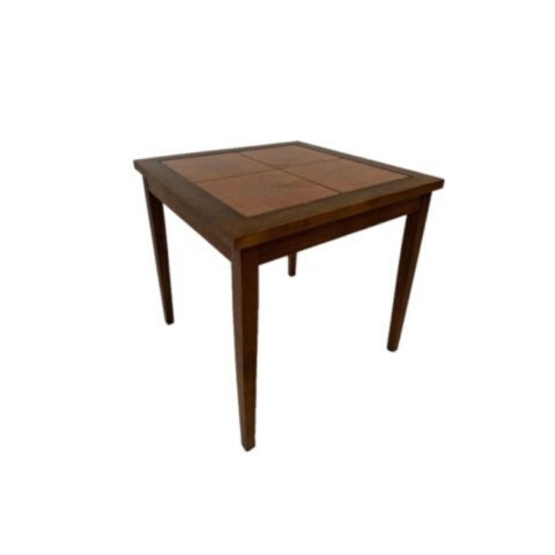
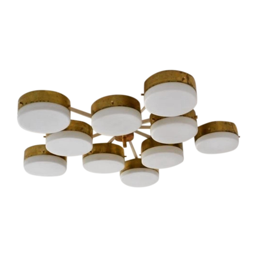
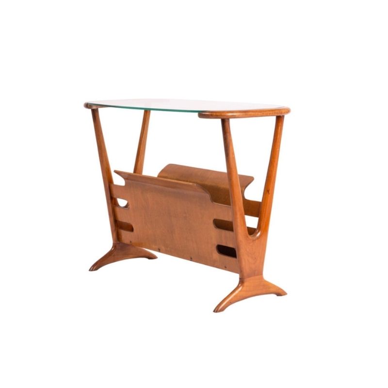
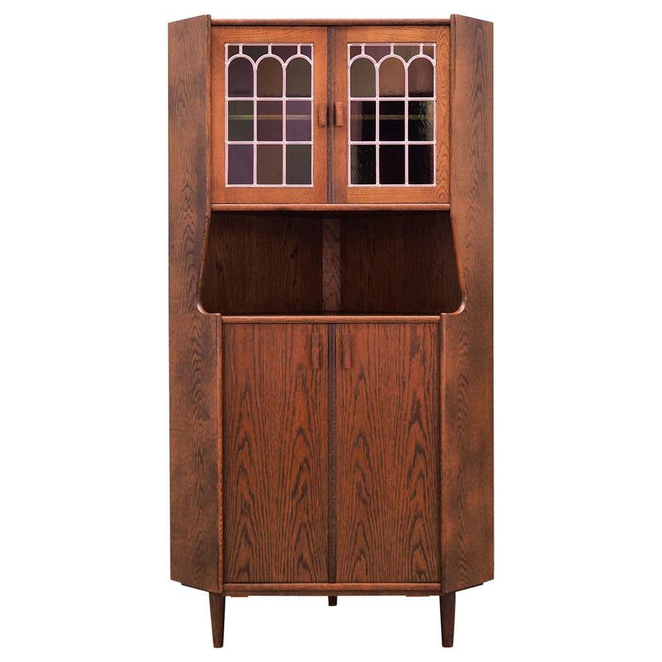
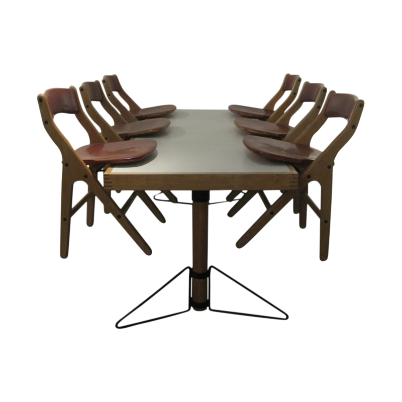
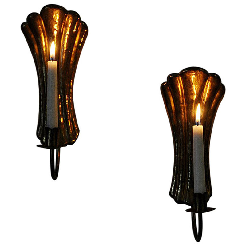
This is a color that I have begun to gget quite fond of...not hot oranges like the fruit but deeper burned ones that lean towards ochres. Since hubby and I have been visiting New Mexico a lot I've been seing tones of orange and greyed ochres that I am totally falling in love with in the landscape. My beloved greens are not so common out there but these soft rich oranges are everywhere.
I bought a cowhide rug for my living area and the fur is a deep chocolate that fades to a carameled orange-ish tone, it looks gorgeous again the maple floors and the grey sofa.
Excellent choice
Orange is a great color, esp. when complimented another color. As you pointed out, Grey. Contrast is wonderful! A friends wife painted their living room Orange and Grey. Like him, wasn't too enthusiastic about it at first...it eventually won us over.
Same color contrast as seen in Howard Miller clock hands. With one hand being white or grey.
I have a thing for orange vases. Like Kastrup by Holmegaard....even Haeger.
Orange sunsets can't be topped.
Often Teak woods have that wonderful deeply organic orange glow.
I recall seeing orange in the Knoll line...could be mistaken for shade of red.
All colors are great
Just for the record, since I made a fool of myself with the Puce thread (joke, mon), the house I bought has white walls and a breige-greyish oatmeal carpeting in the living room, dining room and back den.
It wasn't my color choice, but after moving out of a tiny, nasty, brown, ivory and beige house, I got to like the simplicity of the white and oatmeal tones.
Most of my ceramics are blue and orange (all Italian, mostly Bitossi).
The dining room furniture is a round Eames table with a greyish formica top and slightly darker grey border. The chairs I won on eBay are 4 EC-127 Eames metal leg chairs with the same greyish plastic backing and a nice blue hopsack wool upholstery. It all goes nicely.
Next year, I might introduce some color to the living room. I love all the colors, except, perhaps, yellow.
Orange
is an odd one
it arived in my world via the medium of fashion in 1997
I really felt it was a fashion 'flash in the pan'
But I was quickly proved wrong, and it crept into product, advertising and interiors with a vengeance
Here in Europe we had a telecommunications company form called Orange, and it was everywhere in graphics and interiors .
It was the death of red ..........
😉
http://www.google.co.uk/search?hl=en&q=orange&meta=
If you need any help, please contact us at – info@designaddict.com


