Design Addict

Cart

UPDATE PIX: Credenz...
 

UPDATE PIX: Credenza @ Dining  

  RSS

rogerdunn
(@rogerdunn)
Active Member
Joined: 10 years ago
Posts: 17
13/03/2015 11:32 am  

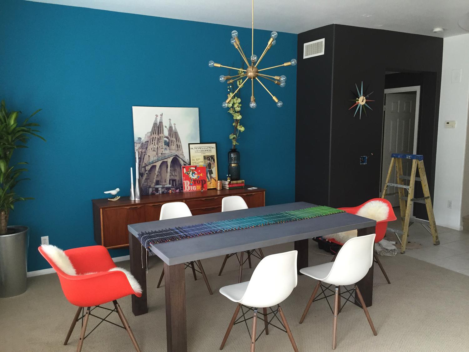
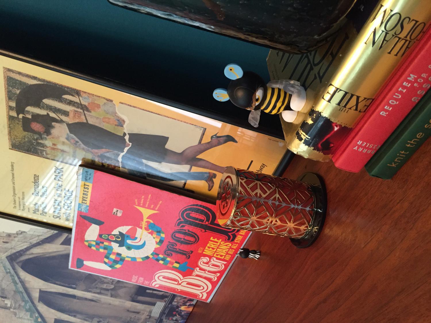
Hello everyone,Just wanted to post an update on what i have worked on these couple of months.   Finally got the last piece of the puzzle installed... a sputnik chandelier that i got from Etsy.com.  Also bought a credenza (circa 1969) also from a vendor at same website.  Got all my chairs from Herman Miller, which took 8 weeks + another 6 weeks cause two of the chairs i ordered had a clanking noise which they replaced and took extra time.So from our last discussion, we talked about either walnut legs on the chairs or the stainless steel one.  And i was so glad that i went with the walnut one.  It just made the space warmer and matched with all the other elements i had in the house.  As a result, i also went with a warmer tone sputnik chandelier in lieu of a raw steel finish.Took all your advises in mind and i decided not to hang anything on my teal colored wall and just leaned a couple fo artwork along with the walnut Danish credenza which i was very happy to acquire. Thanks to all... and here you go... 
<img class="wpforo-default-im


Quote
difeliciantonio
(@difeliciantonio)
Noble Member
Joined: 15 years ago
Posts: 291
14/03/2015 3:30 am  

Looks like a very nice space! The black wall is a little harsh for my taste.
Who makes the table runner? Looks almost like color pencils linked together


ReplyQuote
SDR
 SDR
(@sdr)
Illustrious Member
Joined: 15 years ago
Posts: 6462
14/03/2015 5:25 am  

Nice -- cozy and colorful.
If the black wall palls, perhaps the dark color of the table leg could be substituted ?  I've always favored brown and blue mixtures . . .


ReplyQuote
Spanky
(@spanky)
Illustrious Member
Joined: 6 years ago
Posts: 4376
14/03/2015 5:50 am  

Very nice!!
The walnut legs have more visual weight, which I think you need with that heavy table.  Good call.


ReplyQuote
rogerdunn
(@rogerdunn)
Active Member
Joined: 10 years ago
Posts: 17
14/03/2015 10:39 am  

Thanks to you all for your design inputs. As you remember i had different ideas on the teal wall but with your suggestions i went with a much more toned down version. 
 
The he table runner is by CB2.com. They are hand rolled colored paper by the blind from India. Love the color and how it ties my color scheme. 
 
The black wall actually is lighter in color. It's the lighting that madebit dark. It's a bit of dark chocolate brown/black. 
 
Here's a couple more pix. Enjoyed working on this room. Still work in progress but i am happy with it for now. Gotta move on to my next room 🙂


ReplyQuote
powbum
(@powbum)
Estimable Member
Joined: 15 years ago
Posts: 96
14/03/2015 4:20 pm  

looks great. I used chrome top bulbs in my starburst, like them, light is less harsh. also put it on a dimmer, don't like it, turns light yellow. have fun!


ReplyQuote
rogerdunn
(@rogerdunn)
Active Member
Joined: 10 years ago
Posts: 17
14/03/2015 5:59 pm  

Thanks i did install a dimmer. We like the yellow light effect :). The dimmer is a must for this light though. 


ReplyQuote
rogerdunn
(@rogerdunn)
Active Member
Joined: 10 years ago
Posts: 17
14/03/2015 6:02 pm  

I agree Spanky. I originally ordered the chrome legs and it was too skinny looking next to the table. Plus the wood gives it more character. 


ReplyQuote
Share:

If you need any help, please contact us at – info@designaddict.com

  
Working

Please Login or Register