Design Addict

Cart

Prouve EM Table and...
 

Prouve EM Table and Black wishbone chairs?  

Page 1 / 2
  RSS

NULL NULL
(@samdhayesgmail-com)
Eminent Member
Joined: 6 years ago
Posts: 31
29/03/2009 10:08 am  

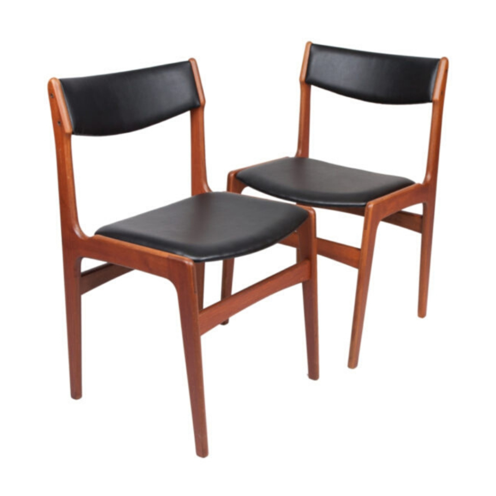
Would these two go well together??? Black and birch prouve em table and black wishbone table??? Thanks


Quote
azurechicken (USA)
(@azurechicken-usa)
Illustrious Member
Joined: 15 years ago
Posts: 1966
29/03/2009 11:25 am  

.
great looks good...


ReplyQuote
chewbacca rug (USA)
(@chewbacca-rug-usa)
Noble Member
Joined: 15 years ago
Posts: 230
29/03/2009 11:36 am  

nice selection.....
those would look great together..... go for it !


ReplyQuote
Lunchbox
(@lunchbox)
Illustrious Member
Joined: 15 years ago
Posts: 1208
29/03/2009 12:03 pm  

I'm jealous.
I'm jealous.


ReplyQuote
Robert Leach
(@robertleach1960yahoo-co-uk)
Illustrious Member
Joined: 6 years ago
Posts: 3212
29/03/2009 2:07 pm  

Dream Combo !
.


ReplyQuote
rockland
(@rockland)
Illustrious Member
Joined: 15 years ago
Posts: 984
29/03/2009 5:22 pm  

Or the Beech in soap treatment?
Nice pairing either way.


ReplyQuote
LuciferSum
(@lucifersum)
Illustrious Member
Joined: 15 years ago
Posts: 1874
29/03/2009 8:31 pm  

I'm with Rockland
Black lacquer might be a little heavy. I like the fresher all/natural look.


ReplyQuote
benedicth
(@benedicth)
Active Member
Joined: 15 years ago
Posts: 14
30/03/2009 6:24 am  

Too much black
It depends on how imposing a look you want and how light (natural light and decor) the room is where the table and chairs are going to be. If the room is neither very large nor very light, I expect the effect might be rather too dark, and the look will be imposing in any room.
To coordinate the table and chairs in a more quiet manner, you might want to go for Wishbone chairs with black cord seats and a plain wood frame that matches the Prouvé table's surface. To my mind the black cord seat on the Wishbone chair often looks better anyhow.


ReplyQuote
Lunchbox
(@lunchbox)
Illustrious Member
Joined: 15 years ago
Posts: 1208
30/03/2009 6:46 am  

I like the black...
Much more formal pairing with the ebonized chairs.


ReplyQuote
SDR
 SDR
(@sdr)
Illustrious Member
Joined: 15 years ago
Posts: 6462
30/03/2009 9:35 am  

Guess I'm
just old-fashioned -- but isn't this the correct chair (and a better aesthetic match) for the table ?
I really think the forms of the Wegner chair -- and the design philosophy, the "soul" ? -- are at odds with the Prouvé table. But maybe "obvious" is too. . .obvious ?


ReplyQuote
Lunchbox
(@lunchbox)
Illustrious Member
Joined: 15 years ago
Posts: 1208
30/03/2009 9:40 am  

Agreed, SDR...
Although I'd prefer natural seat and back on black frame. Even more obvious...


ReplyQuote
SDR
 SDR
(@sdr)
Illustrious Member
Joined: 15 years ago
Posts: 6462
30/03/2009 10:06 am  

Yes
surely. The illustrations I found make it appear that this would have to be a custom order. . .oddly. Well worth it for the effect, though !
Another issue with mix-and-match from different manufacturers (and in different materials), like the originally-proposed pairing, is that there are almost as many blacks as whites, out there -- and different sheens and textures, obviously.


ReplyQuote
azurechicken (USA)
(@azurechicken-usa)
Illustrious Member
Joined: 15 years ago
Posts: 1966
30/03/2009 10:53 am  

REALLY
The world is still too matchy poo as it is.I think the first idea is the best: two blond flat planes.The support is black in both cases.Wegner chair curves play nicely against the angularity of the table.But now we have a huge upsurge of the everything must NOT match school of design...vincente wolf look for example...


ReplyQuote
SDR
 SDR
(@sdr)
Illustrious Member
Joined: 15 years ago
Posts: 6462
30/03/2009 12:13 pm  

People get bored
I suppose, even with perfection.
For decades I've been disheartened with the constant rehashing of auto body designs, merely to have something "different" to sell each year or two. Detroit led the way, and now the Japanese do it too. The problem is that the designers do their best with the initial offering -- and then the sales division says "change it" in subsequent years, so the stylists have to try to improve on their work, and inevitably make worse what they had already accomplished.
All things go in cycles, so if "too perfect" (i.e., matching and coordinated) is out now, it will be back. It's hard to argue that both are equally valid design strategies, if you ask me. "So bad it's good" ? Sorry, I don't buy it !
Of course, I don't mean I've never seen an "assorted" room that I liked. (Almost) anything can be done well, or poorly. But, given the choice, would you want six different chairs around a table (for instance), or a set that matched ?


ReplyQuote
NULL NULL
(@sockmonkeygirlgmail-com)
Noble Member
Joined: 6 years ago
Posts: 249
30/03/2009 10:25 pm  

...
I don't like Matchy poo either, but I agree with SDR on this one. The flat back just looks better with this table. Wegners chair has beautiful curves but I just don't see it as a prefect match. Well that is just me and my eyes. I'm wondering what it would look like with some ghost chairs. Hmmm.


ReplyQuote
Page 1 / 2
Share:

If you need any help, please contact us at – info@designaddict.com

  
Working

Please Login or Register