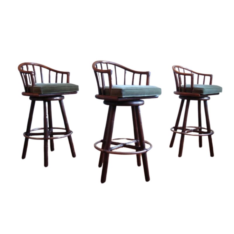
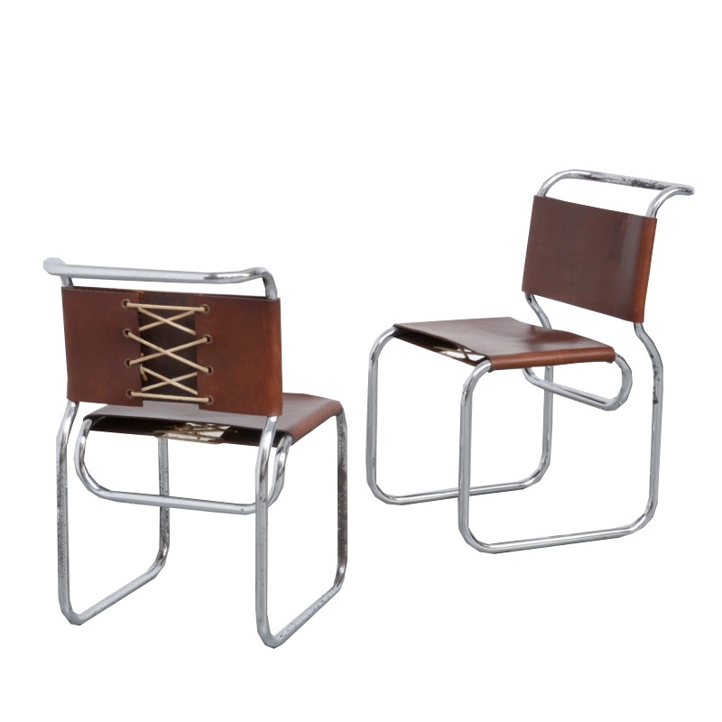
I mean Throwback. The ads are stupid, but the furniture's nice.
Who said?
Who said that advertising is always a poor thing?
There are other ways/directions that could be smart and interesting.
Brent, thanks for sharing
In the store, as once I said, we work with ad. agencies who makes commercial TV ads (the worst or dirty quick work as they say), as well as Tv series and Films (i.e.:Coppola is living/working here now).
Most of them are professionals from different areas, and all work together for the same end, each one with his design/profesion/side. Many of them come from UBA (Universidad de Buenos Aires) from Desing Building (With the careers: architecture/Textiles:Fabrics/Cinema/Graphis/Industrial Design )
All the furniture and objects, colours, clothes, etc. are selected very carefully, and goes in order with specific idea of the product (in case of a TV commercial ad) as well as any object in any film set.
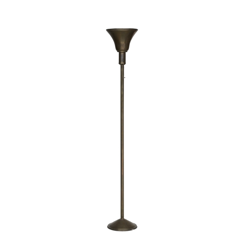
we rent and/or design and produce different objects, some are generic and some are for specific films with specific ideas. (IE: Lamps for diet-systems couldn't be fat. How would you design a lamp for slim-ads?)
Although don't have much time for tv, That's provably why I enjoy many tv ads. Try to detect each object in each ad, where it comes from (Where it have been rented? some professional friend perhaps?) and the connection between the object and the product, they also reflects social interests and subliminal popular ideas and future trends.
That's why I wanted to ask you, and didn't know how...
I notice that in last years the trend was going to simpler and simpler things. That's in clear contrast with 90's ads with everything perfect and such a glamour.
As here in South America, in 90's and now there are very different paradigm, I see that they are very clear reflected in ads, and it's perfectly understandable.
Before seeing pepsi ad, I also suspected that all DArs see retro or non-glamorous ads on tv. Why?, how do you read that?
In Pepsi Throwback. Happens the same. The face of the blue shirt guy's face.... says everything.
Barry, I couldn't find the commercial for Laughing Cow cheese still intrigued searching. 🙂
Gancia Magnetism
Here is Gancia Magnetismo. A two years old ad that I liked at the moment, and wanted to share it.
By the way some lamps are our, as the two globes tower lamps beside the shop window at the cafe, was the first time we rented them just a two days after we finished them.
As I searched Gancia is here a very popular drink as in Italy, but not much in other places, perhaps you don't know it.
http://www.landia.com/directores/andy-fogwill/view/?p=gancia%20magnetismo
Provocame
Provocame, by Chayanne, it's suppose to be a song that's not good music, not for man.
"esta musica la escucha mi tia, que somos mi tia?"
My aunt listen this music, What we are? my anut?
I also like the "casual" mix of ordinary furniture-design stuff (blue ant chair, eams cahir, and many etc), and I just realize 5 minutes ago had one or two of my lamps too 🙂
I insist on the less glamour more everyday-casual way of commercials today.
Searching for this, I also didn't realize before how much sex-sexy are most of them. (To answer this as well as the sex-and design thread)
http://www.youtube.com/watch?v=wRSZ-jg5WYY&feature=related
Addition (part 2) and Provocame on Florida Street
Addition (part2)
It seem this addition was thinking on girls...
http://www.youtube.com/watch?v=I5IluaKISIA&feature=related
Provocame on Florida Street
And I learned that this is call "mod",
it's on Florida Street, main street (pedestrian):
http://www.youtube.com/watch?v=cNY0q747I7w&feature=related
Ikea
At least they could have good commercials 😉
http://www.youtube.com/watch?v=K-mSwqes_p8&feature=related
If you need any help, please contact us at – info@designaddict.com


