..Some ideas would be cool, I'm hoping to freshen up the site a little as I've had the same design now for a couple of years and fancy a mini overhaul.
Comments, suggestions, what you'd like to see etc would be most appreciated!
wow, you have some really...
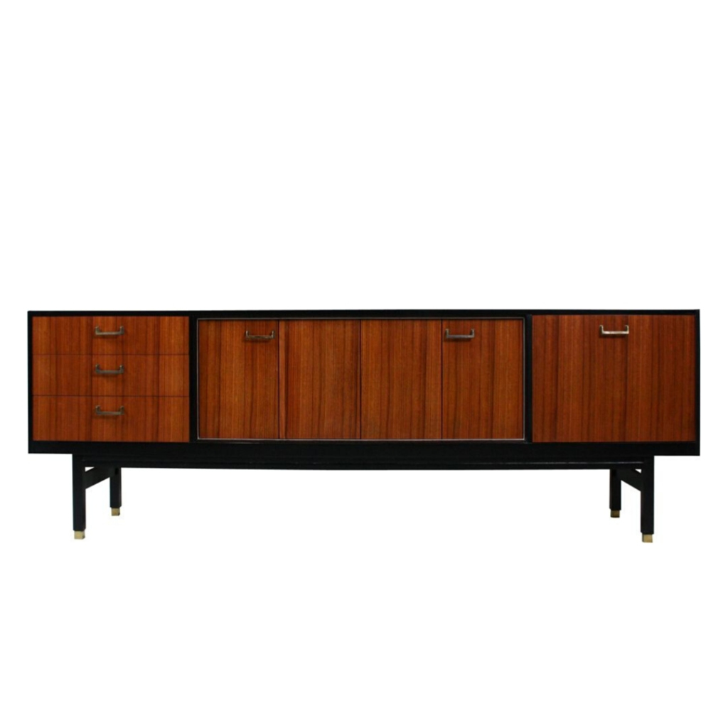
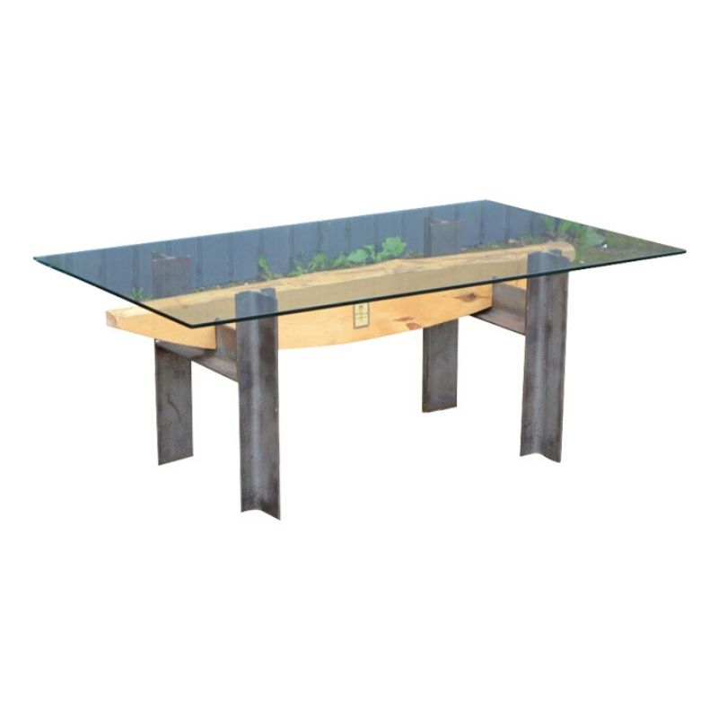
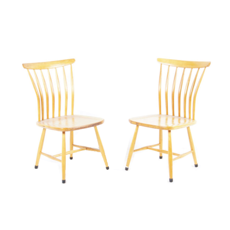
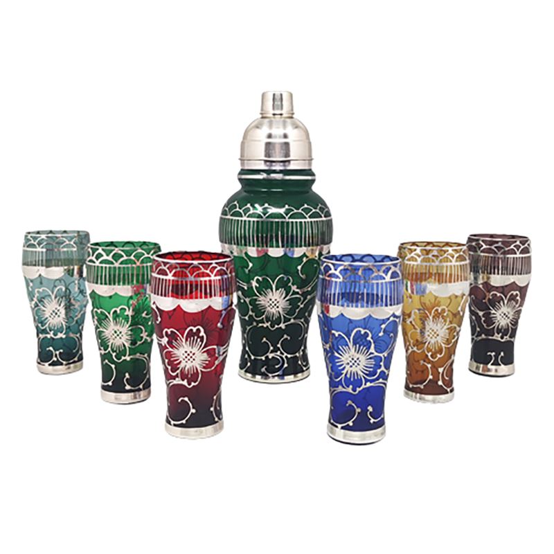
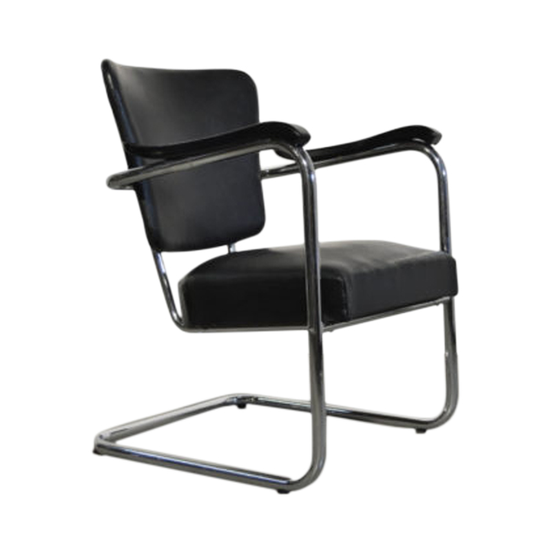
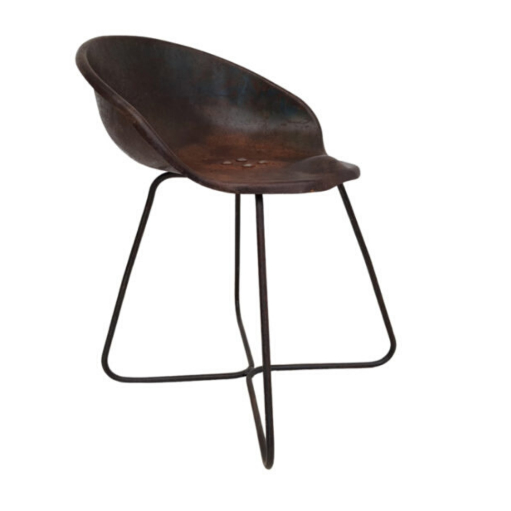
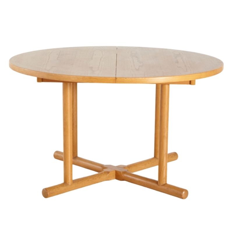
wow, you have some really good pieces there but I think your photography is letting you down a bit, even just a 3MP point and shoot with good light and clean background can look quite good.
I like the Braun "50 years of design" website lately, just for the look of it, the structure wouldn't suit and this one whilst far from perfect avoids the common orange and brown colour scheme.
http://www.mondotrasho.com.au/
If you need any help, please contact us at – info@designaddict.com


