I actually have no problem
with that. I doubt Arne Jacobsen was that specific. As long as they're keeping the same quality style, what's the difference?
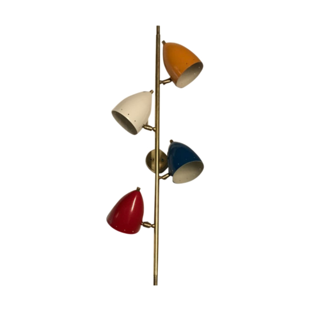
Are these lamps supposted to be vintage antique or should they move with the times?
People like more colorful desk lamps, these days.
Better than
Better than removing colors ala Eames shell chairs. It would also be different if colors were being changed on someone solely attuned to color theory - Josep Albers, say, or creating new colorways for Gunta Stoltzl.
Jacobsen was fairly specific in the colors he choose - for specific installations. I doubt he would object to different colors for his objects outside his installations - like the Egg chairs in various shades.
I also like the colors.
But that's beside the point of the question.
I don't know how specific Arne Jacobsen was in this case. I do know he was specific about the number of legs on the Ant chair. That didn't stop Fritz Hansen from going against his specifications after his death. If we ignore for a moment that the manufacturers are primarily in it for the money, was that move evolutionary or disrespectful?
I am not saying colors and finishes are the same thing, but where do you draw the line? Is the only constraint that the product solve the problem it was designed for? And how is removing colors worse than adding? The designer approved neither.
I don't know. I do like a liberal approach whenever appropriate, but I am not a designer.
Barry, these were announced last week. Preorders only for now. I don't think they ship until March or April.
Thanks, Gustav
OK, here's my take on the deal; Louis Poulsen is a careful, well run company with a good reputation. When they make a decision like this, they know what they're doing, especially considering that they made all of these lamps from the get-go.
As long as the three original colors remain available, I don't see any big issue.
.
Generally, I think I would prefer a classic white or black over the new available colors, but they don't bother me. I do hope that they will make it clear in the brochures and other documention which colors are "original architects pick" versus "later offered colors" though. I think it's great if you can still reconstruct later what the original vision of the designer was - it gives you a better understanding of what was made in what context. And it still leaves you the choice what you want to buy - but why not simply credit the persons who made the choices ?
Alternatively, I like it best when later changes/ additions are in line with what the designer himself would have liked. For instance, if an additional new green color would be added to the flower pot range, great ! I don't think Vernon would have minded- he seemed to enjoy a bright room, and might have added a new green himself if he still lived now.
In that vein, I like the new left color of the AJ lamp, but not so much the bright -ish red and blue: it seemed like AJ never picked any bright colored fixtures in any of his interiors (at least, that is what I remember from Oxford, and from seeing the pictures of the SAS hotel and that other restaurant).
But it's not that bad, think for instance of that lovely Kjaerholm table in clear glass: say for instance Kartell would issue a plastic fluor pink laced etched table top for it *shudder*
http://www.flickr.com/photos/81508516@N00/sets/72157602119441144/
If you need any help, please contact us at – info@designaddict.com


