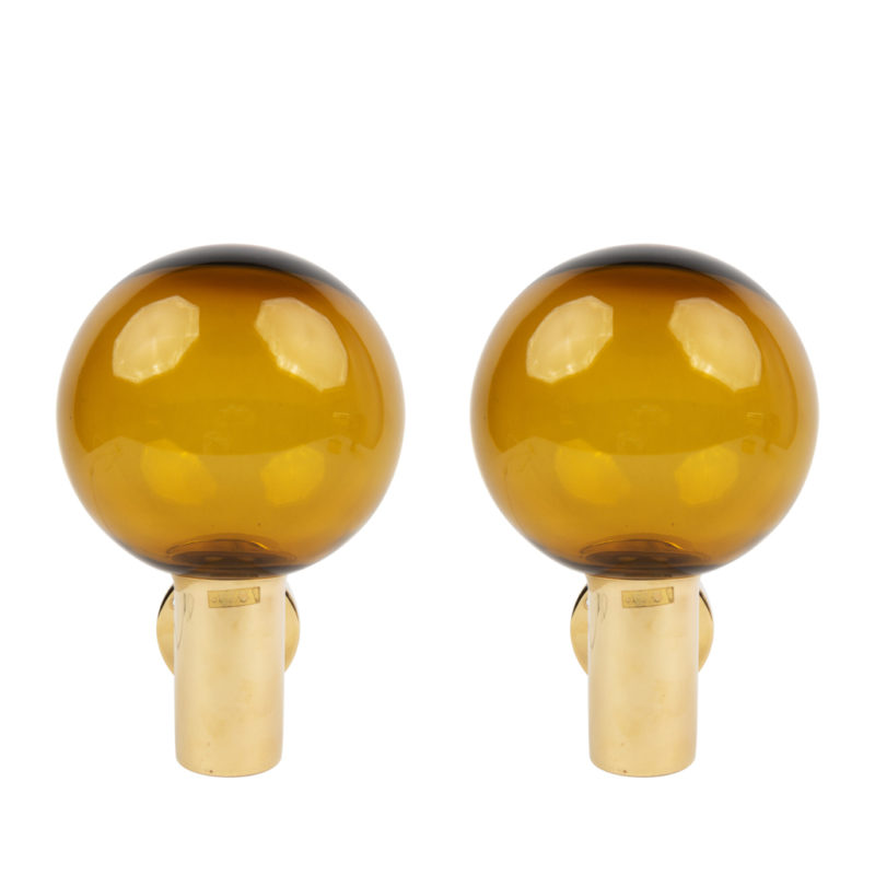
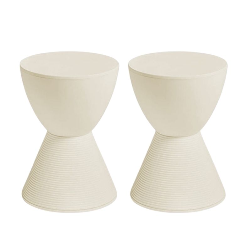
There is a lot of talk about vintage designs (understandably) here on Design Addict. Are there any new designs that you are impressed with?
a few of mine:
1. Facett by the Bouroullec Brothers

2. Bourgie Lamp by Ferruccio Laviani
http://momastore.org/webapp/wcs/stores/servlet/ProductDisplay?catalogId=10001&storeId=10001&productId=31998&categoryId=10262&langId=-1
3. TOGO by Michael Ducaroy
http://www.ligne-roset-usa.com/products/sofas/togo.htm
Sorry about the links. Can you put multiple links on the provided link bar?
Let me respond to what you linked...PT I
Bouroullec: a "qualified yes" to the furniture and a cool "it works/it doesnn't work" to the juxtaposition of it with the vintage space.
First, consider the Bouroullec furniture. While in some respects retro modern, the forms remind me most of the current sliced baloney Cadillacs, which are themselves references to the stealth aesthetics of F117s. I find this look authentic to the times, though I wish the times were different. Color choices for the furniture are unecessarily retro IMHO. They mistakenly link this look to retro modern when it ought to be linked to contempo stealth tech. Doing so would sharpen the juxtaposition of the furniture with the room, which is apparently the designer's intent. I fancy the way the ottoman fits with the chairs to form a chaise, or as a detached ottoman, or as a freestanding stool. And I like furniture that has a sculptural quality to it. However, having been infected by koen's and other's insistence on practical function for things like easy chairs (at least), I think angle of fit between chair and ottoman would make it rather impractical for use as a detached ottoman, unless it were turned 360 to the chair (otherwise where do the legs go getting in and out?) and then the lines and massing might look wrong and the top surface angle would be all wrong for lounging, too. Nevertheless, I've been waiting for someone to do furniture like this for awhile. Maybe others have done it and I don't know about it. The biggest problem I see with the look of the furniture, is that Cadillac's had it for 3-4 years now. It may already be slipping behind the curve of the moment and it does not seem to me to be the kind of furniture I'm going to want to live with for 30 years. FWIW, Contempo Stealth Tech style was appropo when USA was the unchallenged superpower after Gulf War I. But as Gulf War II drags on and China's productivity dwarfs that of my beloved country, and Hugo Chavez taunts my selected President as the silver spoon bully in the school yard that he apparently is, Contempo Stealth Tech maybe day old bread, not freshly sliced salami ready for a rightous baguette, or even some rye.
Let me respond to what you linked...PT 2
Now, about the new/old juxtaposition of the Contempo Stealth Tech furniture with the old look room. Juxtapostion always works as a technique to call attention to the arrival of something new, but that is not the same as good design. Here's my basic problem with this juxtaposition, at least today. Its become cliche, regardless of how "now and nutty" the Bouroullec Bros intend its message. Three quarters of a century ago, modernists began making a virtue of the shock of the new by consciously juxtaposing modernist forms with legacy surroundings. And it shocked. And it jarred. And it worked, despite wrecking the harmony of alot of fine old neighborhoods and interiors. And it was authentic the first time around. But then the post modernists inverted the trick by putting shockingly (for a brief time) ironic legacy ornamentation on modernist forms and shock soon ceased to shock and became rather esoteric and allegorical in its effect. Complexity and contradiction are good, to paraphrase Bobby the V, but commentary can quickly get boring, or even pedantic in design. FWIW, I can never really forgive I.M. Pei for ruining the design integrity of the Louvre with those dumb glass pyramids, the effect of which is now as outdated and stale as the original Louvre was satisfyingly right. Given the enormity of the cultural legacy that was the Louvre, turning Pei loose on it was akin to giving Michael Graves a chance to put peanuts on the Great Pyramid as part of mixed use up grade of Ghiza, but I digress. The postmodernism stuff subsided and now here we are in a retro modern cycle and now the Bouroullec bros are taking the retro schtick all the way to recycling the shock-of-the-new juxtoposition. I don't know. It just doesn't work. Color combos are right. The room hangs together at best contrapuntally. I get the message. The juxtaposition shows the brothers studied some modernism and post modernism at school and are aware that at least something vague happened before then. But its not really new and I guess that's the brother's message here.
Let me respond to what you linked...PT 3
The Bouroullec brothers appear to be commenting that even the shock of the new is old now. Is this the sign of an exhausted civilization, or what? This is what I suspect koen and others around this site are hinting at from time to time; that there must be a deeper stratum, or better yet a deeper root, that design must tap into to resume its rejuvenating dynamism and functional relevance in our lives. If even the shock of the new is old, then this husk of a western civilization needs designers to dig deeper than the modernists to reconnect it to its living cultural roots. Remember the modernists basically connected back to the formalism of classical antiquity. And the Florentine renaissance designers/artists prided themselves on connecting back into classical antiquity too to jump-start their moribund (to them) middle ages legacy. Yep, I think contemporary designers are going to have to go back farther than the 1950s-1960s to find the root system that is life giving. Venturi, god bless him, went back to Florence, at least, but as we've learned with Post Modernism, it wasn't far enough, or deep enough. When then?
Let me respond to what you linked...PT 4
Given science's progress at pushing back the beginning of the birth of the universe, and its remarkable exploration of the ancient light of the universe itself that reaches us today from billions or trillions of years ago, perhaps it is time for designers to go back beyond classical antiquity for inspiration. Is there another older ur-culture of the west? If not, perhaps it is time to begin to look at the structure and dynamism of the universe itself for fresh forms that can recharge this western civilization that lies in a ditch now being raped by war mongers and thieves and oligarchs. That the universe juxtaposes old and new is true, but it also offers up a magnificiently unfolding legacy quality to it, too. True, it is full of complexity and quantum contradiction. But it also has Einsteinian constants like light speed (at least outside of black holes) and the persisting Newtonian relationships between masses in motion. Local star and planet forms turn out to exist ubiquitously from here to eternity. Space appears infinite in all directions to crib from Freeman Dyson, and yet it has limits without bounds, to crib from Stephen Hawkings. Perhaps I am dreaming here. Perhaps no design genius can take us back to a live root starting further back than classical antiquity. Perhaps society has dumbed people down too much to be reenlivened now. But I still think it is possible; that one can and that one will one day. And I think it is necessary. The collosally pointless barbarism of Gitmo, Abu Ghraib, and Fallujah--committed by USA and UK--two lights of the west--warns that the enlightenment of the west flickers. Design can't save a civilization, but design can help reawaken a civilization's desire to save itself.
Re Bourgie: its different, but so are random mutations of HIV. I don't want either.
Re Ducaroy: this seems perfectly designed for the aparments of college basketball players and no one else.
In closing, let me switch metaphors a moment. Someone out there design us a river flowing from as far back as one must to resuscitate the culture's life force. Dont' think globally or locally, modern or post modern. Think eternally; that is where the life force springs from. I am convinced of it.
P.S.: When I find a link to something new and worthy I will post it. I still like Grgich's (sp?) chair alot. It aspires to the universe, I think, intentionally or not. Practical? Not. On one of many possible right tracks? Yes.
DCW-
I do love your...
DCW-
I do love your long-winded rants. They are very interesting, although you do lose me on some points.
I do think comparing a lamp to HIV is a little insensitive, however.
That aside - Let me tell you the perspective I am coming from.
I am a young songwriter/musician/graphic designer who as been interested in architecture/design for about 5 or 6 years. Now that I have lived with the typical Eames/Knoll/case study program obsession for a while I have been letting my head turn in other directions. I think it is a natural cycle. So this traditional old world meets modern contradiction is a newer concept to me. My interest in it has been bubbling up for the last 2 or 3 years. Seeing designs like this have quenched my aesthetic thirst for this type of design. While it may be tired and old in relation to design in general, it seems fresh enough to me. I can see how it might be day old bread being that I am aware of some of its retro orgins, but I didn't realize it was as old as it is. I think it is okay for young designers like the Bouroullec brothers to design for a younger generation who has not experienced these design concepts firsthand. I believe their talent will make it possible for them to eventually get closer to the kind of statement you are asking for. Perhaps when they are old and gray and even more knowledgeable.
Now that I know your stance on this type of design it is obvious to me that you would like neither the TOGO or the lamp I chose. The lamp is obviously meant to be a clever mix of old and new. I don't agree with your statements about the TOGO. With some imagination it could be very interesting as a part of a much more formal and elegant room setting. Again that is the same contradiction you are weary of. Either way the TOGO was my last choice in this series of 3 that I chose. I much prefer the Bouroullec's Facett.
Are we
in any danger of confusing the furniture, with the setting that was chosen -- for this photo session, ayway -- to display it ? Are we saying the furniture must have been designed for this kind of setting, and as the designer's intentions are sacrosanct, we can only consider the furniture in this context ?
Or have I mistaken the thrust of your comments. . .
SDR, I certainly leaped to the conclusion that...
the furniture and the setting were coordinated to create the look that results. It never occurred to me that a designer would intentionally showcase his furniture in a room it didn't go well with. I stand corrected, if the designer was on a shoestring budget and had to put it in the first flat that was handy. I do find this improbable though, don't you?
Also, I apologize for the quality of caustic criticsim. Its something I try to avoid and failed at this time.
Frankly, I think this furntiure of the Bouroullec Brothers shows considerable talent and skill, has a few practical flaws, and becomes less than it could be if the furniture IS meant to go with vintage spaces like the one in which it is pictured.
Likewise, I apologize for the caustic language used in expressing my thoughts about the Bourgie lamp. All I should have said was: it doesn't work. Isn't that the ultimate hammer?
Regarding the Ducaroy furniture, what can I say? I really do see it as sofas and chairs designed for slouching over the way college jocks like to sit on furniture and play the XBOX. I just don't see it as a furniture line that works for adult spaces.
Regardless, the point I tried to make still stands: none of these designers is IMHO digging deep enough into the marrow of western civilization and its forms to revitalize our sensibilities, or even appears to be trying to do so.
I hope
TOGO is comfortable. . .
The "overstuffed" upholstered pieces of the past were sometimes the most comfortable seating in the house. It's too bad that appearance and comfort are not at all necessarily linked.
I'm thinking there's a lot of life yet in the Cadillac - Grcic crisp/angled/expressionist school; I think there's a lot still to be done in that vein, in a number of object types. Of course, like anything else, it will eventually pall -- and we'll return to good ol' Modern again, while awaiting the next swing/craze.
Just don't try to sell me an (American) Ford Focus. . .!
DC
I agree that all these peices could be more than they are (and am not defending any of them) --which was I guess the point of whitespikes initial post. post. And I certainly agree that the placing of the Facett pieces in that setting might be a distraction from whatever qualities they might have.
I just think that new pieces keep appearing all the time, and that some of them have more promise than others, and some seem to be developments of previous design ideas while occasionally something really new comes along -- though I haven't been "keeping up" enough to readily name examples of either category.
Guess I'm just blabbing -- do carry on.
I have seen that. I like the...
I have seen that. I like the aesthetics of it, but I don't know how practical it is.
I also like some of Marcel Wanders' work. Although some of it is a little OTT for me.
http://www.marcelwanders.com/
Bouroullec
Definetely the Bouroullec brothers are one of the best contemporaries.The after post moderns
I see though a more than huge influence from Jasper Morrison and the way he interprets the contemporary furniture lanquage to something like a minimal post modernism (whatever...)
And a clear reference in cappellini's icons (kuramata,Schwan , even mendini)
If you need any help, please contact us at – info@designaddict.com


