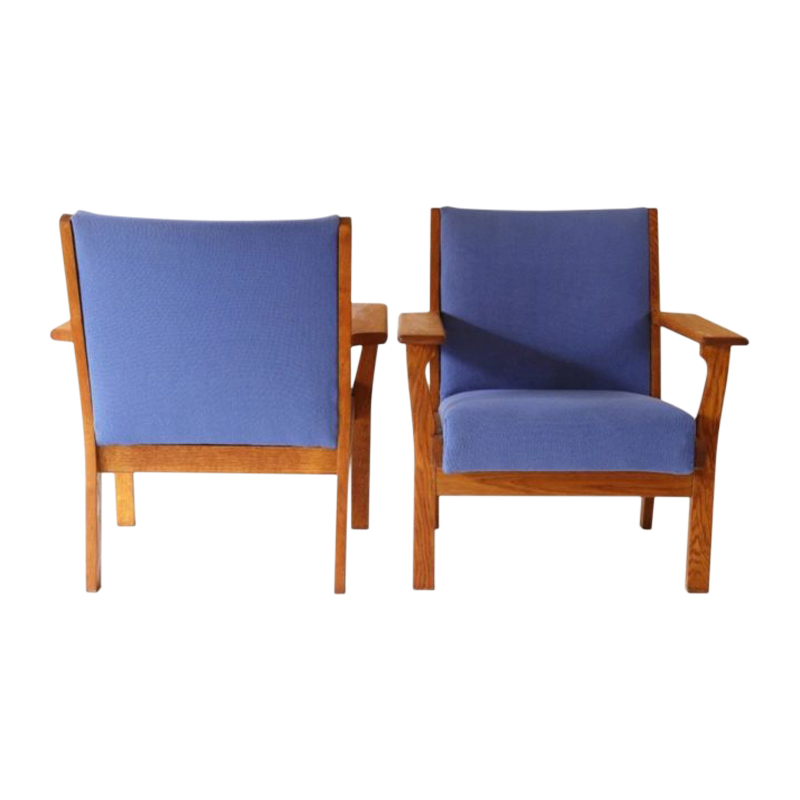
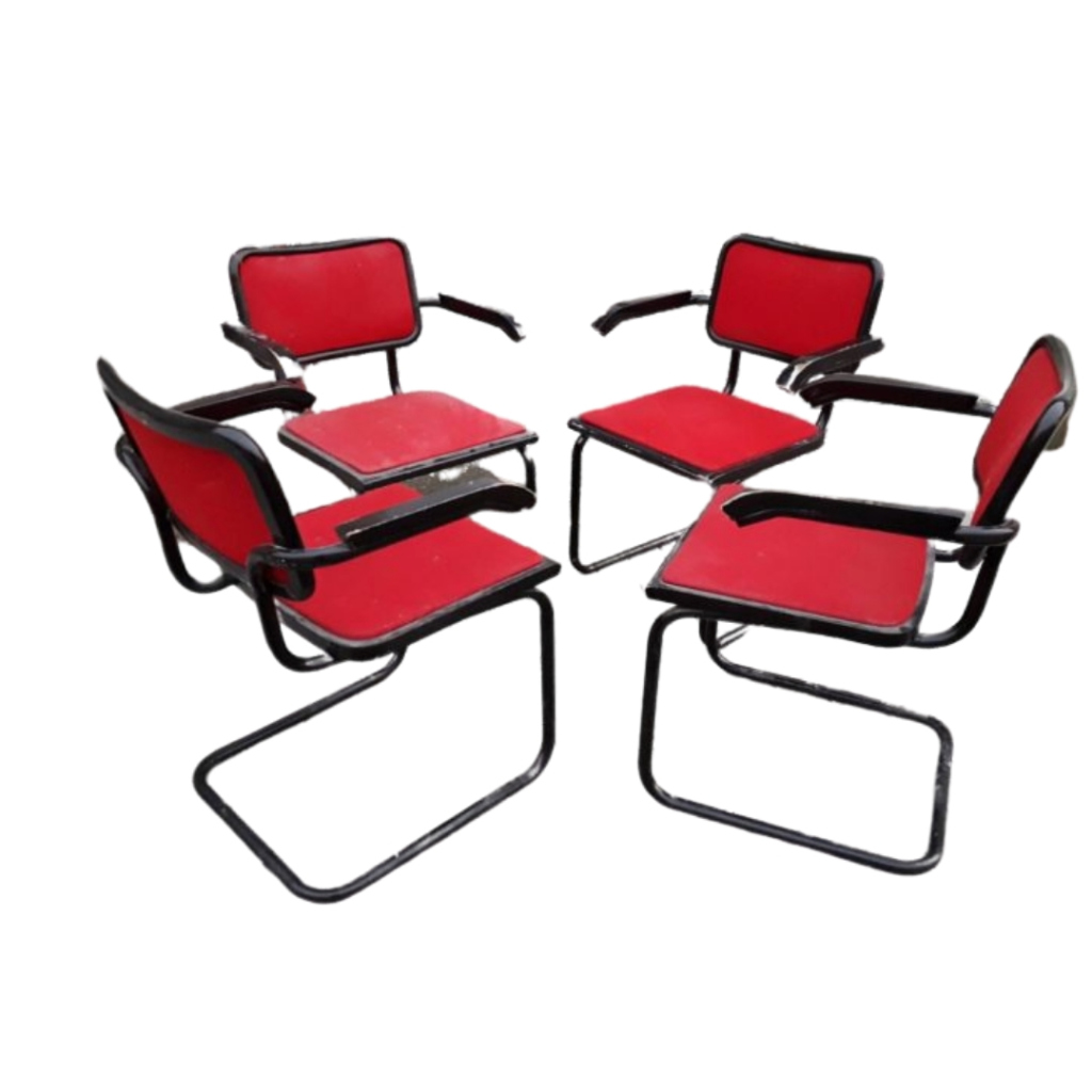
Check out this fine piece of history. It's clunky wooden legs make the design so much better. George Nelson only wishes he could exude this level of proportion and color.
Perfection
That's awesome, Whitespike... I've always felt the early Nelson chair was too light and sterile, yet this version has weight and warm emotional appeal. The legs say "here to stay," whereas Nelson's first draft always seemed somehow distant, impermanent. Good job finding this. It's really perfect.
Did you mean from Lunchbox,...
Did you mean from Lunchbox, or from Brent, paulanna? I don't see irony in the Lunchbox comment, but would have maybe if he'd just written "right" sans the addition. And the comment from Brent I guess seems possibly more cagey or satirical than ironic to me, engaging nonetheless. I'm dense when it comes to all things postmodern, especially irony and satire. Cleanup on aisle five: failure of irony.
Perhaps the Lunchbox comment was a failure to recognize irony in the initial post, but I doubt it. More likely it was/is a minor issue with execution, or, ah ha, I now see/saw - as you say and/or said - a failure of irony.
If you need any help, please contact us at – info@designaddict.com


