What's wrong with this picture: Rosie O'Donnell's Crafty U for Simon & Schuster (signed copy). Not mid-century and probably wrong in any century.
I do my best to remember Rosie O'Donnell was excellent in A League of Their Own. I also like signed books. I was compelled to pay the 90¢. The growth of colorful lime deposits on charcoal briquettes seemed to be a good project...
This is a little earlier than mid-century but I see elements of it in there. It's a page from a Danish song book for children, c. 1910. I got it on Etsy because I loved the composition and the colors. I'll stick it in a nice frame and it will go on my the wall somewhere eventually.
The one of the runaway cookie is from the same book. I found them when I was searching for "danish toy soldier" ---another page that has since been sold was a really great illlustration of little soldiers marching off to battle, I guess---very reminiscent of Bojesen soldiers. I almost got that one but then I saw the boat picture.

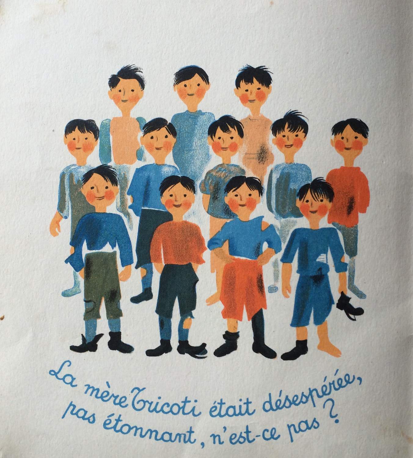
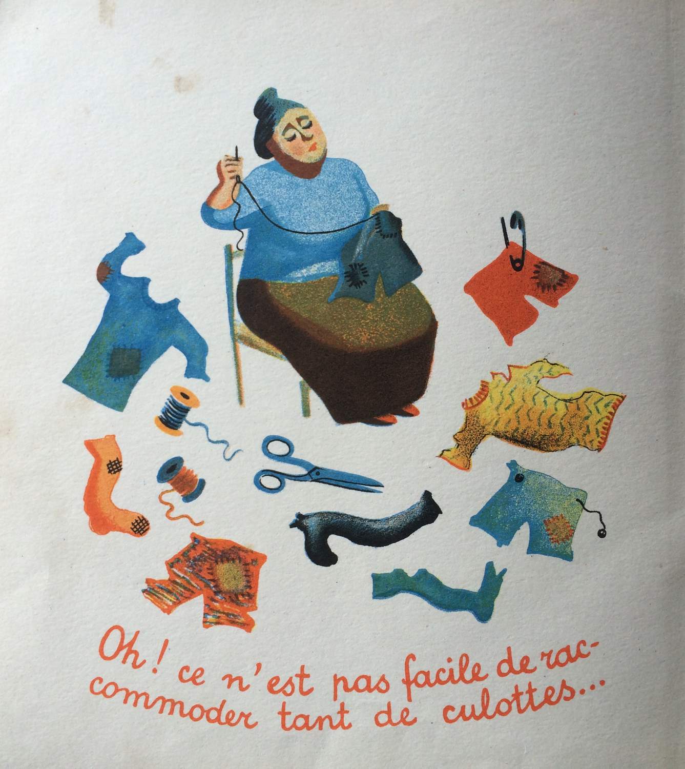
Mid-Century was a prolific period for furniture and product design but not only. We are currently rediscovering the world of twentieth century graphic designers. Especially children's book illustrators.
Here is an example: The title of this book in French is « Très grand et tout petit » published by Editions des deux coqs. The title in English is « The big little book » publisher: Golden press New York.
It was written by Dorothy Hall Smith and illustrated by Moritz Kennel in 1962 (The year of our birth).More to come…
If you have children's books with nice illustrations, please feel free to share them in this thread.
P&A
Regarding the children's book illustrators, i can say that there is a very big variety between styles/tastes/themes that are used in order to create those books. Whether it be children’s book illustration, 2D animation or almost anything visual, they can make illustration or animation project as beautiful and immersive as possible.
If you need any help, please contact us at – info@designaddict.com


