Oh, good!
I thought maybe I just hadn't noticed all this stuff in previous seasons (having been blinded by the beauty of Don Draper), so I'm glad to hear that it's different things.
I want to live in his new apartment, though I think I would trade the Erik Buch stools for something else. Never been a fan of those.
Most over-rated TV show in...
Most over-rated TV show in history.
Predictable characters, mickey mouse writing and acting performances that were mailed in.
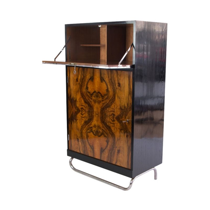
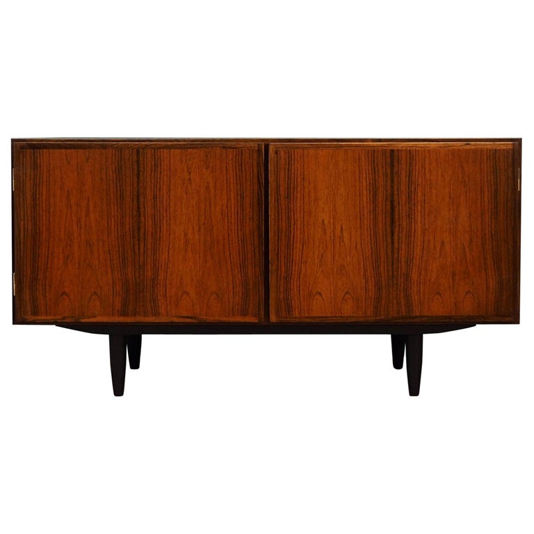
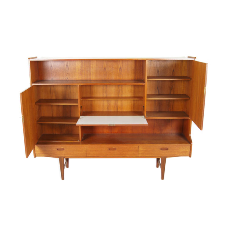
Everytime a customer comes in and says "omg that dresser is just like the one on Mad Men!!" or "Do you watch Mad Men?? You need to see the furniture on there!!" a part of me dies.
i don't think the show is over-rated at all
it's one of the best series on TV now along with "southland" when it comes to character development, production design, directing and editing.
but people who have no knowledge, sense, and real passion for design to begin with and decide to jump on the bandwagon of modernism due to the popularity of the show are indeed quite irritating.
speaking of the show, i think it would be more appropriate for the production designer to use the eames PSCC-4 or PSCA instead of the PSC for the typists/staff members to sit on?
fb
I like the show and it is f...
I like the show and it is fun. They try to get the period
correct but I doubt they would do all Herman Miller and Knoll . They are at the top end of any executive office,during the 60's they saved the best for Roger Sterling the senior partners office and I doubt that any executive would want to sit at Saarinen table all day and not at a desk so i think that is wrong.
The entry lobby is mostly Florence Knoll sofas, perfect for that era.
I am sure they will roll out some real goodies in the next few episode.
Roger's office
If I'm recalling correctly, Roger's young wife chose the decorations for his office, and he doesn't actually like them. Now that he's not getting along well with her, I'm surprised he hasn't changed it...but at least that explains why his design is so singular, over the top and inconsistent with the rest of the office's decor.
1960s offices
For what it's worth, I happen to have a great little book from 1968 called 'Office Planning and Design' whose photo illustrations are decidedly masculine: steel, leather, wood and solid color fabric. The Mad Men office seems to get it right--at least judging by this book.
Catalogs, magazine
articles and ads, books, etc of the period (any period) are a priceless entrée into the thinking of the moment -- "from the horse's mouth" as it were.
However, one would be shortsighted to rely on just one or two such sources, in looking for a broadly accurate picture of the state of the art -- because each publication represents only one (set of) opinions and tastes (and, let's face it, commercial interests) among many. So, catalogs (say) from several or many of the principal players of the day will enable one to take in more of the spectrum of the moment in question.
In fact one could trace the spread of an idea or a style by a close reading of the ephemeral literature, from source to syncophant, leaders to followers, month by month and year by year. What was shown when, and where; what was published by various parties when, and where . . .
I s'pose that's what a dedicated researcher or journalist would do . . . ?
Anybody have more old stuff -- print ads, catalogs, etc to salivate over ?
Spacepirate1
That was the first time I have actually laughed at one of your comments.
However, all these new customers that come into your shop and make references to Mad Men, are most likely driven to your premises due to the popularity of the show. So it might increase your sales if you actually embrace the program? Just a thought...
If you need any help, please contact us at – info@designaddict.com


