I need some design help. I love antiques(don't barf, moan, or choke)and I love modern. My Fiance has had enough of the antiques(naturally). Lucky for me I was already adding modern pieces to my collection. I would love to have an eclectic mix. So with that said I currently own a:
Starck Ghost Chair
Eames Walnut Stool
Saarinen Tulip end table (black)
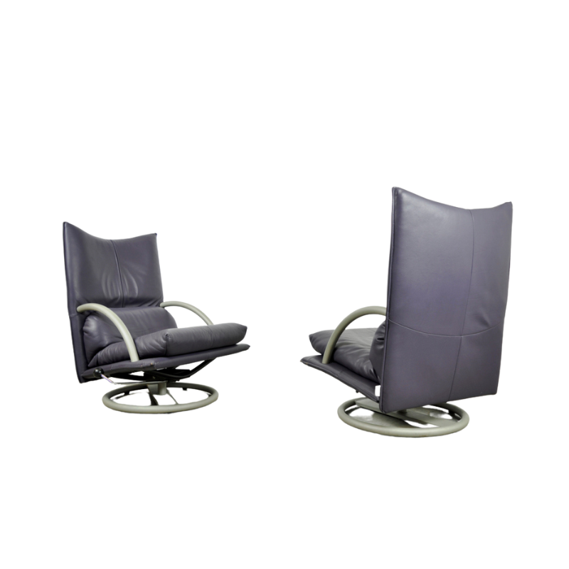
Pair of Bellini chairs in gray
I picked up some chairs at the flea market for $60, knowing they needed to be upholstered. I'm willing to part with one because I'm not crazy about it. How can I inject a modern flavor into this chair? I thought Knoll fabric might be nice. Or matching the color with modern chair and putting them together? I have no clue right now.
Chair is on the left. Right is going to goodwill.
Classic Bergeres chair...you can have a blast with these!
here's some thoughts...
Paint the wood high gloss white lacquer and upholster in faux zebra
Paint the wood high gloss black and upholster in a good quality velvet in a color that works with your space
Paint the wood metallic silver and upholster in white leather
Paint the wood a rich lipstick red and upholster in black leather
Upholster in a classic Maharam or Eames print and strip the wood to a natural oil-rubbed finish if it's in good enough shape or paint it a 'natural' brown/tan color
The trick is to use a finish that is totally unexpected forthe shape of the piece and to keep the shape of the chair noticable by using a high contrast of the exposed wood and the upholstery.
So you've got some elegant...
So you've got some elegant pieces (bellini and saarinen) and some modern pieces (saarinen and Eames) and some playfulness with materials (Starck). I would continue the playfulness with materials in any of the ways Olive suggested. The Zebra/Gloss white, or gloss white with grey Eames Dot fabric are my favorites. Pair it with the Saarinen table and you've got a great arrangement.
I'd keep the chair on the left; its got way more personality than the one on the right. Whichever fabric you use I'd get enough to make a throw pillow or two to bring it back again somewhere else in the room. Whatever you do, use a classic fabric, and not some crazy faddish thing (thinking bright green leaves here) that will need to be redone in 12 months.
Great Ideas
Please keep them coming! Love the orange bergere and the one on the right is leaving for greener pastures this weekend. I like the idea of painting the frame.
Also, I was going to post this in another thread but I might as well add it here. I have a victorian chaise with great lines AND I HATE THE FABRIC! I don't have the money to upholster right now (as I would rather do the bergere)and I managed to find a wall color that works well with it. How can I hide this funky fabric for now? Pillows? Throws? Thanks for the help.
I read french interior deco...
I read french interior deco mags and often see a mix of antique and design classics. I've seen this type of chair done in silver, i.e. the wood is painted (or sprayed) a metallic silver with the upholstery in a similar fabric (grey silk for example or flannel); also seen wood white or black painted with a graphic black and white print...
I saw a 'banquette' of the same era done in white paint and white linen upholstery...
Fantastic
I love these ideas. I never thought about faux fur pillows on the chaise. I can't imagine anything else working with it. I plan on putting the black tulip table next to it.
Thank you for the compliment on the lines & form. I love curves in my furniture. And I'm a minimalist to some degree. I dislike cluttered surfaces or drawers. I get peeved when I can't find something so I start throwing things out. lol My family usually receives my cast offs and they love it.
The color on the wall is "Ralph Lauren - Strudel".
I haven't decided what to do with the chair just yet. I love red and I keep thinking red velvet but I would like to be more adventurous then that.
You don't need to get too adventuresome
The chair already had a great form so go ahead with the red velvet it'll be sumptuous. Black, dark chocolate, pewter or even citron green would all be interesting colors for the paint on the wood. Do what makes YOU happy not what you think is going to be perceived as 'adventurous!
And I do love room with a mix of old and new...more sophisticated...especially when the occupant can really curtare the space and make the sapes work without going over the top! Sounds like your the girl for that!
If you need any help, please contact us at – info@designaddict.com


