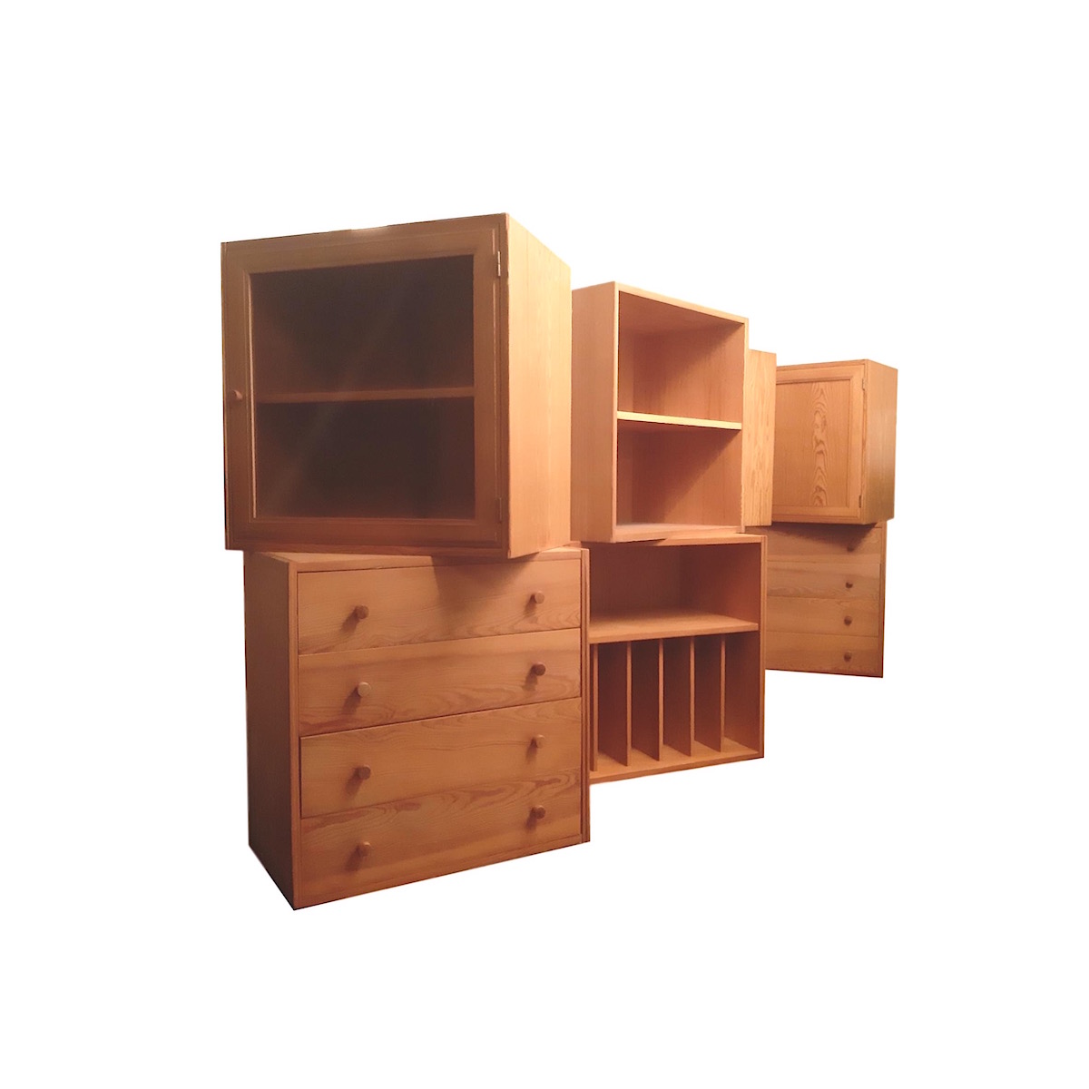
A couple of pictures of my home in New Mexico are posted as a sneak peak on the Blog/e-zine Apartment Therapy this month. They're not the best shots but, hey what t the heck, it's kinda fun.
I have no problem with the criticism I got from readers but I have to say that I'm a bit confused by one of the statements and I wondered if you all would have a more educated/informed way of describing it.
It was said that my style, or the home, not sure which, 'lacks cohesion'. I'm a bit puzzled by that, our stuff is almost universally mid-century modern or following that aesthetic. Lots of natural, honest materials with clean lines and a noticable asian-ness. If anything, I'm guilty of a little too much consistency and I try to go outside the box occassionally.
So can anyone explain what you think the poster was really trying to tell me? I have no intention of changing a thing, but it would be nice to have a bit of comprehension! I'm wondering if tmaybe the poster means that they don't like when the architecture and the furnishings aren't all of the same period or style, which, personally, I'd find dull!
Now, this is just my...
Now, this is just my opinion:
Modern furniture, of the sort you collect, is all about innovation - letting go of the past and embracing new materials and techniques.
Your 'adobe style' house is all about, well, none of those things. It wares the adobe style like a costume over its wood frame and high-tech insulation - like its afraid of what it really is.
I see it as a clash of ideals.
Nice collection, by the way!
Hmm...
I'd be the first to admit that I may have a skewed sense of what's appropriate -- my living room is about the size of yours and has seating for 19 -- but maybe it's just that you have relatively few pieces and they're all clustered together against one wall of the room.
Plus, (practically) no art on the walls makes the empty spaces look even more empty.
I wouldn't describe that problem as a "lack of cohesion", though. To me it's merely a symptom of having just moved in. It takes time to figure out where in the new house to put all the stuff from the old house, and even longer to decide what, if anything, to add. If the person who commented on AT had known that you'd been in the house only a month, I suspect that he wouldn't have said anything.
Well thanks, that's helpful!
I'm floored, seating for 19 in a space that's about 15ftx17ft? YIKES that's a lot! I absolutely couldn't fit that in mine, I have a traffic pattern that has to wrap around the room leading from the foyer, around past the fireplace and into the back hallway. I can't really spread the furniture out any farther or there would be nowhere to walk.
I'm also intrigued by the adobe costume concept. I live in a development where all the homes are a version of modernist pueblo style. It's a common update of the antique adobe style and the only way to get a clean lined modern home out here in New Mexico. There is no way you would ever want a glass box with the kind of sun you get out here. I never considered that it could be seen as somehow like a McMansion or what is commonly called out here...a faux-dobe. Those homes try to recreate the antique and fail miserably. These homes respect the lovcal vernacular but clean up the lines and simplify the decorative bits. Interesting to consider.
As for wall art...personally I don't like it all that much. I like bare walls, or at least lost of visual resting space and I've got some incredible art by Mother Nature right outside my windows. So I guess that's going to stay a fail, but that's OK.
Thanks all for your insights they're helpful.
Lovely, Olive...
Very nice place.
I think the lack, or supposed lack I should say, of wall hangings and objects is most likely what triggered the comment. But any devout minimalist would say you've far too much clutter about. So what really matters is what you think and whether or not you're happy. Personally, I'd cover up nearly every inch of wall and fill every inch of space with objects if I could. But that's preference. And being that I appreciate design, I also appreciate other styles and approaches.
That said, I will give you my friendly critique since you ask. If it were an older, more naturally cozy place your furnishings and swatch choices would be home runs. But the problem I find with new construction modernism is that many times it lacks the soul of other styles or even older modern construction. So yes, I do think more objects would benefit the space. And some warm or even darker color on the walls or perhaps some panelling might create some contrast as well against the concrete floors.
I think you're brave to put...
I think you're brave to put your place on Apartment Therapy! I'd be too worried about nasty comments. I think your place looks really nice.
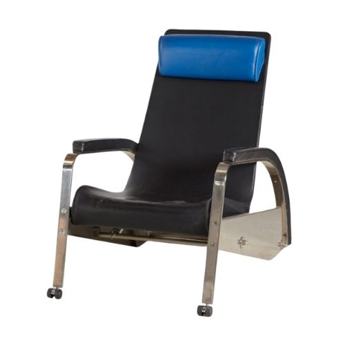
Anyway, in response to the comment you mention about your place lacking cohesiveness -- hard to know what that meant, exactly, but I'll say this: I think those of us who collect vintage look at furniture a little differently than most people. We recognize when a piece is special and rare, and I know if I find something great, its cohesiveness with other stuff I own is the last thing on my mind. I don't give a lick about, for example, whether the woods in my place are close in tone -- in one room I have maple, birch, teak, rosewood, walnut and oak pieces. Doesn't bother me in the least but I imagine some folks would see that as lacking cohesiveness. I wonder if that comment was made in reference to your living room with the chrome frame sofa and chair, the black iron frame womb chair/ottoman, and then that one large wooden sideboard?
In any case, I think your place looks really nice. I guess if I had to be critical, I'd say that I think the living room space could be warmed up a little. The animal skin on the concrete floor is kind of cold; I'd put down a larger area rug in a warm color that is nice and plush. I think it would help define the seating area too. I think a large plant or two in nice looking planters would make a big difference. I don't think the walls need to painted a different color, I like them white.
Don't worry, be happy
Olive,
I have never truly concerned myself with the opinions of others and I would suggest that you do the same.
I really like the red wall with the dark door and the bench. Very nice.
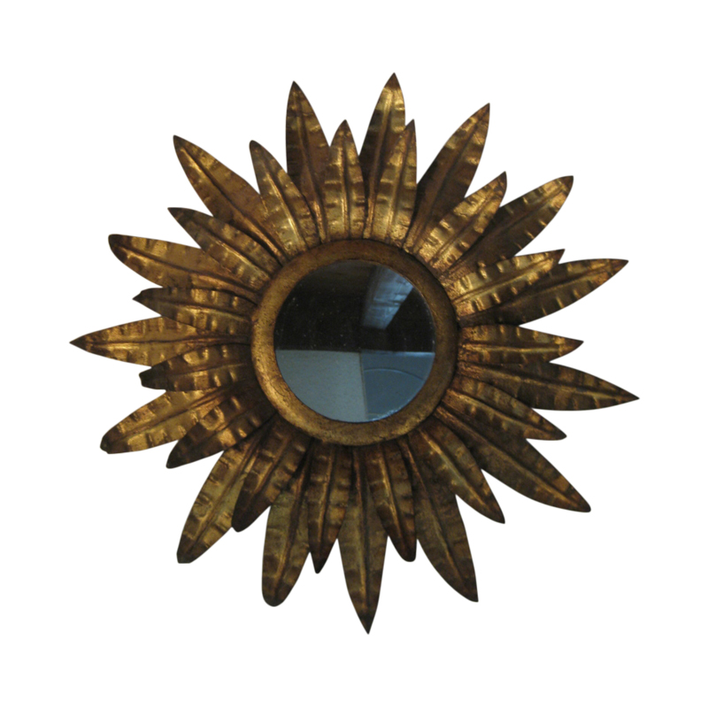
The only possible tweaking I see would be the area near the fireplace seems empty (not that it should be stuffed to the gills), the hanging star like object does not appear to fit, and the refrigerator in the corner brings my eye to that corner and not the remainder of the room.
All in all, well done.
Olive, I'm
swooning over your orange wall. Perfect with that Nelson bench. The color makes me want to lick it!
Why do you care what some random idiots think about your house?! I'm sure they were referring to the minimalist overall feel and they don't get that a womb chair doesn't need a bunch of pillows and an afghan thrown on it!
Cheers, girl, it looks great to me. If anything, I'd put in some more pops of that saturated orange.
The final AP comment was rude
"Why on earth was this posted?" Gimme a break,I'd love to see their place.Some people... Ayhow,Olive I think your home is stunning,and I'd give my eye teeth for a place like yours.It's evident you put alot of thought and hard work in each room/space,and your furnishings are top notch;nothing cheap or tawdry here.Ignore the critics.You know what they say about opinions...
Gee, wow, thanks!
Very very good input. I've been looking at our new home for a bit now and wondering what I wanted to work on next and sometimes it's hard to see the forest for the trees.
Honestly I am not really caring about the AT comment, some folks really don't like or understand modernism and AT has its fair share of those...'haters gonna hate' as was said above. Don't care what they think, but I really wanted to understand what they meant! The feedback here is more educated, a far more knowledgable criticism, and therefore much more helpful. I appreciate it!
Riki...don't worry there's more orange! Behind the bed in the master, and if I get to do a full spread for AT then you'll see it. It's called "Spicy Tomato" so I completely understand the urge to want to eat it. It's a really fabulous color and I love orange! I wanted to use it back at my other house but it was just too too...ya know?
One thing that's been pointed out a couple of times is the space over the fridge. It's funny how hard it is to capture the depth of a space and understand why/what/where. The fridge we have is a honking big sucker and quite deep. And since we're quite tall in this house the counters and the cabinets are set high on the wall. If I put set over the fridge, I, my big 6ft self, would need to go up several steps on a ladder to even get to them, a step stool would not be enough! So, it's just not a practical option. But the space does kinda look empty. I've been working on what I want to put up there. Right now I have a lamp and some bowls...and meh, not really thrilling me. I might move the Pinata from the living room to hang in the corner...just not sure yet...I think I want light up there somehow.
Anyhow thanks a lot, I will probably incorporate some suggestions before I do a photoshoot for the big AT thing, if it happens. I want the place to look it's best. I'm working on ading that 'soul'!
I think your home is great ...
I think your home is great !! I see nothing the matter with it. most people that respond to Apt therapy have no clue what a great place is.
As you know, The longer you live in a place it changes all the time, living in Santa Fe you are exposed to all kinds of cool art and cool stuff. so what is on the walls today might not be on the walls tomorrow.
I hope you are enjoying your new home.
Oh, I LOVE my new home...never fear!
And I agree on the evolution thing. We've discussed that a gazillion times here on DA. A collected home that has matured and evolved over time is a far more interesting and sophisticated space.
I was lucky, I got to design this home, for the most part. So pretty much all of our furniture knew where it was going to live before we moved in. I made scale model cut outs of each piece and set them in place to be sure that the space, traffic pattern, practicality and fel of the place would be what we wanted.
I'm also lucky that I have so much wonderful art around me, either from Nature or from the local artists, Santa Fe is amazing in that regard. It will be fun to look and find what makes us happy. One local guy we've been watching is Willy Bo Richardson; we also like Joel Nakamura.
This is a Joel Nakamura piece, and there's a link to WillyBo's stuff below.
http://www.willyrichardson.com/
Olive
You know me, I like your style!
I don't see any lack of cohesion. In fact it is very cohesive. Some people like to have opinions wether educated on the subject or not.
The space over the cabinets:
Now, I know many people cringe at the idea of super dark colors on the wall. My house has a kitchen and living room sharing a very long wall, cut in half by a hall door opening and capped off (the rest of the room is very high, sloped ceilings) by a soffit (is that the right word?). Because of all that white, I decided to paint the long wall a really dark brown/gray.
I was thinking you could take the dark hue from your tile and paint the wall where the fridge is. It would jill the heavy white/dark contrast between the wall and cabinet. This minimizing the open empty space. I think it would look nice! If it still looks empty I suggest putting a mounted moose head there 😉
Empty fireplace: I know your a minimalist-ish gal. If it were me the paintings would stack vertically above the fireplace opening. Either side might have planters and lush plants.
I love your house! F*ck those peeps. And good for you for having the balls to post it.
Please excuse my poor writing. At work and hurried.


If you need any help, please contact us at – info@designaddict.com