In my opinion, this sofa is...
In my opinion, this sofa is made from polyurethane mass, but on the other hand it could be made of something different, cuz these sharpnesses form of polyurethane can not hold. But if there's no plastic or mass of polyurethane, then what? It's difficult to valuate, because I had never seen forms like these.
One theory to answer your question
Veneer pieces over thin wood sections that were made pliable by being subjected to water and slowly molded. I doubt it was a plastic. My live-in master carpenter concurs. Hope that helps you understand one way that sofa could be accomplished. Many layers of thin wood, bent and piled on become quite strong. That, I believe, is how he/she made it.
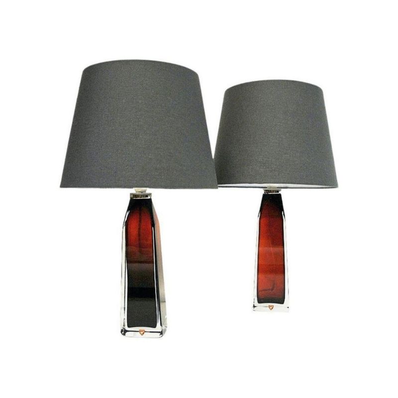
I find it quite lovely. Someone directed me here to ask a question about two lamps I have. He told me to brace for the sort of commentary you received about this piece. Ha ha! Some people quite enjoy their fur flying fests don't they?
I would say they are fibregla...
I would say they are fibreglass shells, for small runs its affordable, other moulding technologies would be very expensive and I doubt you would get much of a return on investment.
I can't see any stitching on that edge , even on an Egg chair the hand stitching is obvious. Given how sharp and tidy that it looks I would guess 2 shells have been used or the inner part foam has been upholstered, the edge of the fabric tucked and glued over and then this section glued onto the inside of the fibreglass shell, maybe!
Hasn't the word...
Hasn't the word "contemporary" also moved past it's original intent, and isn't it used as a name of a style rather than meaning "current?" I would have filed this design under "contemporary" as well as a first reaction.
I think it's hideous. It's original shape serves no purpose other than to show off. I find it very uninspiring. A technical feat for the very sake of nothing, or to make a statement. Wouldn't that smack of post-modernsim more than anything?
That's one ugly sofa, yes indeedy!
But I'm intrigued with the 'contemporary' 'modern' and 'modernist' semantics.
My sister is selling her much despised house in western PA and moving back to civilization near NYC. The agent listing her house describes it as 'Contemporary'. It IS only 6 years old so, if one uses the dictionary meaning, it is contemporary. But it's a spec house built to be as universal, read bland, as possible. It has boring oak trim, tacky pseudo granite laminate countertops, cream carpeting and beige tiling. She has hated it since the day she moved in; it was bought out of necesity. In my view this is sadly what 'Contemporary' means. BLAND. That's what a society that buys and resells houses every 5 years on average and churns through crappy furniture and housewares really wants. Nice bland, boring, pablum that looks familiar to every other buyer out there. YUCK!
I think the term 'Modern' means more of an individual and exclectic mix more on the level of modern art. And I think there are designs that are modern even if they are 40 years old, it's that 'je ne sais quoi' of a piece that keeps it looking new in my eyes. I'd define 'Modernist' as more of the MCM movement aesthetic. It was a time when designers were consciously developing a particular ethos and feeling to their work. They collectively hive-minded a style that at the time was very forward thinking. Hence, 'Modernist'.
If you need any help, please contact us at – info@designaddict.com


