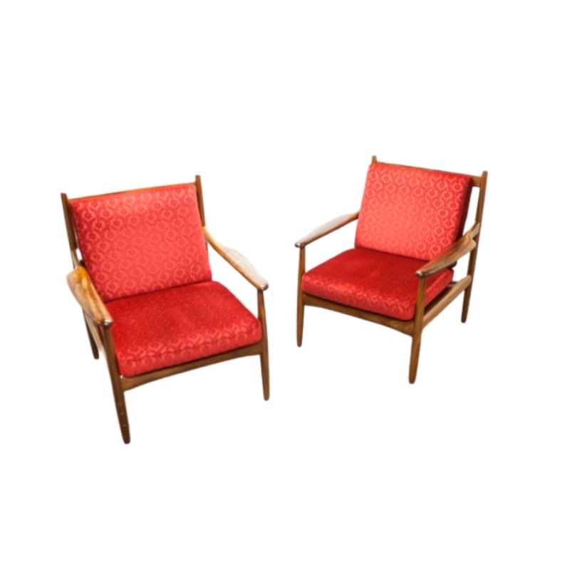
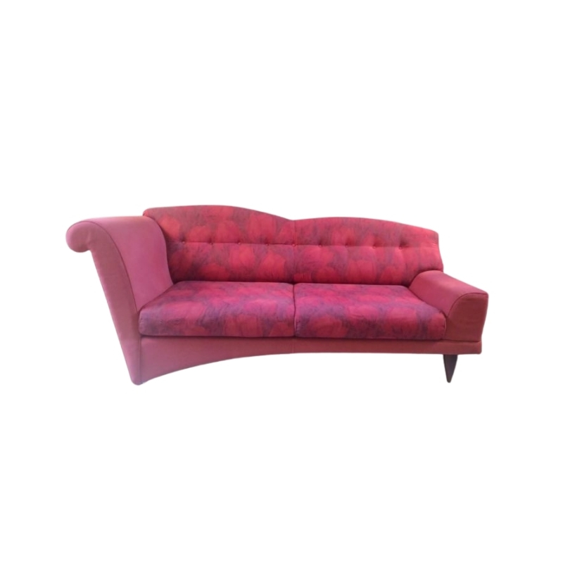
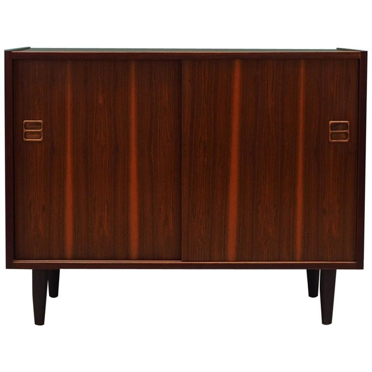
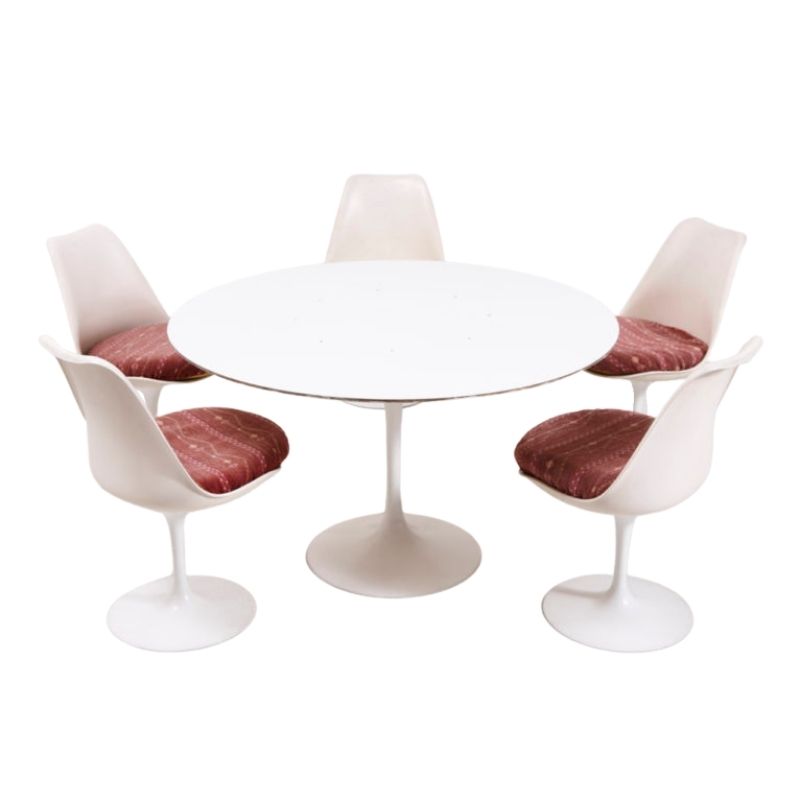
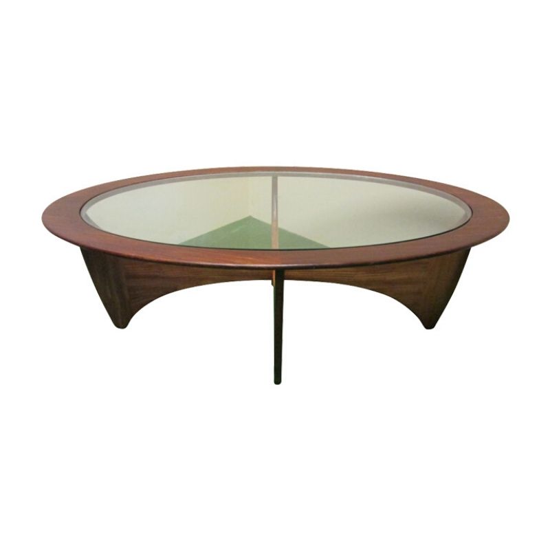
I'm sitting in a low-priced Missouri hotel looking at furniture I would describe as Hotel Modern. It's sad, sort of pseudo modern with lines and swirls that serve no purpose at all but to look 'not old fashioned'. I hope this trend ends, and hotels revert to something else or move on to something else. 

Expensive - Cheap
I love dichotomies.
Hi Brent!
How are you?!
You know...your images of the ,,low-priced hotel,, lamps, recall me more the suppose "expensive hotel".
I was searching to post images of "expensive hotels", and so so many ,,bad taste,, so much options, that didn?t know which one to choose.
I wonder which is exactly the trend that must be stop?
I don't know why I imagine those lamps in http://www.lordssouthbeach.com
(via James > via www.whatisjameswearing.com > via Mark > via Robert1960)
(Thanks, best DA thread ever)
By the way here it's suppose that anything labeled MCM must be good.
My problems is that I like everything?
Hi Mark!
By the way I love the images of the ,,low price hotel,,. Somewhat ,,class B,, cinema. Much more interesting than many ,,class A,, hotel, if you know where to look at. (Avoid brands please).
Again, By the way here at DA it's suppose that anything labeled MCM must be good.
You know, when I think on MCM that image come to mind, and not DADanish. And the bigger problem is that I like it more that the Danish. Am I confused?
ps.
ps. It's not that I like the first lamps, -yes or not- it doesn't matter, Or Mark's hotel. What I like is that -relative- idea of good-bad taste. That hidden taste. That taste that's in the edge. That border taste. You run the border, and you can fall to the right or to the left. But while you run on the border... you are on three times at the time.
That's what I see on Brent as on Mark images.
That's exactly what I see on Muranos (Riki's ideas on Muranos I recall)I find Muranos so great because could be uber chic and uber cheese almost at the same time.
Trend
Hi, Gustavo. The trend I'd like to stop is the mass-production of objects (such as lamps) that are made to imply modern by arbitrarily incorporating aspects of modern design.
I know this isn't a new problem in design. Just consider the mass-produced 'modern' design objects of the 1950s such as boomerang lamps and kidney-shaped coffee tables. But I travel a lot in the U.S. for work, and more and more I see hotels filled with bad design meant to suggest something modern or minimal without being either.
I would much rather see...
I would much rather see hotels across America putting their money into comfortable beds and bedding that is 100% washable. Decor is secondary, as long as I don't have to sleep on a concrete-like surface under a quilted synthetic bedspread or one of those icky Vellux blankets that you know doesn't get cleaned after every guest.
Marriot Courtyard has innocuous Pottery Barn style stuff in the rooms but their beds are comfy and they have those cotton duvet covers that are always pristine white. There are some others like this---Omni is pretty good. Maybe design will follow someday.
Hipster Hotel Hell
The Standard Downtown
Be sure and take the vitual tour.
http://www.standardhotels.com/los-angeles/
Brent, the building itself is cool.
It was originally the west coast headquarters of the Standard Oil Company. There is a backlit sculptural frieze depicting scenes related to the oil industry running around a portion of the lobby that is obviously original to the building that I thought was the highlight. The "Calder" mobile is a fake.
http://www.flickr.com/photos/10281225@N04/2560724628/in/set-72157605497647057
If you need any help, please contact us at – info@designaddict.com


