
woodywood
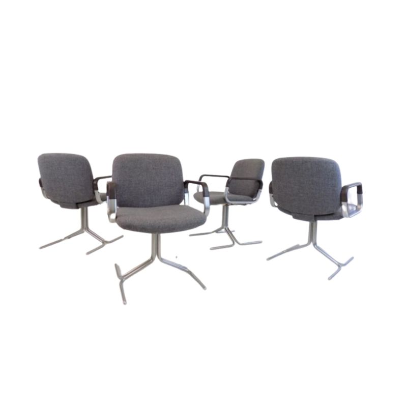
That's actually a really nice Jack Lenor Larsen printed cotton velvet on those Thonet chairs! Though not in a colorway I like so much. I have the same fabric in the olive/brown/lime/turquoise colorway but mine is just on some throw pillows.
The designer is Astrid-somebody, I think---early 1960s. I don't like it on those chairs and even if the color and pattern worked, printed velvet is not a good choice for dining chairs.
Mine:
I thought I recognized that velvet print, Spanky nailed it.
But let's face it-- prints, even appealing prints, are best utilized for throw pillows.
Notice that most (all?) of the examples of "hideous upholstery" in this thread happen to be PRINTS. Prints always detract from the form they're applied to, they always seem to make it worse, never better.
The only exception to this rule seems to be stripes, which can sometimes be used to pleasing effect-- maybe because repeating parallel lines help to describe a shape, accentuating the straight lines & curves alike? (
Oh, I dunno...
...I think pattern can look great on an upholstered piece if it's the right pattern on the right piece. Which nothing here is.
In one of the design books I have, there is a sofa upholstered in that Larsen fabric above and it looks great, in my opinion, though I tend to neutrals and much more subtle pattern, if any, in my own furniture. I always worry that I'll get sick of big patterns pretty quickly.
The first photo is of a 50s sectional that I redid in Unika Vaev's "Wink", one of my favorite fabrics ever (followed by a closeup of the fabric). It's 7-8 years later and I still love this.
I think it's an individual preference thing, though. I can see how some would prefer only solid colors on upholstered things. (One thing that I bet most of us agree on is the current trend to do cushions in one fabric and the rest in something totally different is just flat out wrong.)
So...
..while hunting around online for some good examples of patterned fabric on upholstered pieces, I found this!
Kind of the opposite of everything else here---good fabric, bad chair!
The chair isn't even that awful for what it is---it's just that overweight seat cushion! What were they thinking! Is it for a houseful of sensitive bony-butts? I don't get it.
Well, ok...
...I'll keep your challenge in mind when I'm out and about on the internet. But what you said originally was, "Prints always detract from the form they're applied to, they always seem to make it worse, never better."
It's the "always" that I take issue with. I don't think it's always. I think sometimes the pattern is the thing and the furniture is the vehicle and together they can make a pleasing whole. BUT this is coming from someone who has a lifelong, serious passion for fabric.
In the end, I think it's a matter of personal preference and I agree with you totally that solids look good pretty much on anything. And if it's an interesting texture and/or color, a solid can hold its appeal over time.
Oh my!
Well after reading the last couple of posts by whc and spanky, who's opinions I respect...perhaps I fucked up by only recovering the top cushions on my b&b italia sectional in a Maharam print textile called "betwixt". This is actually the second round of cushion recovery in the last 20 years. It might just be time to redo the whole piece in a solid..as I hate to own anything that would qualify for being in this particular thread. And I'm quite sorry to repeat this same photo again...I don't return to Florida until November (that's where the sectional is).
ps,
Sorry if I've steered the thread off topic a bit.

If you need any help, please contact us at – info@designaddict.com