Design Addict

Cart

Here is a wonderful...
 

Here is a wonderful chair by Gustafson...  

Page 1 / 2
  RSS

dcwilson
(@dcwilson)
Illustrious Member
Joined: 14 years ago
Posts: 2358
16/08/2007 10:12 am  

if only Sigurdur Gustafson had created a back cushion with a little rake and useful lumbar support, I'd say he was a genius.


Quote
HP
 HP
(@hp)
Illustrious Member
Joined: 14 years ago
Posts: 636
16/08/2007 1:20 pm  

you are crazy in the coconut


ReplyQuote
James-2
(@james-2)
Illustrious Member
Joined: 14 years ago
Posts: 472
16/08/2007 1:52 pm  

School
I think I made that in woodshop and got an F-. Of course routing a sign saying "Home Sweet Home" got me a A, so the F is not saying much. All aside, looks like a futuristic school desk, nice eye.


ReplyQuote
Antonella
(@antonella)
Noble Member
Joined: 14 years ago
Posts: 226
16/08/2007 2:41 pm  

It gives me the idea of Esher
http://www.phys.huji.ac.il/~shaviv/Sadna/Sadna.html


ReplyQuote
builder (AUS)
(@builder-aus)
Prominent Member
Joined: 14 years ago
Posts: 173
16/08/2007 3:42 pm  

Design can be judged by looki...
Design can be judged by looking of one piece only. It may be one of a series. The Eames can be well known by creating the wall unit only. the wall unit is very nice but it cant be that desireable if they dont have any other design other than the wall unit.


ReplyQuote
Antonella
(@antonella)
Noble Member
Joined: 14 years ago
Posts: 226
16/08/2007 4:08 pm  

Maybe there are more designs...
Maybe there are more designs part of the collection of the chair...


ReplyQuote
dcwilson
(@dcwilson)
Illustrious Member
Joined: 14 years ago
Posts: 2358
17/08/2007 11:52 am  

HP,
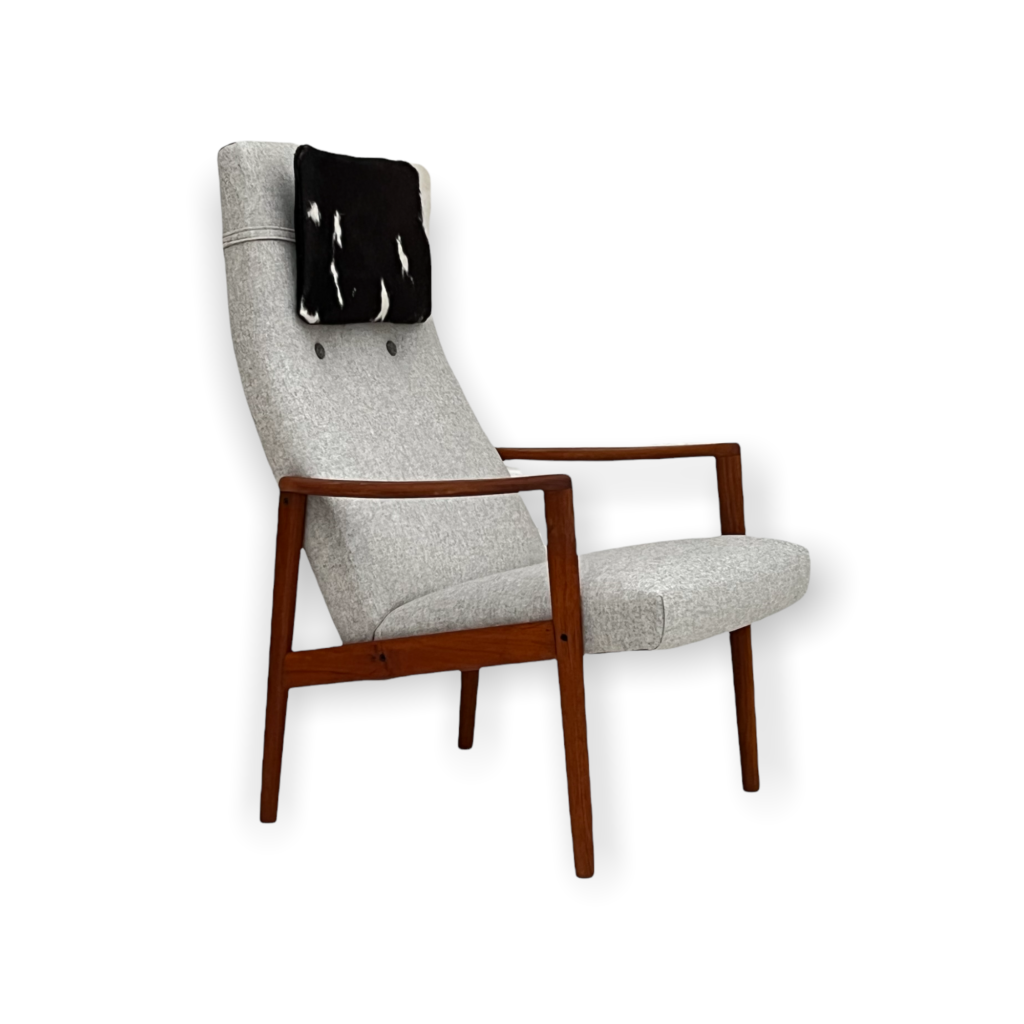
What about this chair doesn't work for you?
I like the asymmetry, the orthogonal planes in surprising compositions and pleasing combining of colors and materials. I like that someone has taken the cube and not so much deconstructed it as reduced it to intersecting planes.
Compare this with one of Corbu's cube chairs with the chrome frames. Corbu's cube chair, a hugely admired classic, is symmetrical and heavy and hogs materials. It is about surface and mass. This chair is light, surprising and would fit wonderfully in a corner or out in open space. Its many surfaces ultimately comprise a space, rather than being about the surfaces. It works for me.


ReplyQuote
HP
 HP
(@hp)
Illustrious Member
Joined: 14 years ago
Posts: 636
17/08/2007 12:06 pm  

It looks too small, I can't...
It looks too small, I can't put my beer on the arm without garroting my wrist, the finish looks toxic and the corners WILL chip.


ReplyQuote
SDR
 SDR
(@sdr)
Illustrious Member
Joined: 14 years ago
Posts: 6462
18/08/2007 4:52 am  

With all due
respect (and without questioning your choice) those are some lame objections. . .! The finish LOOKs toxic: ??
Anyway, here are some precedents, dating from 1923 to 1960:
Jan Pieter Dirk van Gelder, pair of model chairs c. 1920's

Gerrit Rietveld, "Berlin Chair," 1923

Gerrit Rietveld, "Steltman Chair," 1960


ReplyQuote
whitespike
(@whitespike)
Illustrious Member
Joined: 14 years ago
Posts: 3499
18/08/2007 5:13 am  

I don't like it.
Not even sort of. In fact I strongly dislike it. I don't know exactly why just yet, but it feels like there isn't much room with that arm holding you in, the back seems very low and uncomfortable, and beyond that it just isn't aesthetically pleasing to me.


ReplyQuote
whitespike
(@whitespike)
Illustrious Member
Joined: 14 years ago
Posts: 3499
18/08/2007 5:14 am  

Rietveld, "Berlin Chair"
This chair seems lighter and more generous with space all at once. The back is taller and offers more support without a bulky feeling. The arm is perfect for a can of beer!


ReplyQuote
dcwilson
(@dcwilson)
Illustrious Member
Joined: 14 years ago
Posts: 2358
18/08/2007 7:15 am  

SDR...
thanks for these Rietveld pics. This helps me much better understand the origins of this chair by Gustafson. I've always liked GR and now that it is apparent that Gustafson is riffing on GR, I can see why my like-button was pushed.


ReplyQuote
dcwilson
(@dcwilson)
Illustrious Member
Joined: 14 years ago
Posts: 2358
18/08/2007 7:18 am  

And. SDR...
that morph from van Gelder to GR to Gustafson is very fascinating. Once again, I'm amazed at the ability of DesignAddict to find surprising connections.


ReplyQuote
HP
 HP
(@hp)
Illustrious Member
Joined: 14 years ago
Posts: 636
18/08/2007 8:52 am  

if thats two pack bright...
if thats two pack bright green on the backrest there is no way I'd have it in my house. Read up on out-gassing, it is not a lame objection.


ReplyQuote
SDR
 SDR
(@sdr)
Illustrious Member
Joined: 14 years ago
Posts: 6462
18/08/2007 10:48 am  

Sorry,
I wasn't aware that some colors were more likely to emit than others -- if that's what you're saying ?
The asymmetry is probably the most interesting thing about these pieces. Note that the Berlin chair is seen in both right- and left-handed versions, while both of the van Gelder models (these are about six by seven inches) are of the same hand.
It is a little hard to judge any of these chairs without knowing for sure how big they are. There is nothing in any of the photos to give them scale -- and chairs can have widely varying seat heights. The Berlin Chair is 106 cm high, with a seat height of 50 cm; the Steltman measurements are 70 and 40 cm.


ReplyQuote
Page 1 / 2
Share:

If you need any help, please contact us at – info@designaddict.com

  
Working

Please Login or Register