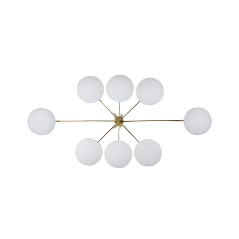
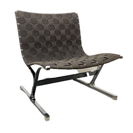
I need to be talked down off the ledge about Ico Parisi. He was either insanely good, or insanely bad. Can someone work me through what he is about and what he was/is up to aesthetically. The coffee table above is a case in point. This thing irritates hell out of me and yet it is utterly fascinating. The asymmetry of the form language at each end makes it look like two tables cut in half and joined together by a sngle glass top.
I have a feeling there comes a time in one's life when one must come to grips with this designer whether one wishes to or not.
Who was Ico Parisi and why was he doing strange things like this?
I mean what would you do if someone invited you for a nooner and invited you into a bedroom with something like this in it? I wouldn't know whether to strip naked and do the Watusi, or run and call the authorities recommend they investigate for ritual sacrifices. 🙂
Here is a Parisi link to Architonic...
If you care to do some therapy with me.
http://www.architonic.com/mus/8101359/1
If you need any help, please contact us at – info@designaddict.com


